Churchill China Brand Guidelines
The Longton earthenware maker that became a hotel tableware brand.
Aa
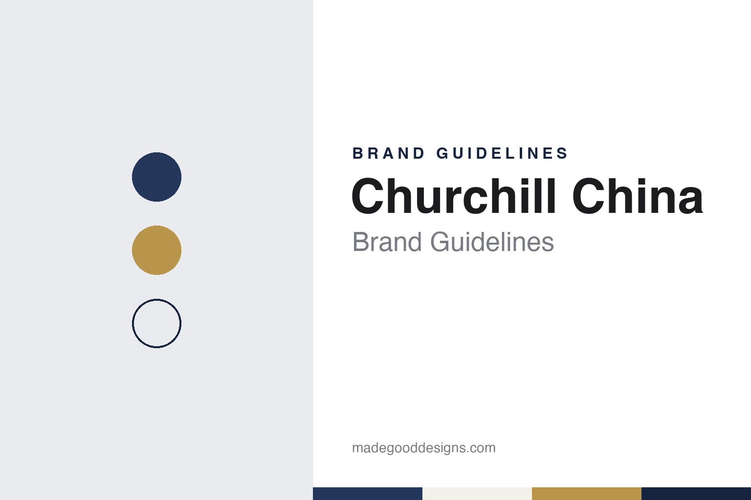
Two constants: a deep blue, white and ochre palette and a classic serif register. Abstract homage — not a Churchill product or mark; no plate, lion or backstamp is reproduced.
Sampson Bridgwood
An earthenware pottery in Longton.
Churchill China traces its story to 1795, when, the company says, Sampson Bridgwood began making earthenware in Longton, one of the six towns that now make up Stoke-on-Trent. English Wikipedia also dates the firm’s origins to 1795 and the founding of its first factory in what later became the city, as a maker of ceramic tableware.
The modern name came much later. In 1984, the company’s own timeline says, the business was rebranded as Churchill: growth and acquisitions had left it needing one name, and it adopted a lion as its mark, which it describes as standing for “strength and leadership.” Four years earlier, in 1980, it had made its first vitrified hotelware, and it says it treated vitrification as essential for that market from the start.
The company then joined the stock market. It says it listed on the London Stock Exchange in 1994; its corporate governance page today refers to the AIM Rules for Companies and to the Quoted Companies Alliance code, and English Wikipedia gives its ticker as CHH. The share register published on its website in October 2025 lists members of the Roper family among its larger holders, alongside investment firms, and in September 2026 TheBusinessDesk reported that a new chief executive, James Roper, had taken over.
The company’s old works are part of the city’s story too. In March 2017 the BBC reported that plans had been approved to build 193 homes on the site of the former Churchill China factory off Waterloo Road in Hanley, land that had stood unused for many years. The business is now based in the north of the city, where it opened a showroom at its head office in 2016.
Colour
Hotelware, ranges and the Dudson name.
Churchill makes tableware for two markets. In August 2010 the BBC described it as a Stoke-on-Trent firm making tableware and goods for the hospitality and retail markets, and reported that its hospitality side had done better than expected in 2010 after a year in which fewer people dining out had cut demand for restaurant crockery. Its website today is built mostly around professional buyers, with ranges sorted by plate shape, colour, finish and sector, from hotels and buffets to cafés and restaurants.
Its named brands carry the design story. The company says it launched Alchemy, a premium collection for fine dining, in 2002, and Stonecast, a hand-decorated range inspired by the seasons and fresh ingredients, in 2014; it says Stonecast won Product of the Year at the Caterer’s Product of the Year Awards in 2016. Its current brand list also includes Churchill Super Vitrified, Art de Cuisine, Studio Prints, Inked and Emerge, and it sells partner brands such as Zwiesel glass and Comas and Sola cutlery.
In 2019 Churchill bought the Dudson brand. The company’s timeline lists the acquisition that year, and English Wikipedia says that in April 2019 Churchill bought the right to the Dudson name and to its two most popular ranges, Harvest and Evo, from Dudson, which the same article describes as a competitor. The same year, the company says, it bought its materials supplier, Furlong Mills, and opened a warehouse in Rotterdam.
Recognition has come mainly through export awards. The company says it won the Queen’s Export Award in 1988 and again in 1993, and in 2020 received the Queen’s Award for Enterprise in International Trade for growth in overseas sales over six years. It says it sells through more than 800 distributors in over 80 countries, with warehouses in Stoke, Rotterdam and Chicago and showrooms in London (opened in 2011), Madrid (2015) and Berlin (2023).
Chefs are part of how the company presents itself. It says it has sponsored the National Chef of the Year competition in the UK since 2011 and has partnered with the Craft Guild of Chefs since 2012, as well as with culinary schools in Britain, Spain and Germany, among them Westminster Kingsway College in London since 2011.
The factory itself features in the company’s account of its work. It says it keeps investing in its UK manufacturing base for shape, decoration and lower-impact production, and its timeline records more than 5,100 solar panels on site by 2022. It also names the materials, glazes and finishes of its ranges — semi-matte, matte, embossed and hand-decorated among them — so buyers can sort them by surface as well as by colour.
Typography
Tableware and the table.
Tableware and glassware makers mostly present themselves through the table rather than the logo. Their catalogues and websites lean on collection photography: a single glass against a plain ground, a stack of plates, or a full place setting with cutlery, napkins and food. The setting does much of the work, signalling whether a range is meant for a family kitchen, a formal dinner or a busy restaurant, and the same pieces are often shown in more than one of those roles.
Names carry a large share of the identity. Ceramic makers mark the underside of a plate with a backstamp that gives the maker’s name, often with a pattern name and a place, and collectors and buyers use that mark to identify a piece. Patterns and shapes are usually given their own names, so that a single company may sell dozens of named ranges, each with its own photography and description, while the company name stays small.
Many makers also split their identity between home and trade. Arc, for example, keeps separate brand names for consumer tableware and for bars, hotels and restaurants, according to French Wikipedia. Hospitality catalogues tend to be practical documents, organised by shape, capacity and use, with product codes and packing details, while the consumer side is closer to a lifestyle magazine. Some makers add their own shops: Paşabahçe, the Turkish glassware brand, runs a chain of stores under its own name.
Behind the products sits a corporate layer. Company pages describe factories, founding dates and owners, and in this sector those stories often involve old works, family control, takeovers and court-supervised restructurings, as the profiles in this guide show. For a designer, the useful lesson is how these makers keep a recognisable voice across a long range of named collections, a trade catalogue and a corporate history at once.
Aa
A classic serif — chosen for a maker with roots in the eighteenth century. (Specimen set in Libre Caslon Text, a serif STAND-IN; NOT the Churchill logo.)
Churchill
A lion, a name and a catalogue for chefs.
Churchill’s identity rests on a name and an animal rather than on a founder. The company says the 1984 name and lion were chosen to reflect the business it had become through acquisition and growth, and the lion remains its mark today. Beside it sit sub-brands with their own names — Alchemy, which the company presents as its premium fine-dining collection, Stonecast, Super Vitrified and Dudson.
The website groups ranges into colour stories, from “moody blues” and fresh greens to warm neutrals and mid-century tones, and offers a gallery of plated dishes. The company says its portfolio runs to more than 4,000 items in 80 colours, 170 shapes and 27 designs.
For a design guide, Churchill China shows how a Stoke-on-Trent pottery can turn its age and a simple animal mark into a trade brand for professional kitchens. Compare Dudson, the hotel-tableware name it bought in 2019, and Steelite, another Stoke-on-Trent maker selling to hospitality. For this guide we use a deep blue, a warm white and an ochre with a serif, an unofficial interpretation; no product or logo is reproduced.
Explore & save
Keep Churchill China’s identity on hand — save it to a board in the Made Good inspiration library.
Churchill China identity set
Pin the Churchill deep blue, white and ochre palette and the classic serif register to your own board.