Dr.Jart+ Brand Guidelines
A Seoul skincare brand that turned its plus sign into a system.
Aa
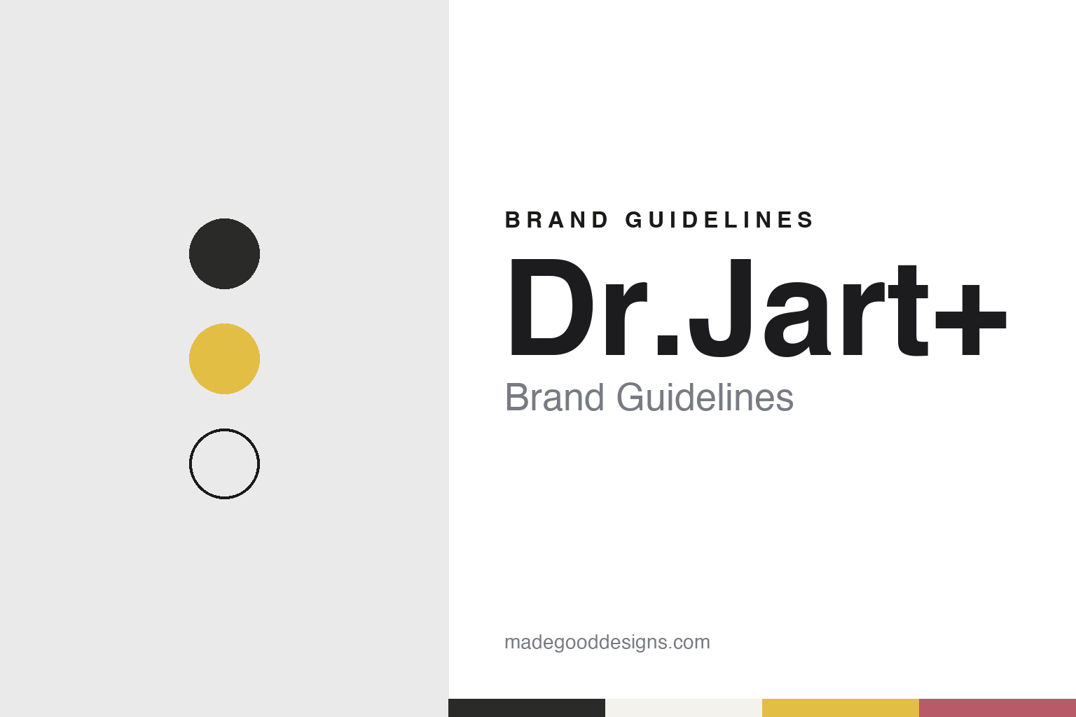
Two constants: a graphite, warm white and signal yellow palette and a neo-grotesque sans register. Abstract homage — not a Dr.Jart+ product or mark; no container, logo or plus sign is reproduced.
Doctor joins art
A BB cream project, a Seoul company and a plus sign.
Dr.Jart+ is a skincare brand from Seoul. English Wikipedia, citing a 2009 profile in The Korea Daily, says Lee Jin-wook began research on a BB cream in 2003 and launched the brand commercially in December 2004. The Moodie Davitt Report, the travel-retail trade journal, wrote in February 2017 that the brand was formed in 2004 after three years of development by the dermatologist Jung Sung-jae and Lee, his close friend. Later Estée Lauder announcements, quoted by Moodie Davitt in 2019, give the founding year as 2005.
The company behind the brand was set up the same year. Moodie Davitt reported in 2017 that the brand-management company Have & Be was established in 2004 with Lee as chief executive, in part to run Dr.Jart+. Have & Be later added a men’s grooming brand, Do The Right Thing.
There are two accounts of the name. English Wikipedia, citing The Korea Daily, says “Jart” was first coined from Jung’s surname and the word “art”. Moodie Davitt, Pentagram and BP&O all give the brand’s own reading, “Doctor Joins Art”, a phrase the company uses for its pairing of skincare with work by artists and designers. The plus sign closes the name.
The early route to market was narrow. English Wikipedia says the brand first sold through skin clinics and e-commerce sites, reached New York in June 2009 through the Takashimaya department store on Fifth Avenue, and entered the American market in early 2011 with Sephora, which stocked two BB creams in ten of its stores. By February 2017 Moodie Davitt put its reach at about 4,000 stores in 31 countries, and described a Seoul flagship in Gangnam called Filter Space.
Colour
Pentagram, Helvetica and the plus.
In 2018 the brand changed its packaging. Pentagram’s New York office, with the partner Paula Scher and the product designer Piotr Woronkowicz, developed new bottles, dispensers and containers and an identity system for the product lines, Pentagram says. Before the change, the studio says, each line had its own structural form, material, typography and colour, which diluted the brand; the new system keeps the forms consistent and changes only materials and colours from line to line.
The containers borrow from industrial objects — oil cans, kerosene cans and paint tubes — according to Pentagram and to Richard Baird’s review in BP&O on 15 January 2018. A wide pump marks a thicker product such as a lotion and a round pump an oil or a liquid; the forms have rounded edges and a soft-touch matte finish, and the stackable shapes were drawn to use shelf space tightly. Baird noted yellow used as a surface for interaction and white as a surface to grip, with the brand name placed low on the pack.
Type stayed familiar. The designers refined the existing logo and unified the brand’s use of Helvetica, Pentagram says, and BP&O noted that the typeface was carried over from earlier packaging. The plus sign changed role: as the brand spread abroad, Pentagram says, the “+” was being read differently in different countries and was hard to own, so it became a flexible mark that signals what each line is for. BP&O described it as relief on lids, UV varnish on boxes and a pattern on tissue paper, and judged it, in those first uses, low in contrast and recall next to the structural design, which it praised.
The first line in the new look was Ceramidin, which BP&O said had launched in South Korea in 2017 before its international roll-out; Pentagram says the system was to be extended across the other lines.
Typography
Korean independent skincare.
The Korean skincare brands in this group introduce themselves through a small set of fixed elements: a short coined name, a plain wordmark, and product names built from a line name and a format, so that a toner, a cream and a pad from the same family share their first words. COSRX explains its name as “Cosmetics + Rx” and writes it in capitals; Dr.Jart+ glosses its name as “Doctor Joins Art” and, in a 2018 redesign by Pentagram, turned the plus sign into a mark for its different lines.
Export shapes how these brands appear. Their online shops speak to buyers in more than one country, and the dated press tracks how two of them reached shelves abroad: Dr.Jart+ entered the American market with Sephora in 2011, according to English Wikipedia, and Chosun Biz reported in 2025 that COSRX was sold in about 150 countries. Campaigns follow the same route, from outdoor screens in Times Square to K-pop ambassadors named in a launch.
Several have been bought by larger groups, and this guide describes those deals plainly, by date and stake. Amorepacific took a 38.4% stake in COSRX in 2021 and moved to 93.2% in 2023; Estée Lauder invested in Have & Be, the company behind Dr.Jart+, in 2015 and completed its purchase in December 2019. Where a brand remains independent, the guide says so only where a dated source does.
Each entry draws on corporate pages for founders, owners and export markets, and on dated independent press for anything beyond the company’s own word. Product lines are named as the companies publish them; the guide does not describe what the products do, and the palettes and typefaces shown are an unofficial interpretation rather than any brand’s own.
Aa
A neo-grotesque sans, after the Helvetica the brand uses. (Specimen set in Archivo, a sans STAND-IN; NOT the Dr.Jart+ logo.)
Dr.Jart+
From a minority stake to full ownership.
Estée Lauder came in gradually. It made a minority investment in Have & Be in December 2015, Moodie Davitt reported in 2017. In November 2019 the American group agreed to buy the remaining two-thirds of the company, and on 18 December 2019 it announced that the acquisition of Have & Be, with Dr.Jart+ and Do The Right Thing, was complete, the Moodie Davitt Report reported that day. The brand’s named collections at that point included Cicapair and Ceramidin.
The brand’s publicity has changed with its owner. English Wikipedia, citing WWD in 2018, says the brand long favoured its own animations over celebrity endorsements, though it used Korean campaign models from 2009. In October 2023 Billboard reported that the K-pop group ENHYPEN had been named global ambassadors for Dr.Jart+, timed to new products launching in Korea that November, with members discussing the Cicapair range.
Have & Be remains the Seoul company behind the brand, and English Wikipedia lists both Have & Be and Estée Lauder as its parents.
For a design guide, Dr.Jart+ shows how one structural language — a set of pumps, caps and tube shapes — and a single punctuation mark can hold many product lines together. Compare COSRX, another Seoul skincare brand bought by a larger group, and Sephora, the retailer that carried it into the United States. For this guide we use graphite, warm white and a signal yellow with a sans, an unofficial interpretation; no product or logo is reproduced.
Explore & save
Keep Dr.Jart+’s identity on hand — save it to a board in the Made Good inspiration library.
Dr.Jart+ identity set
Pin the Dr.Jart+ graphite, warm white and signal yellow palette and the neo-grotesque sans register to your own board.
Source & notes
Frequently Asked Questions
What font can I use to match the Dr.Jart+ look?
This guide describes Dr.Jart+’s type as “A neo-grotesque sans, after the Helvetica the brand uses”. Its type specimen is set in Archivo from Google Fonts as a stand-in; Archivo is not Dr.Jart+’s own lettering.
What colours are in the Dr.Jart+ palette?
This guide’s Dr.Jart+ palette is Graphite #2A2A28, Deep graphite #1A1A19, Warm white #F4F2EC, Signal yellow #E3BE45 and Thorn pink #B85A68. The tones are the guide’s own unofficial interpretation, not official Dr.Jart+ hex codes.
When was Dr.Jart+ founded?
Dr.Jart+ was founded in 2004 (2005 in later Estée Lauder releases), in Seoul, South Korea.
Who founded Dr.Jart+?
Dr.Jart+ was founded in 2004 (2005 in later Estée Lauder releases) by Lee Jin-wook, with Jung Sung-jae.
Who owns Dr.Jart+?
Dr.Jart+ is owned by Estée Lauder (fully from December 2019).