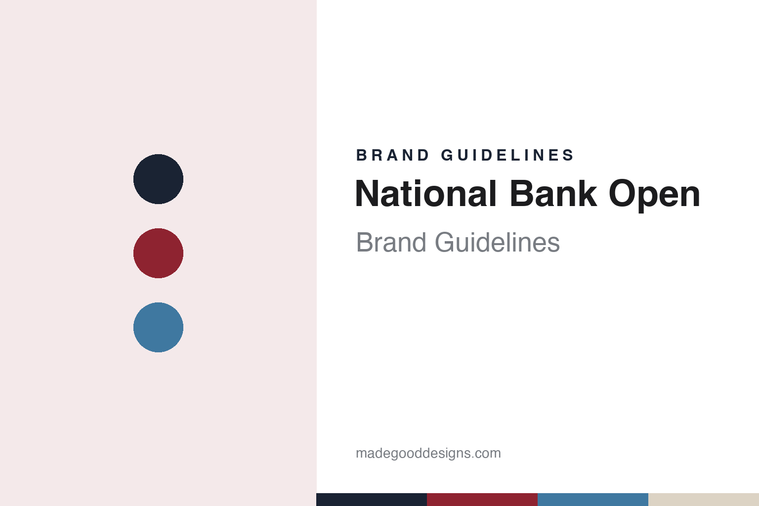
National Bank Open Brand Guidelines
Canada’s open, played in two cities under one name.
Aa
Two constants: a crimson, ink and court blue palette and a bilingual sans register. Abstract homage — not a National Bank Open asset; no logo, trophy or court graphic is reproduced.
The Canadian Open
An 1881 tournament run by a national federation.
The National Bank Open is the current name of the Canadian Open, the country’s top professional tennis tournament. The organisers date it to 1881, and in a 2026 article on their own site they describe it as the third-oldest active tournament after Wimbledon and the US Open. They also say it was played on clay until a switch to hard courts in 1979, and that it is now one of five ATP Masters 1000 events played on outdoor hard courts.
The tournament belongs to Tennis Canada. The federation’s own “About” page says it was founded in 1890, describes it as a non-profit national sport association, and says it owns and operates the National Bank Open presented by Rogers, both the WTA and the ATP events, as well as several other ATP- and ITF-sanctioned tournaments in Canada. Tennis Canada is a member of the International Tennis Federation and selects Canada’s Davis Cup and Billie Jean King Cup teams, the same page says.
What sets the event apart in its own presentation is geography. The organisers describe it as the only event on tour with two host cities, Montreal and Toronto, which alternate the men’s and women’s tournaments from year to year. In 2021 the men played in Toronto and the women in Montreal, CBC Sports reported; in 2025, The Globe and Mail reported, it was the same split; and in 2026, the organisers said, the men went to Montreal and the women to Toronto. The WTA’s tournament page, which lists the event as a WTA 1000 under its French name, Omnium Banque Nationale, puts it simply: the two cities alternate hosting years.
Colour
From the Rogers Cup to the National Bank Open.
The current name dates from 2 February 2021. That day Tennis Canada renamed its event, then called the Rogers Cup, as the National Bank Open after announcing a 10-year partnership with the bank, CBC Sports reported. CBC described the tournament as a Masters 1000 stop on the ATP Tour that runs concurrently with a WTA 1000 event, and said Rogers would continue as a presenting sponsor. National Bank had been a presenting sponsor of the Montreal event since 2005 and of the Toronto event since 2010, the same report said. The full event title used by the organisers is now “National Bank Open presented by Rogers.”
The bank and the tournament are separate subjects. National Bank of Canada, whose name sits on the event, has its own corporate identity, covered in our National Bank of Canada guide; this guide covers the tournament that carries its name.
The two venues are both run by Tennis Canada. In Toronto the event uses Sobeys Stadium, which the federation says sits on the York University campus in the north end of the city, spreads over 15 acres and serves as Centre Court for the National Bank Open; it also hosts concerts and other events outside tournament weeks. In Montreal the event uses IGA Stadium, which Tennis Canada also operates as a public court facility. The WTA gives the capacities as about 12,500 at Sobeys Stadium and 11,500 at IGA Stadium.
Both stadiums carry commercial names of their own, so the event shows several company names at once: one in the title, one as presenter and one on each stadium. The identity that holds those names together is the tournament name and the two-city calendar.
Typography
Tournaments and team competitions.
Professional tennis events present themselves through a small set of repeated elements: an event name, a logo, a trophy and a venue. Organisers publish these on their own websites, alongside pages on the event’s history, its past champions and the cities it has called home. Many tournaments have moved more than once, and their published histories often read as a list of venues and dates as much as a list of results.
Names change more often than places. A title sponsor’s name usually leads the event name, and when a partner changes, the name changes with it: the Miami tournament has carried the names of a tea company, a telecoms firm, a stock index and a bank since 1985, and the Indian Wells event has been named for an airline, a magazine, an insurer and a bank. Some events add a presenting partner after the main title rather than before it. Sanctioning bodies, such as the ATP, the WTA and the ITF, and the companies or federations that own each event are part of the record and are named here plainly.
Much of the visual identity sits on the site itself. Court colours are chosen for the event and sometimes explained by the surface supplier; signage around the court, scoreboards, branded balls and towels, and the uniforms of officials and ball kids carry the event and sponsor marks into broadcast pictures. Merchandise extends the same colours and logos to visitors.
This guide looks at those elements as organisers and independent sources describe them: names, owners, venues, sponsors and documented design choices. It leaves out results, scores and money, and treats each sponsor’s own identity as a separate subject.
Aa
A bilingual sans — set to read the same in English and French. (Specimen set in Libre Franklin, a sans STAND-IN; NOT the National Bank Open logo.)
Twelve days
A larger format from 2025.
The format changed in 2025. That July, The Globe and Mail reported on 25 July, the Montreal and Toronto events grew for the first time to 12 days, with 96-player singles draws instead of the previous 56, and 32 doubles teams instead of 28. Players got a day off between early-round matches, the quarter-finals, semi-finals and final moved to night sessions over the last four days, and the final was set for a Thursday rather than the old Sunday afternoon. The paper compared the new shape with other combined 1000 events such as Indian Wells and Madrid. The WTA’s tournament page gives the same draw figures, 96 singles players and 32 doubles teams.
The calendar position stayed the same. The Globe and Mail described the Canadian events as the first ATP and WTA 1000 tournaments of the North American hard-court summer, scheduled between Wimbledon and the US Open and followed directly by the Cincinnati Open. The organisers’ 2026 article adds that, for a year before the event, points Canadian players earn at domestic tournaments count towards a national race for main-draw places.
The public face of the event is bilingual and double. The organisers’ site carries a city switch for Montreal and Toronto at the top of every page, each city with its own dates and stadium, and offers a French version alongside the English; the WTA lists the women’s event under both names. Sponsors appear in layers, with National Bank in the title and Rogers as presenter. For signage, programmes and screen graphics, that means one tournament name repeated in two languages and two cities, with the sponsor names changing around it.
For a design guide, the National Bank Open shows how a long-running national championship keeps one identity across two cities, two languages and a chain of sponsor names. Compare the BNP Paribas Open, another combined event named after a bank, and the National Bank of Canada identity behind the title. For this guide we use a crimson, a night ink and a court blue with a sans, an unofficial interpretation; no product or logo is reproduced.
Explore & save
Keep National Bank Open’s identity on hand — save it to a board in the Made Good inspiration library.
National Bank Open identity set
Pin the National Bank Open crimson, ink and court blue palette and the bilingual sans register to your own board.
Source & notes
Frequently Asked Questions
What font can I use to match the National Bank Open look?
This guide describes National Bank Open’s type as “A bilingual sans — set to read the same in English and French”. Its type specimen is set in Libre Franklin from Google Fonts as a stand-in; Libre Franklin is not National Bank Open’s own lettering.
What colours are in the National Bank Open palette?
This guide’s National Bank Open palette is Maple crimson #8E2330, Night ink #1A2333, Hard-court blue #3F78A0, Summer sand #DCD3C4 and Chalk #F5F3EE. The tones are the guide’s own unofficial interpretation, not official National Bank Open hex codes.
Who owns National Bank Open?
National Bank Open is owned by Tennis Canada.