Otto Marseus van Schrieck painted thistles, poppies, toadstools, snails, lizards and snakes, and he painted them in the half-dark under the plants rather than in a vase on a table. The Metropolitan Museum of Art records him as Dutch, born in Nijmegen in 1619 or 1620 and died in Amsterdam in 1678. This guide looks at his work with a designer’s eye: how the compositions are built, what the palette does, and which habits are worth borrowing for posters, packaging and editorial layouts. For more cleared images from museum collections, browse the MGD museum inspiration collection.
Who was Otto Marseus van Schrieck?
The Met’s catalogue record gives his dates as 1619/20 to 1678 and names Nijmegen and Amsterdam as the places of his birth and death. Other reference works give an earlier birth year, around 1613, so the start of his life is stated with a range rather than a single date. His name also appears in older literature as Otto Marcelis, a spelling you will meet when searching archives and library catalogues.
Biographical summaries based on Arnold Houbraken’s 1718 collection of painters’ lives place him in Italy from about 1652 to 1657, in Rome and Florence, in the company of fellow Dutch artists including Matthias Withoos and Willem van Aelst. The same sources say he joined the Bentvueghels, the Dutch and Flemish artists’ society in Rome, and was nicknamed the snuffelaer, a word usually translated as “ferreter” or “sniffer-out”, because he was always poking about in gardens for detail. Ferdinando II de’ Medici, Grand Duke of Tuscany, is named in these accounts as a patron. After his return he settled in Amsterdam, where he died.
The sottobosco: a forest-floor still life
Art historians use the Italian word sottobosco, meaning undergrowth, for the kind of picture associated with him: a close view of plants, fungi and small animals at ground level, often with a tree trunk or a broken stone behind. The Met’s label for the poppy picture notes that, instead of flowers arranged in a vase, the painter sets his blooms in a natural setting touched with an element of menace. For a designer that names the trick: a flower piece moved outdoors and into shadow.
Houbraken’s life, as summarised in later biographies, says the painter kept snakes and lizards in a shed behind his house and on walled ground outside the city. Treat that as a period anecdote attributed to Houbraken, not a measured fact about his studio; what the pictures themselves show is reptiles, snails and insects drawn with close, specific detail.
What to look at in the Met’s poppy picture
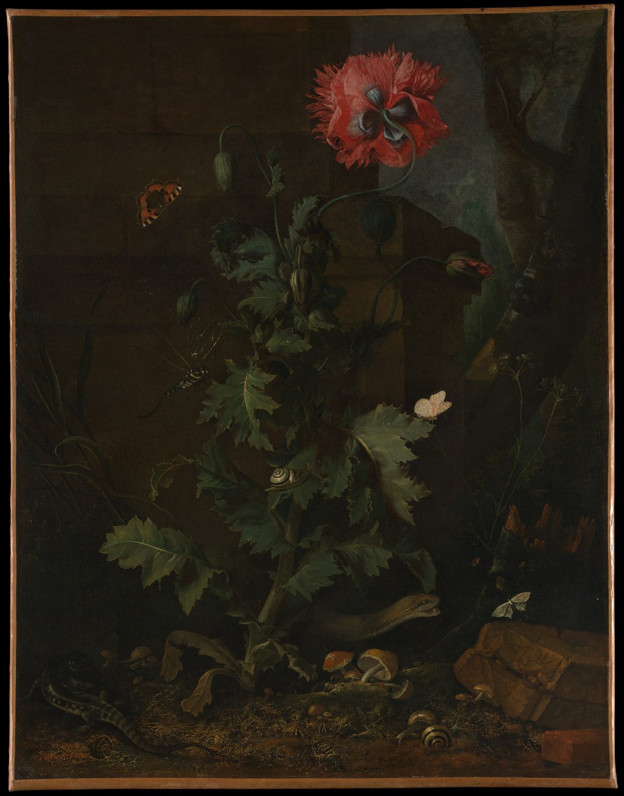
The Met dates Still Life with Poppy, Insects, and Reptiles to about 1670 and describes it as oil on canvas, 68.3 by 52.7 cm, Rogers Fund, 1953. Read it the way you would read a poster, from the main shape down to the small details.
Composition. The canvas is a tall portrait format, and the plant runs up the middle like a column. A single open poppy sits in the upper third, leaning right, with buds on curling stems that echo the curve. Below, the leaves step down the stem in a rough zigzag, and the animals sit at the intersections: a snail on a leaf near the middle, a pale moth on a leaf edge, a dragonfly at the left, a lizard and a snake at the foot. The eye travels down the plant in a slow S, which is a layout you can copy for a tall banner or a book jacket.
Light. The ground is almost black-brown, with a patch of grey-blue sky or masonry at the upper right that lifts the poppy’s edge. The brightest values are small and scattered: the poppy petals, two pale moths, the snail shell. Because they are small, they work like punctuation rather than like a spotlight.
Palette. Measured from the museum’s scan of this impression, the dominant colours are very dark browns and olives, around #191813, #221a10 and #302719, with a warmer ground brown near #513f28. The leaves sample as muted green near #32331e, and the poppy as deep red-brown near #5e2118 with a lighter pink-brown near #764539. These come from a photograph of an old varnished canvas, not the pigments as first applied, but the proportions are the lesson: a field of nearly neutral dark, one saturated accent, and a few pale highlights.
Signature. In the lower left corner the canvas carries a small signature in warm reddish paint, easy to miss against the dark ground. If you are placing a credit line or logo on a dark image, a small warm mark that matches an accent colour in the picture is a quiet way to do it.
Career outline and where to see him
- 1619/20 (the Met’s dating): born in Nijmegen; other sources give around 1613.
- About 1652 to 1657: in Rome and Florence, according to Houbraken-based summaries; member of the Bentvueghels.
- After 1657: settles in Amsterdam, according to the same summaries.
- About 1670: the Met’s dating for the poppy still life in New York.
- 1678: dies in Amsterdam.
The Met’s picture is the only image used here: it is the work the museum flags as public domain, and searches of the Art Institute of Chicago and Cleveland Museum of Art found no works by him. Other museums hold further paintings, so check each one’s rights statement before reusing an image. Reference works citing the Netherlands Institute for Art History (RKD) list later painters in his manner, among them Abraham Mignon and Rachel Ruysch, a useful trail for seeing how others softened the idea.
Technique: building detail on a dark ground
The Met’s record gives only oil on canvas, so claims about layering belong to technical studies. What you can see in the scan is a consistent method: a dark, quiet field for the background, then sharper touches for the things that should be found first. The edges of the leaves are crisp where light hits them and dissolve into the ground where it does not. Dew-like points of light sit on some leaves, and the snail shell carries a clean highlight.
Some accounts credit him with a way of transferring butterfly wing scales to the canvas. The Met’s record does not state this, so treat it as a story attached to the artist, not something you can verify from this picture.
How designers can borrow the idea today
- Dark ground, tiny accent. Start from a near-neutral dark (a brown-black rather than pure black) and add one saturated colour at a single focal point. It suits album covers, whisky or chocolate packaging, and hero banners for natural-history content.
- Small bright elements as wayfinding. Place two or three pale shapes along the path you want the eye to take, like the moths and the snail. In a UI they play the role of secondary calls to action.
- Menace in the margins. The snake at the bottom of the picture changes the mood of the whole poppy. A single unexpected element at the edge of a calm layout can do the same.
- Type. Pair the darkness with a classical serif in off-white. Free options such as EB Garamond or Cormorant Garamond from Google Fonts suit the period; check the font licensing guide before shipping.
To test a dark palette of your own, sample colours from a reference image with the image color picker and check contrast ratios before you commit to text over the darkest areas.
Where he sits among related guides
Marseus van Schrieck belongs to the wider Dutch Golden Age tradition of still life and natural observation. For a sibling study of insects and flowers from the same Netherlandish world, read the guide to Jan van Kessel the Elder, and for the broader background see the article on still life painting. Where many flower pieces show an arrangement made indoors, his pictures keep the dirt, the toadstools and the dark.
Frequently asked questions
Who was Otto Marseus van Schrieck?
A Dutch painter of forest-floor still lifes, recorded by the Met as born in Nijmegen in 1619 or 1620 and died in Amsterdam in 1678. Other reference works give an earlier birth year.
What is a sottobosco painting?
Sottobosco is the Italian word for undergrowth. The term is used for close views of plants, fungi, insects and reptiles on the forest floor, usually set against a dark background, as in his poppy picture at the Met.
Why is his work so dark?
The dark ground makes the small bright details stand out: the poppy, the moths and the snail shell. Some of the darkness in a museum scan also comes from age and varnish, so the colours in a photograph are not the pigments as first painted.
Can I use his paintings in my designs?
The Met flags its painting Still Life with Poppy, Insects, and Reptiles as public domain in its open-access data. Other museums set their own rights, so check each institution’s statement before using an image from another collection.