Smirnoff Brand Guidelines
A red label, a recipe number and an imperial eagle — Russian heritage, an emigrant’s spelling, a global No. 1.
Aa
Two constants: a bold red with silver, and a clean humanist sans. Abstract homage — not the Smirnoff label, No. 21 or eagle.
From Moscow to the world, via a spelling change
Smirnoff’s ‘ff’ ending is a small clue to a big story of revolution and exile.
Smirnoff’s red label is one of the most recognisable in spirits, and its details carry a genuine history. The label bears “No. 21” — the recipe number for the classic vodka — and a double-headed (imperial) eagle, a heritage device echoing the awards and warrants the original Russian house received. The brand was founded in 1864 in Moscow by Pyotr (Pierre) Smirnov, who built a vodka empire under the Tsars. Then came the 1917 Revolution: the family fled, and Pyotr’s son Vladimir relaunched the business in exile in Europe under the Anglicised spelling “Smirnoff” — so the double-f ending is literally the mark of emigration.
From there the brand travelled far from home: US rights passed from Vladimir to Rudolph Kunett (1933), then to Heublein (1939, for about $14,000), and eventually to today’s owner Diageo. Despite the Russian imperial heritage on the label, Smirnoff is not produced in Russia today. The identity keeps the story alive visually — red for strength and heritage, the eagle for imperial provenance, No. 21 for the recipe — while the product became the world’s best-selling vodka.
Colour
Smirnoff’s red is bold, confident and everywhere. Click a swatch to copy the hex.
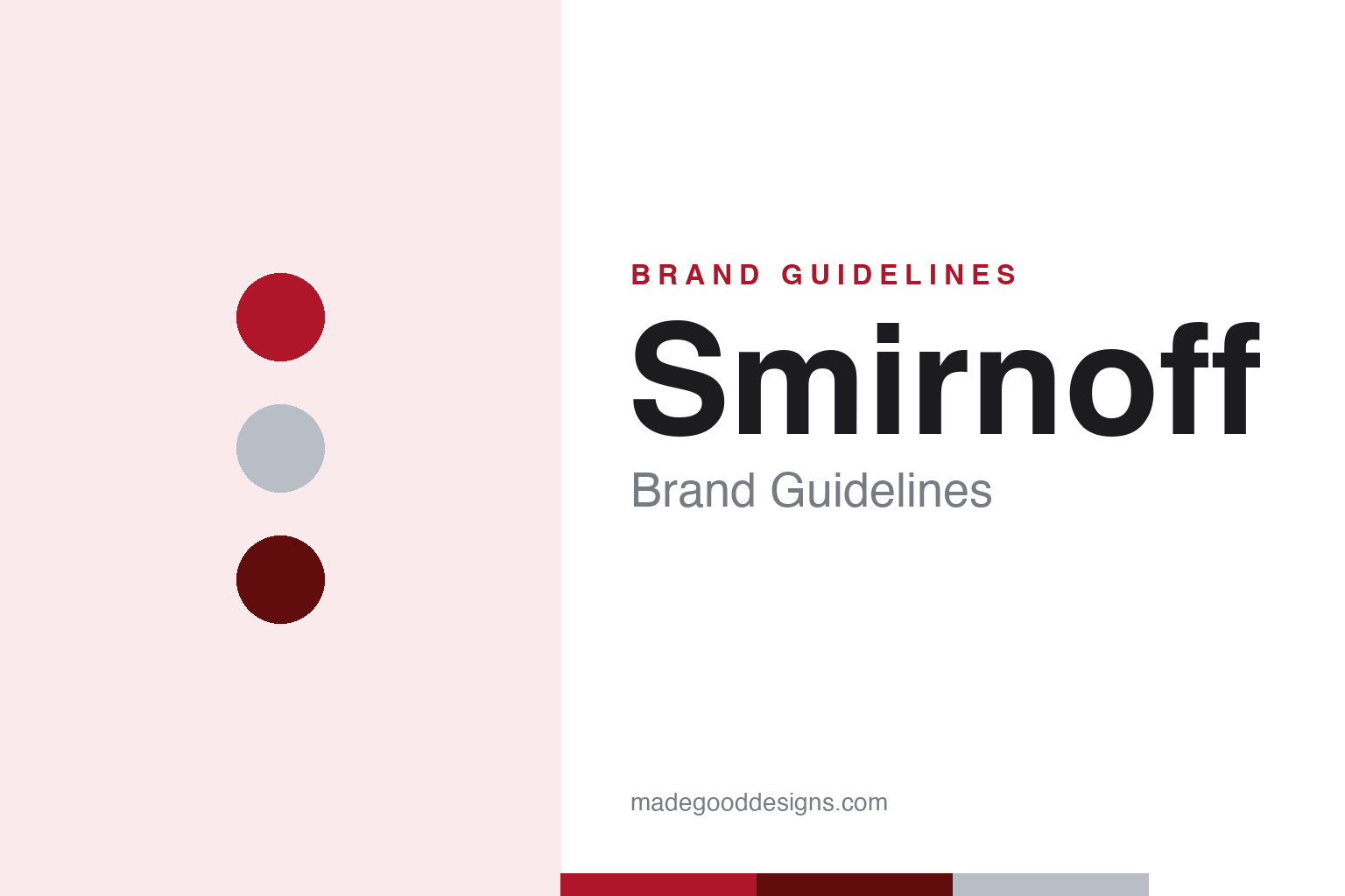
The scheme is “Smirnoff red” with white and silver — red for heritage and strength, silver for a cool, frosty purity. Smirnoff doesn’t publish an official brand-guideline hex, so treat any value (fan-cited around #AF162A, with a deeper maroon elsewhere) as approximate. Red is doing a lot of work on a shelf of clear bottles and neutral spirits: it’s bold, appetite-adjacent, impossible to miss, and instantly signals Smirnoff even at a distance — exactly what the world’s top-selling vodka needs.
The lesson is owning a bold colour in a category of clear glass. Vodka bottles are mostly transparent and interchangeable; a strong, consistent red label is one of the cheapest, most effective ways to stand out and be recognised. As with any bold hue, red is a label-and-brand colour rather than body text — keep it for the mark and packaging, let dark type carry the reading. Smirnoff’s red, held steady across a century and a global rollout, turned an emigrant’s vodka into a mass-market icon recognised almost everywhere. It is a reminder that on a shelf where every rival is clear glass and clear spirit, a single bold, unwavering colour can be the most valuable thing a brand owns.
Typography
The wordmark is a clean, custom sans — modern over the imperial heritage.
Smirnoff’s wordmark is a custom, humanist sans-serif — not a positively-identified retail font (recent packaging work involved Design Bridge for a more premium, contemporary typography). The clean, modern letterforms sit interestingly against the imperial-eagle heritage device: the type says “now,” the eagle and No. 21 say “since 1864.” It’s a smart tension — a mass-market global brand keeps its wordmark contemporary and legible while letting the heritage symbols carry the Russian-imperial story. Modern type, old provenance.
Aa 21
Clean, humanist, modern — over an imperial heritage. (Specimen set in Archivo, a grotesque in the spirit of the Smirnoff wordmark.)
The world’s best-selling vodka
Heritage on the label, ubiquity in the market.
Smirnoff’s brand runs on a productive contradiction: Russian imperial heritage (the eagle, “since 1864,” No. 21) attached to a thoroughly global, mass-market product sold in well over a hundred countries — Diageo’s top spirit and the world’s best-selling vodka. The heritage gives it romance and authenticity; the modern, red-and-silver packaging keeps it accessible and current. The product story — “triple distilled, ten times filtered,” traced to Pyotr Smirnov’s 19th-century charcoal-filtration methods — bridges the two, lending the everyday bottle a claim to craft.
For designers, Smirnoff is a lesson in keeping heritage as flavour, not a cage. The brand honours its origin visually (eagle, recipe number, founding date) without letting the look become dusty — the wordmark stays modern, the red stays bold, the whole thing reads as contemporary. The takeaway: a genuine backstory (even one as dramatic as revolution and exile) is a gift, but it works best applied lightly — a symbol here, a number there — over a clean, confident, present-day identity. Old story, new bottle, everywhere.
Explore & save
Keep Smirnoff’s identity on hand — save it to a board in the Made Good inspiration library.
Smirnoff identity set
Pin the red-and-silver palette and the type spirit to your own board.