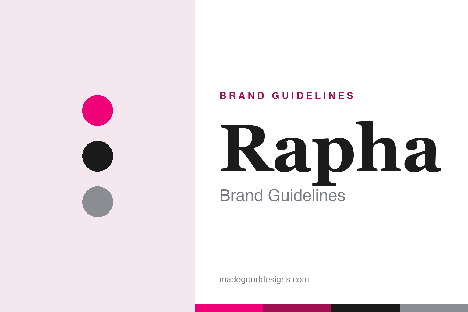
Rapha Brand Guidelines
A white sleeve band, a hot-pink accent and the romance of road racing — premium cycling, made a brand.
Aa
Two constants: a High-Vis Pink accent (over white and black) and an editorial serif. Abstract homage — not the Rapha wordmark or armband.
The armband
Rapha’s signature is a sleeve band — white, with a hot-pink accent.
Rapha built a premium brand on restraint. Its signature visual is a single stripe/armband on the left sleeve of its jerseys — a deliberate, minimalist mark that has been part of the identity since the 2004 launch, conceived as a reaction against the “loud kits plastered with gaudy logos” of pro cycling. An important nuance to get right: the iconic Classic Jersey armband is white (a ribbed, debossed band), while the hot “High-Vis Pink” is Rapha’s other signature — the brand-defining accent used on trim, logos and jerseys. The recognisable combination is white armband + High-Vis Pink accent, not simply a “pink armband.” That clean, premium look — pink, white and black — is the whole aesthetic. (Honest caveats: the wordmark is a bespoke hand-drawn script, so don’t name a retail font; and Rapha publishes no official public hex, so the pink here is an approximation.)
The name is a piece of cycling history. “Rapha” comes from the 1950s–60s French professional team Rapha, itself named after the Saint-Raphaël aperitif that sponsored it — the famous squad of the Jacques Anquetil era (Rapha–Géminiani, Rapha–Gitane). So the chain runs aperitif → legendary pro team → modern apparel brand, and it signals exactly the romance Rapha trades on: “glory and suffering,” the golden age of road racing. The brand was founded in London in 2004 by Simon Mottram and Luke Scheybeler (Mottram, an ex-Interbrand brand consultant, drew Scheybeler in to create the identity), debuting with a “Kings of Pain” exhibition celebrating riders like Coppi, Anquetil and Merckx.
Rapha is also a community brand. The Rapha Cycling Club (RCC), launched in 2015, is a paid membership club with rides and benefits, anchored by Clubhouses — café-and-retail spaces around the world. On ownership: in August 2017, RZC Investments — the vehicle of Steuart and Tom Walton, grandsons of Walmart founder Sam Walton — acquired a majority stake in Rapha, for a reported £200 million (a figure never officially confirmed). Simon Mottram stayed on as CEO until stepping down at the end of 2021, and RZC still owns the brand.
Colour
Rapha lives in High-Vis Pink. Click a swatch to copy the hex.
Rapha’s palette is High-Vis Pink, white and black — a bold, unmistakable accent over a clean, premium base. The hot pink is the brand-defining colour (on logos, trim and packaging), the white belongs to the classic sleeve armband, and black grounds the whole minimalist look. It’s a palette that manages to be both understated and instantly recognisable: restrained and premium in its base, punchy and ownable in its accent. That balance is exactly what set Rapha apart from the garish kits it was reacting against. The honest caveat: Rapha publishes no official public hex, so the pink here is an approximation of the signature High-Vis Pink rather than a confirmed brand value.
The lesson is a bold accent over a restrained base. Rapha’s clean white-and-black premium look, punctuated by one unmistakable hot pink, is a masterclass in standing out through restraint plus a single ownable colour. For designers, it’s a reminder that a minimalist identity with one bold, well-owned accent can be more distinctive than a busy, colourful one. The takeaways: build a clean, premium base (white, black) and add one ownable accent (High-Vis Pink); use restraint as a differentiator in a loud category; and treat the accent’s value as approximate when no official hex is published.
Typography
The wordmark is a bespoke script — with an editorial serif world around it.
Rapha’s wordmark is a bespoke hand-drawn script — originally drawn by co-founder Luke Scheybeler in 2004 and refined with type designer Nick Cooke, with a distinctive indent in the capital “R” and a signature-like quality inspired by 1950s commercial hand-lettering. That script gives the brand warmth and heritage, evoking the golden age of European road racing it romanticises. Around the logo, Rapha uses a considered, editorial type world (custom serif and sans faces, refreshed in a 2024–25 rebrand) that reinforces its premium, magazine-like tone. The overall effect is craft and romantic heritage, not corporate slickness — exactly right for a brand selling the “glory and suffering” of cycling. (The honest description is “a bespoke hand-drawn script,” not a named retail font.) The type behaves like the brand: crafted, editorial and quietly romantic.
Aa
A bespoke script, in an editorial serif world. (Specimen set in Fraunces, an editorial serif standing in for Rapha’s premium type world; the wordmark is a custom hand-drawn script.)
Selling the romance
Rapha turned the culture of road racing into a premium brand.
Rapha is a lesson in building a brand on culture and storytelling. Simon Mottram, a brand consultant by trade, saw that road cycling had a rich, romantic culture — “glory and suffering,” the golden-age champions, the suffering and beauty of the sport — that no apparel brand was expressing. Rapha turned that culture into a premium brand: minimalist, high-quality kit; a heritage-laden name (St Raphaël); editorial storytelling and photography; and a community (the RCC and its Clubhouses) that made customers feel part of a club. The clean design — a white armband, a hot-pink accent, a bespoke script — was the visual signature, but the real product was belonging to a romantic idea of cycling.
For designers and brand-builders, Rapha offers a clear takeaway: a brand can be built on culture, story and community, not just product. The lessons: express an under-served culture or emotion (the romance of road racing) that competitors ignore; use restraint and one bold accent to stand out in a loud category (white/black plus High-Vis Pink); and build community and belonging (the RCC, Clubhouses) as part of the brand. It’s also a reminder to keep the facts precise — the iconic sleeve armband is white and High-Vis Pink is the accent; the name comes from the St Raphaël team and aperitif; Rapha was founded in London in 2004 by Simon Mottram and Luke Scheybeler; and it was acquired by RZC Investments (the Walton heirs) in 2017. Rapha turned the culture of cycling into a premium brand — proof that story and community can be the real product.
Explore & save
Keep Rapha’s identity on hand — save it to a board in the Made Good inspiration library.
Rapha identity set
Pin the High-Vis-Pink palette and the script-and-serif spirit to your own board.