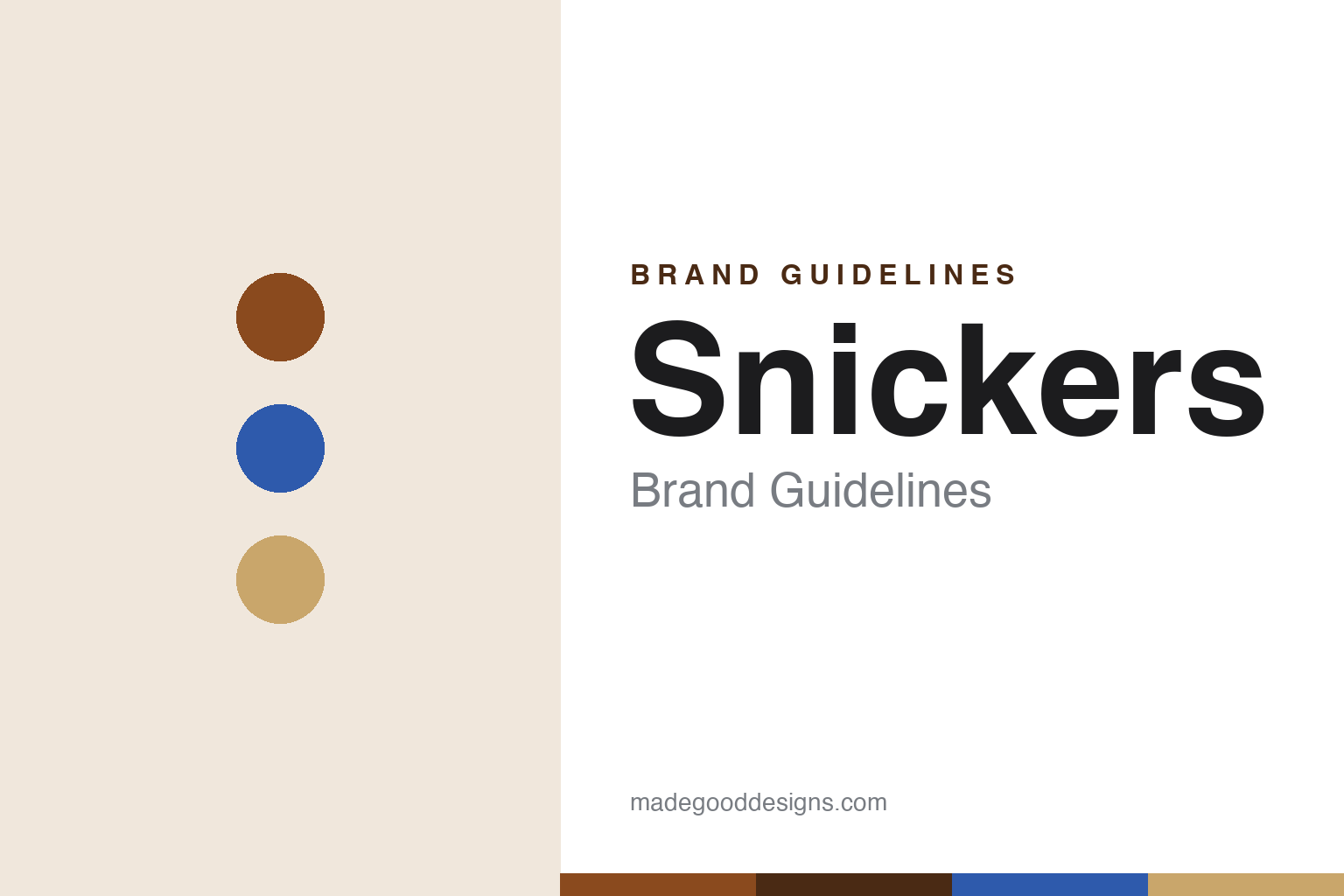
Snickers Brand Guidelines
A bar named after a racehorse, and a slogan that made hunger the whole story.
Aa
Two constants: a brown-and-blue palette and a bold condensed sans. Abstract homage — not the Snickers wordmark or bar.
Named after a horse
Snickers is named after the Mars family’s favourite racehorse.
Snickers carries one of candy’s most charming origin facts: it’s named after a horse. The Mars family bred Thoroughbreds at their Milky Way Farm in Tennessee, and their favourite, a horse called Snickers, died shortly before the bar’s launch — so the family named the new candy in its honour. The bar itself is a simple, brilliant combination: nougat topped with caramel and peanuts, all encased in milk chocolate. Introduced by Mars in 1930, it grew into one of the best-selling chocolate bars in the world. (Honest caveats: the classic wordmark is bold, slightly slanted custom lettering with no documented historic typeface, so don’t name a specific font; and no official brand hex is published — the palette is brown and blue.)
A fun quirk of the brand is that it hasn’t always been called Snickers everywhere. In Britain and Ireland it was sold as “Marathon” until 1990, when Mars renamed it Snickers to unify the brand globally. (A popular story says the different UK name was to avoid a rhyme with “knickers,” but that reasoning is anecdotal — treat it as a fun aside, not fact.) The renaming was part of a broader global standardisation of Mars brands.
Snickers’ modern identity was defined by one of the great ad campaigns: “You’re not you when you’re hungry,” launched in 2010 by BBDO New York, debuting with a Super Bowl spot starring an 88-year-old Betty White playing the “hungry” alter ego of a football player. The ad topped USA Today’s Ad Meter and drove roughly 16% global sales growth in its first year. The campaign — hunger turning you into someone else until a Snickers fixes it — became a flexible, endlessly-extendable platform. Snickers is a Mars, Incorporated brand (via Mars Wrigley), a private, family-owned American company, and in 2025–26 Mars even turned the wordmark into an official custom typeface, “Snickers Sans.” A bar named after a horse, defined by hunger.
Colour
Snickers lives in brown and blue. Click a swatch to copy the hex.
Snickers’ palette is chocolate brown and blue — the brown of the bar and the rich, appetising base, the blue as a bold, confident accent. The brown reads as chocolatey, satisfying and substantial (matching a hearty, hunger-fixing bar); the blue adds contrast and pops on packaging and in advertising. It’s a masculine-leaning, appetising, high-contrast scheme that suits Snickers’ positioning as a filling, satisfying bar rather than a delicate treat. The honest caveat: Mars publishes no official public brand hex for Snickers — the brown and blue here are approximations sampled from packaging rather than a confirmed spec.
The lesson is a palette that signals “satisfying”. Snickers’ chocolate-brown-and-blue reads as hearty and substantial, matching a bar sold on satisfying real hunger. For designers, it’s a reminder that colour can convey a product’s core benefit — here, appetising, filling satisfaction — with brown for chocolate substance and a bold accent for energy. The takeaways: match the palette to the product’s core promise (satisfying, hearty → chocolate brown); use a bold accent (blue) for contrast and energy; and treat specific hexes as approximate when no official spec is published.
Typography
The wordmark is a bold, condensed sans — hearty and confident.
Snickers’ bold, slightly slanted wordmark is hearty and confident — strong, chunky letters (classically italicised with thick strokes) that read as substantial and satisfying, matching a filling, hunger-fixing chocolate bar. The weight and slant give it energy and momentum, and its presence on a wrapper is unmistakable. There’s no daintiness here; the type is bold and grounded, exactly like the bar’s positioning. Notably, Mars took the wordmark’s DNA and, in 2025–26, built it into an official custom typeface, “Snickers Sans” (by Studio DRAMA with JKR) — a rare case of a candy wordmark becoming a full documented typeface. (For the historic mark, the honest description is “a bold, slanted sans,” not a named commercial font.) The type behaves like the brand: bold, hearty and satisfying.
Aa
A bold, slanted sans — hearty and confident. (Specimen set in Oswald, a condensed sans in the spirit of the Snickers wordmark; Mars’s official face is the bespoke “Snickers Sans.”)
Hunger as a platform
Snickers built a brand on a single, flexible insight.
Snickers is a lesson in building a brand on one flexible insight. “You’re not you when you’re hungry” is deceptively simple, but it’s an endlessly extendable idea: anyone, in any situation, can become a diva, a grump, or a wreck when hungry — until a Snickers sets them right. That single insight became a global platform that works across cultures, celebrities and scenarios, giving the brand a consistent yet fresh story for over a decade. It’s a masterclass in finding a human truth (hunger changes your behaviour) that connects the product to real life, and then expressing it flexibly forever.
For designers and brand-builders, Snickers offers a clear takeaway: a single human insight can be a flexible, long-lasting brand platform. The lessons: find a relatable human truth that links to your product (hunger changes you → eat a Snickers) and build a platform on it; keep the identity bold and consistent (the slanted wordmark, brown-and-blue) so the brand stays recognisable across endless creative executions; and let a strong insight, not a single ad, be the engine. It’s also a reminder to keep the facts precise — Snickers is named after the Mars family’s racehorse; it launched in 1930 and was sold as “Marathon” in the UK until 1990; “You’re not you when you’re hungry” launched in 2010 (BBDO, the Betty White Super Bowl ad); and it’s a Mars Wrigley brand. Snickers turned hunger into a platform — proof that one human insight can power a brand for years.
Explore & save
Keep Snickers’s identity on hand — save it to a board in the Made Good inspiration library.
Snickers identity set
Pin the brown-and-blue palette and the condensed-sans spirit to your own board.


