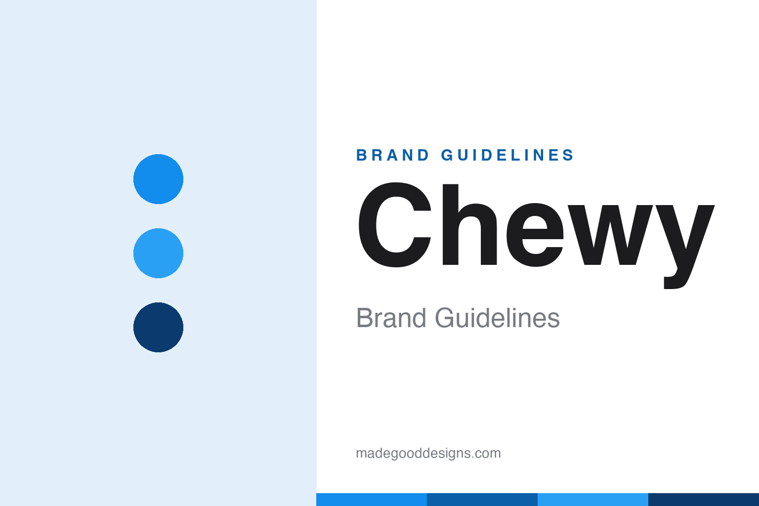
Chewy Brand Guidelines
A friendly blue pet retailer famous for hand-painted portraits and sympathy flowers — service as the brand.
Aa
Two constants: a friendly blue palette and a bubbly, rounded sans. Abstract homage — not the Chewy wordmark.
Service as the brand
Chewy turned customer care into its identity.
Chewy is a lesson in customer service as the entire brand. It was founded in 2011 by Ryan Cohen and Michael Day, originally as “Mr. Chewy,” an online pet-food and supplies retailer. Cohen — who later became famous as GameStop’s chairman — drove the growth, and after an earlier venture failed the pair bootstrapped their way into pet supplies, reaching roughly $2 billion in revenue and about half of US online pet-food sales by 2017. But the thing that made Chewy beloved wasn’t logistics; it was how it treated people and their pets. (Honest caveats: no official brand hex or wordmark typeface is published, so the colours and type here are approximate.)
Chewy’s emotional customer service is legendary and well-documented. The company sends hand-written holiday cards, surprises customers with unrequested hand-painted portraits of their pets, and — most famously — responds to pet loss with real humanity: when a customer’s pet dies, Chewy has sent flowers and a personally signed condolence note, issued refunds on unopened food, and suggested the customer donate it to a shelter. Those gestures, treated as founding-era doctrine rather than a marketing stunt, went viral (a 2022 tweet amplified them) and built extraordinary, word-of-mouth loyalty. Kindness, at scale.
On ownership, a big story: PetSmart acquired Chewy in April 2017 for about $3.35 billion — the largest e-commerce acquisition ever at the time — and Chewy continued to operate independently before IPO’ing in June 2019 (NYSE: CHWY). The identity matches the warmth: a lowercase, extra-bold, bubbly rounded blue wordmark, friendly and a little bouncy, that looks as approachable as the service feels. A pet retailer that competes on heart.
Colour
Chewy lives in a friendly blue. Click a swatch to copy the hex.
Chewy’s palette centres on a friendly, bright blue — approachable, trustworthy and warm — with white and navy support. The blue reads as dependable and caring (fitting for a brand people trust with their pets’ needs), while its brightness keeps it cheerful and modern rather than corporate. Paired with the bubbly wordmark, the blue makes Chewy feel warm, human and reliable — exactly the caring personality behind its famous service. It’s a simple, friendly, high-trust scheme. The honest caveat: Chewy publishes no official public brand hex — the blue here is an approximation (third-party readings vary from around #128CED to #1C49C2), not a confirmed spec.
The lesson is a warm, trustworthy blue. Chewy’s bright, friendly blue signals care and dependability — the right feeling for a brand built on service. For designers, it’s a reminder that a warm take on a trust colour can express both reliability and heart. The takeaways: choose a trustworthy primary and keep it warm and bright (friendly blue); pair it with soft, rounded type for approachability; and treat specific hexes as approximate when no official spec is published.
Typography
The wordmark is a bubbly, rounded sans — friendly and warm.
Chewy’s bubbly, rounded wordmark — the lowercase, extra-bold “chewy,” with its slight bounce — is friendly and warm. The plump, rounded, slightly wobbly letters feel approachable, playful and human, perfectly matching a pet brand famous for kindness and personal touches, and the lowercase treatment keeps it modest and welcoming rather than corporate. It’s the visual equivalent of the brand’s heartfelt service: soft, warm and easy to love. It reads as caring and fun — exactly the personality Chewy has built. (Because the wordmark is a custom, undocumented design — not the unrelated “Chewy” Google font — the honest description is “a bubbly, rounded sans,” not a named font.) The type behaves like the brand: friendly, warm and human.
Aa
A bubbly, rounded sans — friendly and warm. (Specimen set in Fredoka, a rounded sans in the spirit of the Chewy wordmark; the real lettering is custom and undocumented — not the unrelated Google “Chewy” font.)
Kindness as a moat
Chewy made caring its competitive advantage.
Chewy is a lesson in making genuine kindness a competitive advantage. In a commodity business — selling pet food and supplies online, where price and delivery are easy to match — Chewy differentiated on heart: hand-painted pet portraits, holiday cards, and profoundly human responses to pet loss. Those gestures can’t easily be copied because they require a real culture of care, and they created a moat of loyalty and word-of-mouth that ad spending alone never could. The friendly blue-and-bubbly identity is the visual promise of that warmth, but the brand is really built on how it makes people feel. Emotion, done sincerely, is defensible.
For designers and brand-builders, Chewy offers a clear takeaway: authentic, human customer care can be a brand’s strongest, most defensible asset. The lessons: differentiate on genuine emotional experience, not just price or speed (the portraits, the sympathy flowers); make the identity reflect that warmth (friendly blue, bubbly type); and treat care as culture, not a campaign, so it can’t be copied. It’s also a reminder to keep the facts precise — Chewy was founded in 2011 by Ryan Cohen and Michael Day as “Mr. Chewy,” was acquired by PetSmart in 2017 for about $3.35 billion (the largest e-commerce acquisition then), IPO’d in 2019 (NYSE: CHWY), and is famous for hand-painted pet portraits and sympathy responses to pet loss. Chewy made kindness a moat — proof that authentic care can be a brand’s deepest advantage.
Explore & save
Keep Chewy’s identity on hand — save it to a board in the Made Good inspiration library.
Chewy identity set
Pin the friendly-blue palette and the bubbly-sans spirit to your own board.


