Marimekko Brand Guidelines
Prints that make people happy — bold Finnish colour, the Unikko poppy, and a rule made to be broken.
Aa
Two constants: a bold poppy-red-and-pink palette and a friendly, rounded sans. Abstract homage — not the Marimekko wordmark.
Prints that make people happy
Marimekko printed joy.
Marimekko is a lesson in bold print as an identity. It was founded on 29 May 1951 in Helsinki, Finland by Armi Ratia and her husband Viljo Ratia (with dressmaker Riitta Immonen making the clothes for the debut show). It grew out of the Ratias’ oilcloth-printing company, Printex — Marimekko was created to show off Printex’s fabrics through simple garments. Armi Ratia was the visionary force and led the company until her death in 1979. (Two honest notes: no official brand hex is published, and the wordmark typeface is undocumented.)
Marimekko’s most famous asset is a print born from rebellion. The Unikko (“poppy”) print was designed by Maija Isola in 1964 — after Armi Ratia had declared Marimekko would never print florals (she felt no printed flower could beat a real one). Isola defiantly designed a whole series of florals anyway; Ratia then chose Unikko (and several others) for the collection. So the honest version is “designed in defiance, then embraced” — not snuck past her. Unikko became the brand’s signature and has been in production ever since. Another signature is the Jokapoika (“every boy”) striped shirt (1956), using the Piccolo stripe designed by Vuokko Nurmesniemi — Marimekko’s longest continuously-produced product.
Marimekko’s international breakthrough was a celebrity moment: Jacqueline Kennedy bought several Marimekko dresses during the 1960 US presidential campaign and was photographed in them (the exact number is reported as seven or eight). The design ethos is bold, large-scale, colourful abstract and floral prints on simple, unfussy garment shapes — “designs that make people happy.” The name itself is charming: “Marimekko” means “Mari’s dress” (mekko is Finnish for a dress; Mari derives from Maria, in Armi Ratia’s own name). Today Marimekko is a publicly listed Finnish company (Nasdaq Helsinki). Prints that make people happy.
Colour
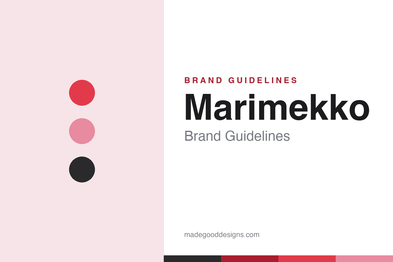
Marimekko lives in bold poppy red and pink. Click a swatch to copy the hex.
Marimekko’s identity is its bold, saturated palette — the signature poppy reds and pinks of Unikko, plus bright primaries, black and white, and joyful high-contrast combinations. The colour is fearless and large-scale — Marimekko’s prints are meant to be seen across a room — and it expresses the brand’s optimistic, happiness-making philosophy. Against simple garment and product shapes, the bold print and colour do all the talking. It’s a confident, joyful palette that defines the brand as much as any logo. The honest caveat: Marimekko publishes no official brand hex, so the poppy red, pink and black here are an original, unofficial interpretation, not first-party values.
The lesson is bold, saturated colour and print can be the whole identity. Marimekko’s poppy-red-and-pink world is instantly recognisable. For designers, it’s a reminder that fearless, large-scale colour and pattern can be a brand’s defining asset. The takeaways: use bold, saturated colour and print as identity; keep shapes simple so the pattern leads; and treat specific hexes as unofficial when the palette is a print language.
Typography
The wordmark is a friendly, rounded sans — understated against the print.
Marimekko’s identity carries a friendly, understated, confident spirit — a lowercase “marimekko” wordmark whose warm, rounded letterforms read as approachable and human, deliberately understated so the loud prints take the spotlight. A friendly rounded sans captures the mood: it’s the quiet counterpoint to the fearless colour, matching a brand whose products “make people happy.” Set against a bold poppy-red-and-pink palette, the type feels warm and human — exactly the joyful, print-first personality Marimekko cultivates. It’s friendly and rounded rather than loud, letting the pattern lead. Because the exact wordmark face isn’t publicly documented, the honest description is “a friendly rounded sans spirit,” not a named font. The type behaves like the brand: friendly, understated and confident.
Aa
A friendly rounded sans spirit — understated against the print. (Specimen set in Quicksand, a friendly rounded sans in the spirit of the Marimekko identity; the real face is undocumented.)
Print as the difference
Marimekko put print first.
Marimekko is a lesson in print and pattern as the core brand asset. While most fashion and homeware brands lead with silhouette, logo or trend, Marimekko led with print — bold, joyful, large-scale patterns like Unikko that are instantly recognisable and endlessly reusable across dresses, bags, textiles and homeware. That print-first identity is the whole differentiator: a Marimekko piece is known by its pattern, not its cut, and the patterns themselves (designed by real artists like Maija Isola) are the brand’s most valuable, ownable assets — timeless enough to stay in production for decades. The story reinforces it: Unikko exists because an artist defied a “no florals” rule, and the brand had the wisdom to embrace it. The lesson is that a distinctive, artist-led print language — bold enough to be recognised across a room and reusable across every product — can be a more durable brand asset than logo or silhouette, and that great brands sometimes come from embracing a rule-breaker. Let the pattern be the brand. Print joy, boldly.
For designers and brand-builders, Marimekko offers a clear takeaway: a bold, artist-led print language can be the core, durable brand asset. The lessons: make pattern the identity (Unikko, recognisable across a room); keep shapes simple so the print leads; and value your artists and the occasional rule-breaker. It’s also a reminder to keep the facts precise — Marimekko was founded in 1951 in Helsinki by Armi and Viljo Ratia, its Unikko poppy was designed by Maija Isola in 1964 (in defiance of a no-florals rule, then embraced), it broke through via Jackie Kennedy in 1960, and it’s a publicly listed Finnish company. Marimekko put print first — proof that pattern can be the difference.
Explore & save
Keep Marimekko’s identity on hand — save it to a board in the Made Good inspiration library.
Marimekko identity set
Pin the bold-print palette and the rounded-sans spirit to your own board.