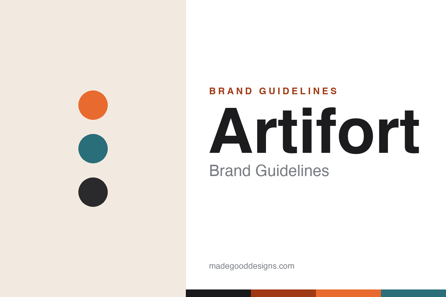
Artifort Brand Guidelines
Art plus comfort — sculptural, organic mid-century chairs, and Pierre Paulin’s Mushroom, Ribbon and Tongue.
Aa
Two constants: an orange-and-teal mid-century palette and a soft, rounded sans. Abstract homage — not the Artifort wordmark.
Art plus comfort
Artifort sculpted the chair.
Artifort is a lesson in sculptural, organic mid-century design. The company traces to 1890 in Maastricht, the Netherlands, founded by Jules Wagemans as an upholstery/furniture workshop. Its name has a lovely meaning: “Artifort,” adopted in 1928, is a contraction of “Art” and “Comfort.” (An honest note: the company dates to 1890, but the name to 1928 — and it’s Art + Comfort, not “art + fort/strong.” Two more notes: no official brand hex is published, and the wordmark typeface is undocumented.)
Artifort’s defining chapter is its work with the French designer Pierre Paulin (from 1958), whose organic, sculptural chairs became the brand’s icons: the Mushroom (F560, 1959–60), the Ribbon Chair (F582, 1966), the Tongue chair (1967–68), the Little Tulip and the Orange Slice. (A key, verifiable credit: it was Artifort’s art director Kho Liang Ie — from 1958 — who redesigned the identity and recruited Paulin, the hire that produced those icons.) Paulin’s Mushroom chair sits in MoMA’s permanent collection.
Artifort’s roster is deep: Theo Ruth (the Congo chair, 1950s), Geoffrey Harcourt (its extensive contract collection), René Holten and others. (An honest note: it works, or has worked, with many designers; a few attributions — like the Wink chair, most associated with Cassina — are best double-checked.) On ownership, a precise fact: Artifort is not independent — through Steelcase Strafor (1990) and Samas (1994), it became a brand of the Lande Family/Group (since 1998), based in the Netherlands. Art plus comfort.
Colour
Artifort lives in an orange-and-teal mid-century palette. Click a swatch to copy the hex.
Artifort’s identity leans on a warm, mid-century palette — the saturated oranges and reds that Paulin’s sculptural chairs are so famous for, teals and greens, and black. The tones read as playful, optimistic and of the 1960s — the colours of moulded-foam organic furniture and mid-century modern interiors — matching a brand whose icons are sinuous, upholstered, colour-forward chairs. The bold orange especially is inseparable from the Paulin/Artifort legacy. The honest caveat: Artifort publishes no official brand hex, so the orange, teal and black here are an original, unofficial interpretation of its famous product colours, not first-party values.
The lesson is a warm, mid-century palette signals organic, optimistic design. Artifort’s orange-and-teal world reads as playful and sculptural. For designers, it’s a reminder that saturated mid-century colour can convey warmth and optimism. The takeaways: use warm mid-century tones for organic design; let a signature colour (orange) lead; and treat specific hexes as unofficial when the palette is finish-based.
Typography
The wordmark is a soft rounded sans — organic and mid-century.
Artifort’s identity carries a soft, organic, mid-century spirit — the lowercase “artifort” wordmark whose clean, friendly letterforms read as warm, modern and approachable. A soft rounded sans captures the mood: it echoes the sinuous, sculptural curves of Paulin’s chairs, matching a brand whose whole identity is organic, comfortable, mid-century form. Set against an orange-and-teal palette, the type feels organic and mid-century — exactly the “art plus comfort” personality Artifort cultivates. It’s soft and rounded rather than sharp or austere, mirroring the curvy, upholstered furniture. Because the exact wordmark face isn’t publicly documented, the honest description is “a soft rounded sans spirit,” not a named font. The type behaves like the brand: soft, organic and mid-century.
Aa
A soft rounded sans spirit — organic and mid-century. (Specimen set in Varela Round, a soft rounded sans in the spirit of the Artifort identity; the real face is undocumented.)
Organic form as the difference
Artifort made comfort art.
Artifort is a lesson in fusing art and comfort through organic form. The brand literally named itself after its philosophy — Art + Comfort — and delivered on it by pioneering sinuous, sculptural, moulded-foam upholstered furniture that was both beautiful and genuinely comfortable. That fusion is the whole differentiator: Paulin’s Mushroom, Ribbon and Tongue chairs are art objects (they sit in MoMA) that you can actually sink into, dissolving the old trade-off between sculpture and seating. Crucially, Artifort’s model shows the value of a great art director: Kho Liang Ie’s decision to recruit Pierre Paulin is what produced the icons — the brand’s genius was as much curatorial (finding and empowering the right designer) as manufacturing. The lesson is that a clear philosophy (art + comfort), realised through a distinctive formal language (organic, sculptural, upholstered) and enabled by smart creative direction, can define a design brand and produce timeless icons. Make comfort beautiful, and beauty comfortable. Art you can sit in.
For designers and brand-builders, Artifort offers a clear takeaway: a clear philosophy plus smart creative direction can produce timeless icons. The lessons: name and live your philosophy (Art + Comfort); develop a distinctive formal language (organic, sculptural, moulded foam); and empower the right creative direction (Kho Liang Ie recruiting Paulin). It’s also a reminder to keep the facts precise — Artifort traces to 1890 in Maastricht, took its Art + Comfort name in 1928, is defined by Pierre Paulin’s chairs (via art director Kho Liang Ie), and is a Lande Group brand. Artifort made comfort art — proof that organic form can be the difference.
Explore & save
Keep Artifort’s identity on hand — save it to a board in the Made Good inspiration library.
Artifort identity set
Pin the mid-century palette and the rounded-sans spirit to your own board.