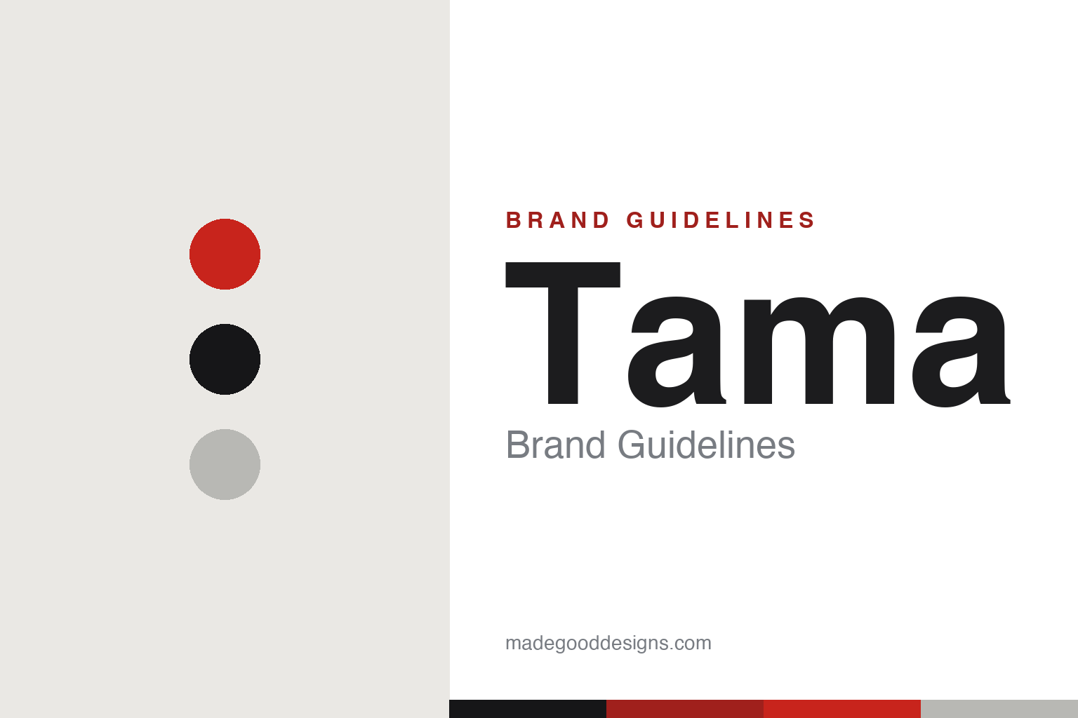
Tama Brand Guidelines
The jewel of the drum world — Hoshino’s hard-hitting brand, made for rock and metal.
Aa
Two constants: a bold red-and-black palette and a bold condensed display. Abstract homage — not the Tama wordmark or logo.
The jewel of the drum world
Tama hits hard.
Tama is a lesson in a hard-hitting brand with a hidden pedigree. Tama is made by Hoshino Gakki — the same Japanese company that makes Ibanez guitars. Hoshino began in 1908 as a bookstore (Hoshino Shoten) before moving into instruments; its drum subsidiary, Tama Seisakusho, opened in 1962, with early drums sold under the “Star” name. The “Tama” brand launched in 1974 as Hoshino pushed into high-quality drums. (Two honest notes: no official brand hex is published, and the wordmark typeface is undocumented.)
The name is lovely: Tama is named after the founder’s wife, Tama — and “tama” is also a homophone of the Japanese word for “jewel/gem” (玉). (An honest correction: it’s the founder’s wife, not mother, in the documented account.)
Tama built a reputation for rugged, hard-hitting drums beloved in rock and metal. Its icons include the Starclassic drums, the Iron Cobra bass-drum pedal, the SLP (“Sound Lab Project”) snares, and the invention of the Octobans (a set of tuned tubular drums). Famous players include Lars Ulrich (Metallica), Mike Portnoy and Bill Bruford. Hoshino Gakki is a private Japanese company headquartered in Nagoya (Tama’s professional drums are built in Seto, Aichi). The jewel of the drum world.
Colour
Tama lives in a bold red-and-black palette. Click a swatch to copy the hex.
Tama’s identity is bold, hard-hitting and rock — a strong red, deep black, and chrome hardware. The palette reads as powerful and energetic: the tones of a rock/metal drum brand, red and black with polished metal, exactly the aggressive, hard-hitting world Tama cultivates. It’s a high-impact world that signals power, energy and rock’n’roll. It’s a red-and-black palette that signals impact, energy and hard-hitting drums. The honest caveat: Tama publishes no official brand hex, so the red, black and chrome here are an original, unofficial interpretation of its identity, not first-party values.
The lesson is a red-and-black palette signals power and impact. Tama’s bold world reads as energetic and hard-hitting. For designers, it’s a reminder that red-and-black with metal is a classic language of power and rock energy. The takeaways: use red-and-black for impact and energy; add chrome for a hard, metallic edge; and treat specific hexes as unofficial when there’s no published spec.
Typography
The wordmark is a bold condensed display — impactful and strong.
Tama’s identity carries a bold, impactful, hard-hitting spirit — a strong “TAMA” wordmark whose condensed, upright letterforms read as powerful and energetic. A bold condensed display captures the mood: it’s big and forceful, matching a brand built for rock and metal drumming. Set against a red-and-black palette, the type feels impactful and strong — exactly the hard-hitting, rock’n’roll personality Tama carries from the Starclassic to the Iron Cobra. It’s bold and condensed rather than delicate or ornate, mirroring drums made to be hit hard. (Tama’s real logo is a trademark we describe but don’t reproduce.) Because the exact wordmark isn’t ours to use, the honest description is “a bold condensed spirit,” not the Tama logo. The type behaves like the brand: bold, impactful and strong.
Aa
A bold condensed spirit — impactful and strong. (Specimen set in Teko, a bold condensed display evoking a hard-hitting brand; NOT the Tama logo, which is a trademark.)
A hidden pedigree as the difference
Tama shares a parent with Ibanez.
Tama is a lesson in the strength of a shared, hidden pedigree. Its differentiator is partly cultural — a rugged, hard-hitting identity that made it the drum brand of choice for a generation of rock and metal players (Lars Ulrich chief among them) — and partly structural: Tama is made by Hoshino Gakki, the same company behind Ibanez guitars. That shared parentage means a deep base of Japanese instrument-manufacturing expertise, hardware innovation (the Iron Cobra pedal, the Octobans) and scale behind a brand that presents as pure rock attitude. The lesson is that a strong, focused brand personality (here, hard-hitting rock) can be powerfully reinforced by an unseen foundation of engineering and craft — the attitude sells it, the pedigree delivers it. Anyone can look tough; Tama has Hoshino’s decades of instrument-making behind the swagger. Pair attitude with real pedigree, and credibility becomes the brand. Hit hard, build well.
For designers and brand-builders, Tama offers a clear takeaway: a bold identity works best on a serious foundation. The lessons: commit to a clear personality (hard-hitting rock/metal); back it with real engineering and craft (Hoshino’s expertise, the Iron Cobra, Octobans); and keep the facts precise — Tama is made by Hoshino Gakki (which also makes Ibanez), the “Tama” brand launched in 1974, and the name honours the founder’s wife and means “jewel.” It’s also a reminder to keep it honest: it’s the founder’s wife (not mother), and no official brand hex or typeface is published, so the palette and type here are an interpretation. Tama shares a parent with Ibanez — proof that a hidden pedigree can be the difference.
Explore & save
Keep Tama’s identity on hand — save it to a board in the Made Good inspiration library.
Tama identity set
Pin the bold palette and the condensed-display spirit to your own board.


