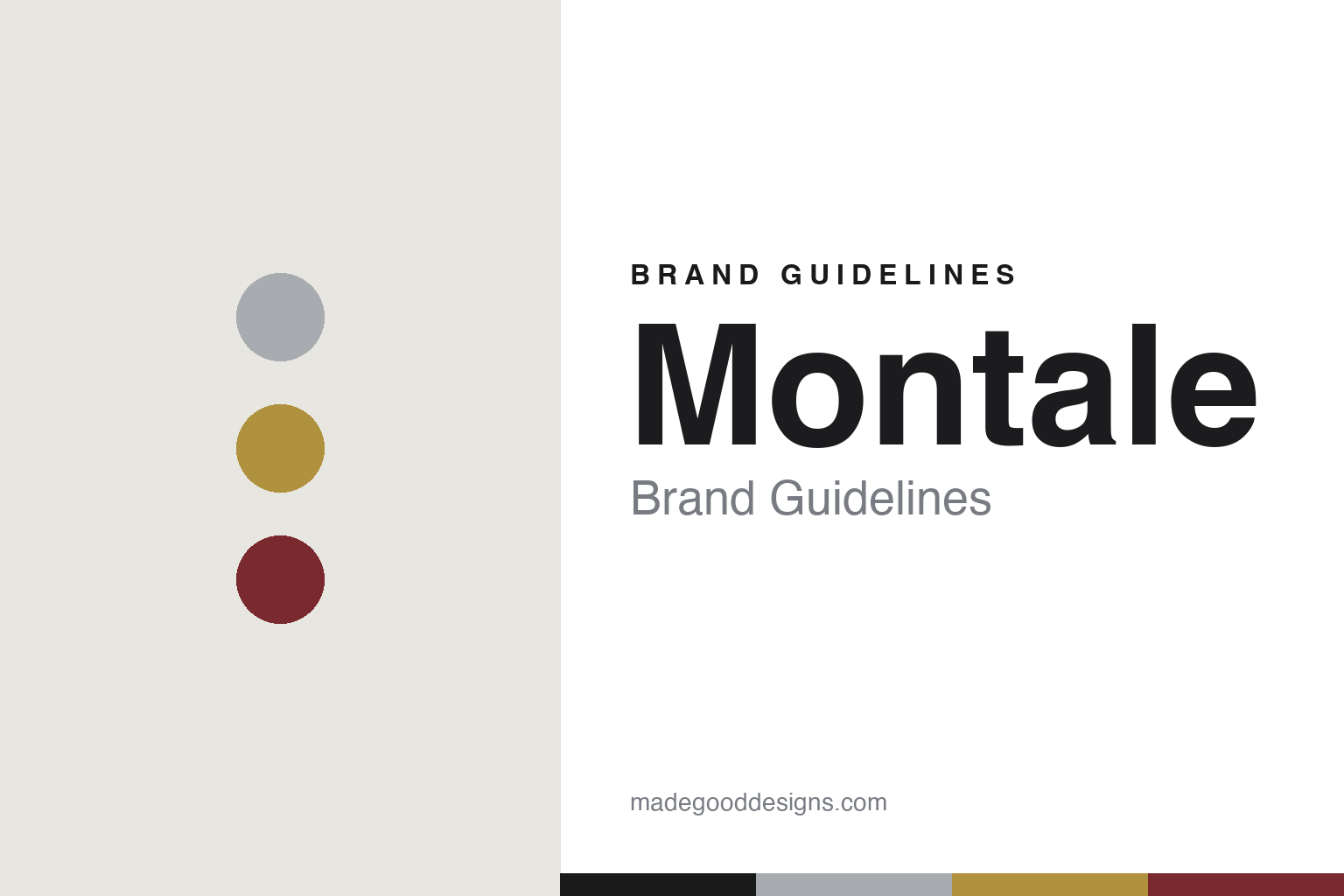
Montale Brand Guidelines
The oud, in metal.
Aa
Two constants: an aluminium-and-gold palette and a technical sans wordmark. Abstract homage — not the Montale cylinder or bottle.
The oud, in metal
Montale put its oud in an aluminium can.
Montale is a lesson in a bottle that is also a function. Founded in 2003 in Paris by Pierre Montale — a French perfumer who had made bespoke fragrances for Saudi royalty and became known as the “Ambassador of Oud” — it brought real, high-concentration oud into Western niche perfumery. Its blockbuster, Intense Café (2013), and classics like Black Aoud made it “the oud house.”
The signature is unmistakable: a plain, industrial aluminium cylinder bottle — one of the most instantly recognisable in perfumery. It isn’t just a look: the metal shields the oud-heavy juice from light, heat and oxygen, aiding maceration (a nod to the old Grasse tradition of storing precious concentrates in aluminium). Different fragrances arrive in different coloured aluminium tubes — black, silver, gold, red — with ornate gold lettering.
(Honest notes: Montale has been subject to a documented ownership/territorial dispute over its name (its Paris operation and a Middle-East party have operated the name in parallel), so we don’t assert a clean sale or retirement date; the Paris house is actively operating in 2026. Its sister house Mancera was founded by the same Pierre Montale (2008) — in glass, not aluminium. No official brand hex is published.)
Colour
Montale lives in aluminium and gold. Click a swatch to copy the hex.
Montale’s identity is industrial, metallic and warm — an aluminium, a black, a gold, a deep red, and a cream. The palette is raw aluminium and gold (with deep, oud-warm accents), a look that reads as function-first and industrial rather than delicate. Its “colour,” really, is a material — anodised aluminium in varied finishes. It signals a rugged, oud-forward, technical luxury. The honest caveat: with no published brand hex, these tones are an original, unofficial interpretation, not first-party values.
The lesson is a material can be the identity. Montale’s world is a metal cylinder. For designers, it is a reminder that a functional choice (aluminium to protect the juice) can become the most recognisable brand asset — the medium is the message, and varied metallic finishes keep a range legible. The takeaways: let a material and finish carry the identity; use gold detailing for warmth; and treat any single hex as unofficial — using graphite for small text so the metal reads clean.
Typography
The wordmark spirit is a technical sans — industrial and precise.
Montale’s identity carries an industrial, precise, technical spirit — gold lettering on a metal cylinder. A technical, slightly condensed sans captures the mood: it is functional and modern, the register of an engineered, oud-forward house. Set against aluminium and gold, the technical sans feels industrial and precise — exactly the metal-cylinder personality Montale carries. It is functional rather than ornate, mirroring an anodised can. (Montale’s real cylinder and lettering are trade dress we describe but do not reproduce, and the exact typeface is not published, so we don’t assert it.) Because the specific mark is not ours to use, the honest description is “a technical sans spirit,” not the Montale logo. The type behaves like the brand: industrial, precise and technical.
Aa
A technical sans spirit — industrial and precise. (Specimen set in Saira, a technical sans; NOT the Montale logo, which is a trademark.)
Function as the look
Montale stands for the aluminium tube.
Montale is a lesson in turning a functional choice into an icon. The aluminium cylinder began as a way to protect oud-heavy juice — and became the most recognisable bottle in niche perfumery, an industrial counterpoint to gilded flacons. The function is the design. The differentiator is a material-and-function-led signature.
For designers and brand-builders, Montale offers a clear takeaway: a functional decision can become your icon. The lessons: let a genuine function (protecting the product) shape the form; use one material and finish consistently; and add warmth with a single accent (gold). It is also a reminder to stay accurate: Montale’s name has a documented ownership dispute, and its sister house Mancera (glass) shares its DNA — with the palette here an unofficial interpretation. Montale put oud in aluminium — proof that function can be the difference.
Explore & save
Keep Montale’s identity on hand — save it to a board in the Made Good inspiration library.
Montale identity set
Pin the aluminium-and-gold palette and the technical-sans spirit to your own board.