Occhio Brand Guidelines
The light system.
Aa
Two constants: a steel-and-amber palette and a technical sans register. Abstract homage — not an Occhio fixture or wordmark.
The light system
Occhio designs a system of light, not a single lamp.
Occhio is a lesson in a system of light as the identity. A German house from Munich, it doesn’t design a single lamp so much as a system — a modular architecture of light with its own controls and light quality.
Its identity is the light system. Occhio’s modular fixtures — a shared head-and-body architecture, gesture and twist controls, tunable warmth — are the work it is known for. Light as a system. Engineering you operate by hand.
(Honest notes: Occhio is a German lighting house based in Munich, founded in 1999 by Axel Meise, who had run a Munich lighting store in the 1980s. Its signature is a system of light: a modular head-and-body architecture shared across the range, touchless gesture and twist controls, and tunable “colour tune” warmth with adjustable up and down light, from its first system in 1999 through later families the house is known for, including its ring light, sold through its own flagship stores. On production, the design press consistently describes it as developed and made in Germany, in Munich, though we couldn’t find an explicit own-factory statement, so we describe it as developed and made in Germany without over-claiming a single plant. On ownership, an honest note: while it is founder-led, an investment firm acquired roughly a forty-four per cent stake in 2018, so it is not one hundred per cent independent. And its co-developer, a physicist who helped create the system, is a design and technology partner, not a corporate co-founder. Its collection names, the modular system, the ring-light form and the gesture and colour-tune technology are IP we describe but don’t reproduce. There’s no official brand hex — these tones are an unofficial interpretation. This is design commentary and does not promote any product.)
Colour
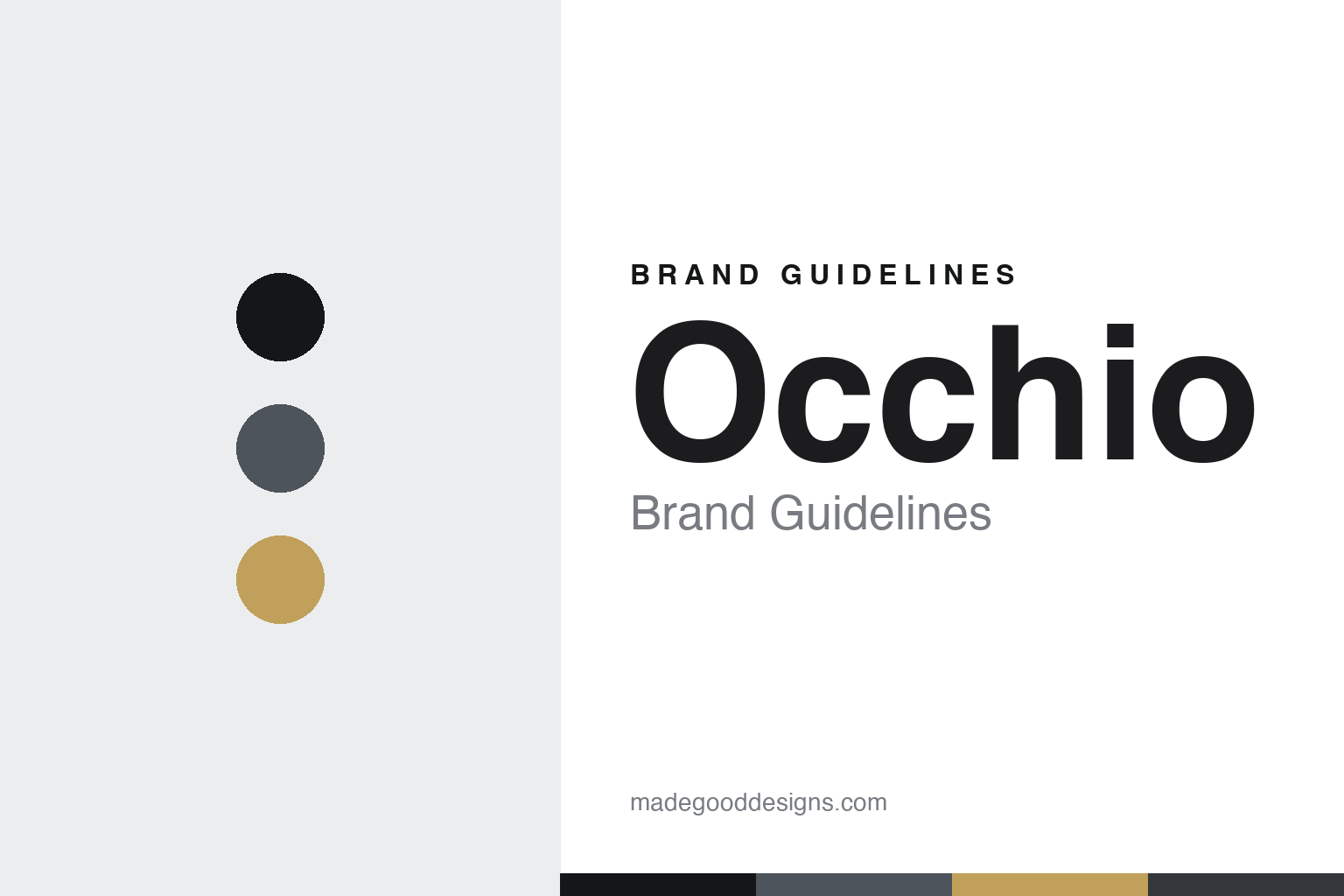
Occhio lives in a steel-and-amber palette. Click a swatch to copy the hex.
Occhio’s identity is technical, precise and warm — a steel, an ink, an amber, a graphite, and a chalk. The palette leans steel and amber — the register of engineered metal and the warm, tunable light it emits. It signals technology and quality rather than novelty. The honest caveat: with no published brand hex, these tones are an original, unofficial interpretation, not first-party values.
The lesson is a steel-and-amber palette signals a light system. Occhio’s world is a technical, precise, warm object. For designers, it is a reminder that a system — a shared architecture, its own controls and light quality — can be the whole identity, and that an engineered-metal-and-warm-light palette signals that precision. Because a mid steel can fail as small text, keep type dark and let the colour live in the accents, palette and band. The takeaways: design a system, not a lamp; control the light quality; own the experience; and treat any single hex as unofficial.
Typography
The register is a technical sans — precise, engineered, modern.
Occhio’s identity carries a precise, engineered, modern spirit — a systematic, warm object. A technical grotesque sans captures the mood: it is exact and current, the register of engineered design. Set in a steel-and-amber palette, the technical sans feels precise and engineered — exactly the personality Occhio carries. It is technical rather than decorative, mirroring a modular system. (Occhio’s real fixtures, its system and controls and the wordmark are works we describe but do not reproduce, and the exact typeface is not ours to use.) Because it is not ours to use, the honest description is “a technical sans spirit,” shown here in a stand-in. The type behaves like the brand: precise, engineered and modern.
Aa
A technical sans spirit — precise and engineered. (Specimen set in Space Grotesk, a technical grotesque sans STAND-IN; NOT the Occhio wordmark.)
A system of light as identity
Occhio stands for the light system.
Occhio is a lesson in making a system the identity. A steel-and-amber palette, a technical sans and a modular fixture make the light system the whole brand — technical, precise, warm. The system is the differentiator. The differentiator is designing an architecture rather than a lamp: a shared head-and-body structure, its own gesture and twist controls, and a tunable light quality that all the products share.
Put to work, the identity is the system as design. A designer or founder building in this spirit would design the platform first — the modules, the controls, the light itself — so every product is part of one coherent family, and would own the retail experience so the system is felt, not just bought. The lesson Occhio teaches is that a system and an experience can build a brand: a modular architecture, a signature way of controlling light, and a precise, engineered design language give it an identity that a single fixture never could. The system is the product, and the light quality is the promise.
For designers and brand-builders, Occhio offers a clear takeaway: design a system, not just an object. The lessons: build the platform; control the light quality; own the experience; and be honest about the story. It is also a reminder to stay accurate: it was founded in 1999 by Axel Meise, its co-developer is a design and technology partner rather than a corporate co-founder, and it is not fully independent since an investment firm took a stake in 2018 — the palette here is an unofficial interpretation. And it is a reminder to be careful about made-where: it is developed and made in Germany, which we state without over-claiming a single factory. Occhio made the light system the brand — proof that a system can be the difference.
Explore & save
Keep Occhio’s identity on hand — save it to a board in the Made Good inspiration library.
Occhio identity set
Pin the steel-and-amber palette and the technical-sans register to your own board.