Aston Martin Brand Guidelines
Spread wings, British racing green — and a name borrowed from a hill the founder liked to race up.
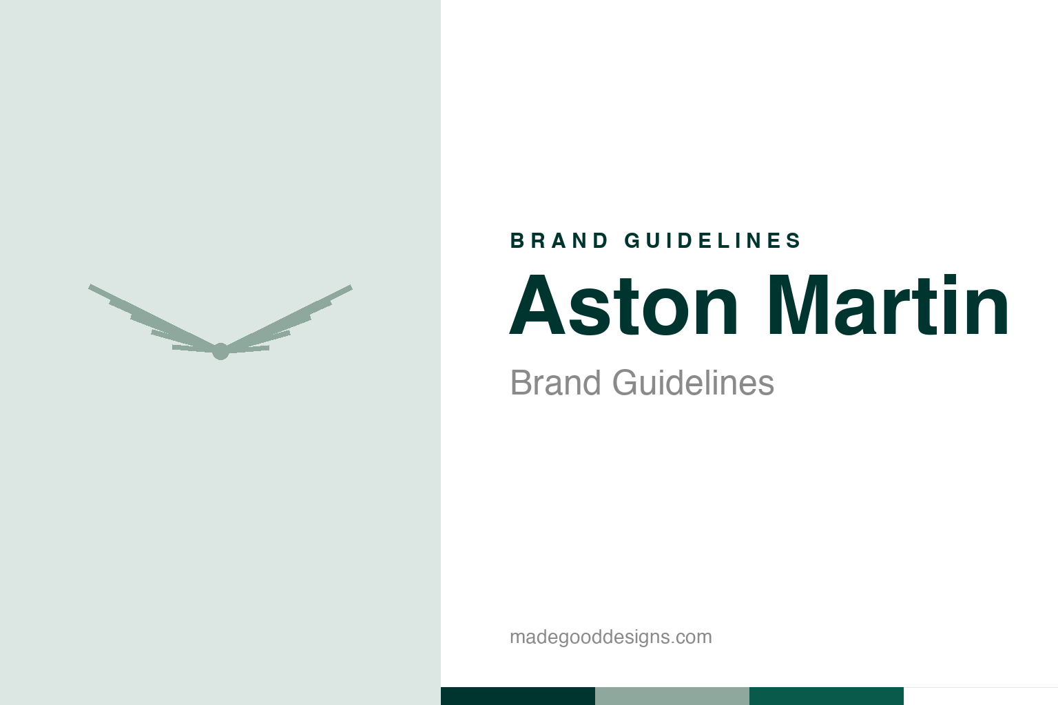
Abstract spread wings — the idea, not the Aston Martin badge. Deliberately not the Aston Martin mark.
Wings for speed
Aston Martin’s badge is built on flight.
Aston Martin’s emblem is a pair of elegant spread wings, usually with the “Aston Martin” name set across them. The wings first appeared around 1927 (an earlier logo used a simple circular “AM” monogram), and they symbolise exactly what you’d expect: speed, freedom and flight — the exhilarating sensation of fast, graceful motion. It’s a visual idea shared by other prestige makers (Bentley and Chrysler among them), because wings so neatly evoke the feeling of a beautiful, powerful car in motion. On Aston Martin, rendered with refinement and paired with British racing green, the wings feel graceful, sporting and quietly luxurious rather than aggressive — fitting for a marque known for beautiful, elegant grand tourers. Our homage nods to abstract spread wings.
Named after a hill
Aston Martin’s name has a charming origin.
The name has a lovely, specific origin. Aston Martin was founded in 1913 by Lionel Martin and Robert Bamford (originally as “Bamford & Martin”), and the “Aston” comes from Aston Hill — a hillclimb course (near the village of Aston Clinton in Buckinghamshire) where Lionel Martin enjoyed racing his cars. Combine the place he loved to race, Aston, with his own surname, Martin, and you get Aston Martin. (A small precision worth noting: the venue is “Aston Hill,” not an “Aston Clinton hillclimb” as it’s sometimes miswritten; the name was adopted in 1914 after Martin’s successful runs there.) It’s a wonderfully personal, sporting origin — the founder’s name plus the hill where he chased speed — and it roots the brand in genuine racing enthusiasm right from the start.
Elegant, sporting, British
Aston Martin’s identity is understated glamour.
Aston Martin occupies a distinctive niche: beautiful, elegant, understated British sports and grand-touring cars — fast and thrilling, but refined and glamorous rather than brash. Its identity reflects that perfectly. The graceful wings, the classic British racing green, the restrained and dignified presentation all signal sophistication, heritage and quiet sporting prestige. There’s also the incalculable brand association with James Bond — Aston Martin as 007’s car of choice cemented its image as the epitome of suave, cool, elegant Britishness. Where some performance brands shout, Aston Martin whispers: it’s the choice of someone who wants speed and beauty with taste and discretion. That blend of performance and elegance, glamour and restraint, is the heart of the brand — thrilling to drive, but always with impeccable style.
Emotion, heritage and taste
Aston Martin shows the power of graceful identity.
Aston Martin offers several lessons in building an elegant, emotionally resonant brand. First, the power of an evocative symbol: the wings instantly convey speed, freedom and grace — feelings central to the driving experience — giving the brand an emotional pull beyond mere specifications. A symbol that captures a feeling connects more deeply than one that merely labels. Second, the value of a rich, personal origin story: the name born from a founder’s surname and the hill he loved to race up gives the brand authentic character and heritage, a genuine tale of sporting passion.
Third, the strength of a clear, consistent positioning: Aston Martin knows exactly what it is — beautiful, elegant, understated British performance — and every element (the graceful wings, the racing green, the refined presentation, even the Bond association) reinforces that identity of glamour with restraint. It doesn’t try to be the loudest or the most extreme; it owns sophistication and taste. The takeaway is that a brand becomes compelling when it pairs an emotionally evocative symbol with an authentic heritage story and a clear, consistently-expressed character. Spread wings, British racing green, and a name from a founder and a hill: Aston Martin turned genuine sporting passion into an identity of effortless, understated glamour — fast and beautiful, always with impeccable taste.
What lingers, in the end, is how much a single well-made mark can carry. Aston Martin demonstrates that an identity is not just a label on a product but a compressed story — of values, of heritage, of a promise to the people who encounter it. When that story is clear and the symbol that tells it is distinctive and consistent, the brand gains something durable: instant recognition, and the trust that travels with it. The craft lies in choosing the right idea in the first place, then having the patience to let it slowly become iconic.
Type & the wordmark
An elegant, spaced wordmark.
Aston Martin sets its name in an elegant, spaced form across the wings. The specimen below stands in with a refined sans.
Power, beauty, soul
Elegant, spaced, refined — type as graceful as the wings. (Specimen set in Archivo, a neutral stand-in.)
Racing green
Classic British racing green. Click a swatch to copy the hex.
Aston Martin’s heritage colour is “Aston Martin Racing Green” #00352F (~PMS 3435 C), with silver and white. Lead with the green below.
Explore & save
Keep the wings idea on hand — save the homage and the racing green to a board.
Aston Martin identity set
Pin the wings homage, the racing green and the graceful-identity lesson to your own board.