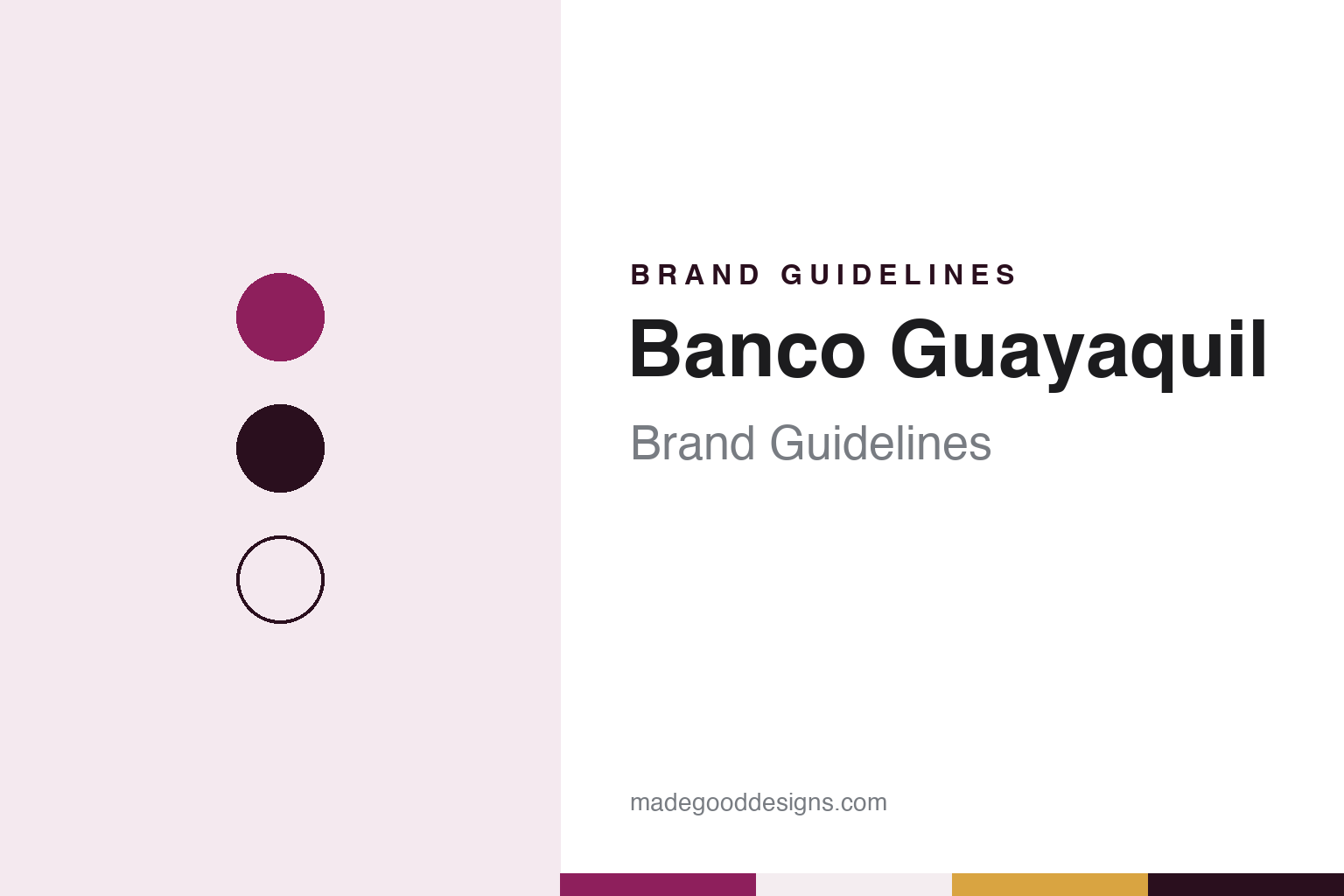
Banco Guayaquil Brand Guidelines
A 1923 Banco Italiano, Banco del Barrio and a 2014 rename.
Aa
Two constants: a deep magenta and plum palette and a rounded geometric sans register. Abstract homage — not a Banco Guayaquil asset; no logo, card or sign is reproduced.
Banco Italiano
An Italian bank on the Guayas, renamed in wartime.
Banco Guayaquil began life under another name. Spanish Wikipedia says it opened in Guayaquil, Ecuador’s port city on the Guayas river, in December 1923 as the Sociedad Anónima Banco Italiano, a foreign bank run with Italian capital and Italian managers. It traded under that name for almost two decades.
The Second World War changed it. When Italy joined the Axis, Spanish Wikipedia says, the bank’s statutes were reformed on 14 August 1941 and it was renamed Banco Nacional del Ecuador; a new public deed of 24 September 1941 then gave it the name Banco de Guayaquil, which it kept for more than seventy years. Spanish Wikipedia says Ecuadorian investors then began buying up all of its shares.
The modern bank took shape in the 1980s and 1990s. On 9 May 1984, according to Spanish Wikipedia, shareholders of the finance company Financiera del Sur, known as Finansur, bought a majority of Banco de Guayaquil, and the new management reorganised it into corporate, personal and investment banking plus a credit-card division branded Visa BG. The two companies merged on 9 August 1990, and the bank began to present itself as Ecuador’s “Multibanco,” a single organisation offering banking and financial services under one roof. In 1997 it merged with Banco Sociedad General.
Spanish Wikipedia adds that during Ecuador’s 1999 financial crisis Banco de Guayaquil was among the institutions that neither closed nor passed into a state rescue. The last change came on 12 June 2014, when a new image shortened the name to Banco Guayaquil, the form it uses today, with the slogan “Primero Tú” (“You first”).
Colour
Banco del Barrio and the shop-counter agent.
One of the bank’s signature projects is the Banco del Barrio, the “neighbourhood bank.” El Universo reported in January 2011 that the first one opened in Quito in May 2008, in the Comité del Pueblo district, followed by one in the south of Guayaquil. Each is a counter inside a business that is not a bank at all: a pharmacy, a grocery shop or a telephone booth, in city neighbourhoods and rural towns. The shopkeeper hosts a small terminal and handles deposits, withdrawals, balance checks, card payments, utility bills and phone top-ups for the bank’s customers.
By early 2011, the paper said, there were more than 2,500 of these points, handling about a million transactions a month between them, with utility payments in highest demand. That year the Inter-American Development Bank gave the project first place in the access-to-banking category of its beyondBanking awards, naming it the largest banking-inclusion project in Latin America for 2010, El Universo reported. The paper noted that the agent model took its data technology from Brazil, while the bank described the wider commercial concept as its own.
For a brand, the Banco del Barrio turns a corner shop into a signpost. A sticker, a sign and a terminal carry the bank’s name into streets that have no branch, which makes small-format signage, legible at a distance on a crowded shopfront, as important to the identity as the head-office tower. The same logic runs through its digital channels: at the 60th assembly of the Latin American banking federation Felaban in Lima, a Banco Guayaquil vice-president told the Peruvian agency Andina in November 2026 that about 88 percent of the bank’s transactions now run through digital channels, and described it as a centenary institution that operates only in Ecuador.
Sport is the other public face. El Universo reported in June 2025 that Banco Guayaquil had announced the end of its sponsorship of the Ecuadorian Football Federation, a partnership that began in 2013 and lasted twelve years; the bank said the contract period had run its course and both sides had agreed to close it, and marked the end with a song, “Cuando pienses en mí.” El Comercio has since carried the bank’s announcement that the Chelsea midfielder Moisés Caicedo is a brand ambassador, joining athletes in tennis, athletics, golf and surfing whom the bank supports.
Typography
Design and documentation.
Latin American banks tend to present themselves through bold wordmarks and a small set of strong colours. Blues, reds, greens and yellows recur across the region’s banking brands, usually paired with a short name or acronym that has to work on a branch front, a debit card and an app icon alike. Many names are Spanish and carry a place, a nation or a founding purpose in them, and slogans are written for a home audience first.
Photography does much of the work. Bank websites and reports in the region often show branches, city streets and customers rather than abstract imagery, and some banks make a landmark headquarters building part of their public face. Financial-inclusion programmes — accounts for people new to banking, credit for small businesses, scholarships — are a recurring theme, presented alongside the core pages on accounts, cards, loans, remittances and mobile apps.
Sponsorship is another constant. Football leagues, stadiums and clubs carry bank names in several countries, and banks also run cultural foundations, art collections and exhibitions that put the brand in a setting far from the branch counter.
The paper trail matters too. Listed banks and the subsidiaries of international groups publish annual reports and sustainability reports, and these, together with dated press coverage and public histories, are what this guide draws on. Each entry sets out who founded the bank, who owns it now and how its name has changed, and marks what rests only on the bank’s own word. The colours and typefaces shown here are unofficial interpretations, not the banks’ own specifications.
Aa
A rounded geometric sans for a city-named bank. (Specimen set in Plus Jakarta Sans, a sans STAND-IN; NOT the Banco Guayaquil logo.)
Banco Guayaquil
One port city, three names, one network of counters.
Read as a sequence, Banco Guayaquil’s names tell its story. Banco Italiano marked foreign capital in a trading port; Banco de Guayaquil, from 1941, tied the bank to its city; and the shorter Banco Guayaquil of 2014 dropped the preposition for a name that reads quickly on a phone screen or a shop sticker. The city stays in the title throughout, even as the bank works in Quito and rural towns and, it told Andina, serves Peruvian companies doing business in Ecuador.
The identity also has to work in very different places: a head office in Guayaquil, a neighbourhood pharmacy, a stadium sponsor board, a card and an app. Spanish Wikipedia lists the bank on the Guayaquil stock exchange, which adds annual reports and investor material to that range. A design system for a bank like this needs a mark that survives being printed small on a counter sign, a palette that stays recognisable on a shopfront, and type that reads clearly at the size of a terminal screen.
For a design guide, Banco Guayaquil shows how a city name, a network of shop-counter agents and long sports sponsorships can carry a bank identity further than its branches. Compare the Banco Pichincha brand guidelines from Quito and the BBVA brand guidelines for a bank group that also works across Latin America. For this guide we use a deep magenta, a dark plum, a soft shell pink and a warm gold accent with a rounded geometric sans, an unofficial interpretation; no product or logo is reproduced.
Explore & save
Keep Banco Guayaquil’s identity on hand — save it to a board in the Made Good inspiration library.
Banco Guayaquil identity set
Pin the Banco Guayaquil deep magenta and plum palette and the rounded geometric sans register to your own board.