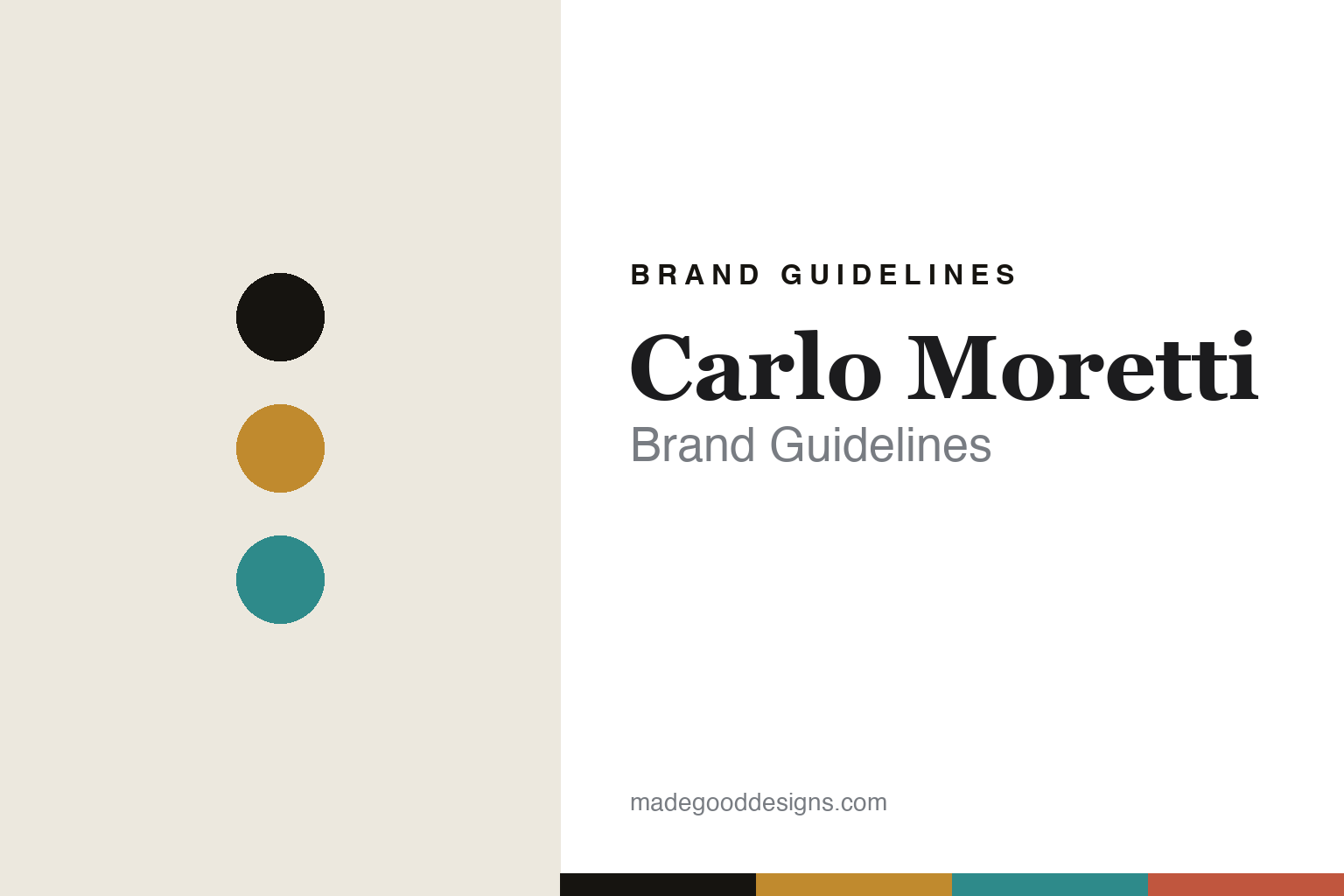
Carlo Moretti Brand Guidelines
The essential Murano.
Aa
Two constants: an amber-and-aqua palette and an essential serif register. Abstract homage — not the Carlo Moretti glass or packaging.
The essential Murano
Carlo Moretti makes Murano clean, essential and coloured.
Carlo Moretti is a lesson in restraint as identity. Founded in 1958 in Murano by brothers Carlo and Giovanni Moretti, it makes Murano glass in a deliberately modern, essential register — a counterpoint to the island’s ornate, figurative tradition.
Its identity is contemporary, essential coloured Murano glass. In the brand’s own words it pursues “clean and essential lines” and a “timeless style,” mouth-blown and hand-finished with the know-how of Murano’s master glassmakers, and its pieces are unique, numbered and signed. It is best known for sets of coloured tumblers such as I Diversi. Colour and clarity, stripped to essentials.
(Honest notes: 1958, the Moretti brothers and Murano are confirmed on the brand’s site; the “still family-run / entirely made in Murano” claim is strongly asserted but we phrase it as “made in Murano” rather than an absolute “100%.” We treat I Diversi as its signature line and hedge secondary line names we couldn’t verify. There’s no official brand hex, so these tones are an unofficial interpretation. This is design commentary and does not promote any product.)
Colour
Carlo Moretti lives in an amber-and-aqua palette. Click a swatch to copy the hex.
Carlo Moretti’s identity is essential, coloured and Italian — an amber, an ink, an aqua, a coral, and a cream. The palette pairs an amber with an aqua — the register of clean, coloured Murano. It signals clarity and colour rather than novelty. The honest caveat: with no published brand hex, these tones are an original, unofficial interpretation, not first-party values.
The lesson is an amber with an aqua signals an essential coloured-Murano house. Carlo Moretti’s world is a clean, colourful, hand-blown glass. For designers, it is a reminder that restraint — not ornament — can be a Murano identity. Because a mid amber can fail as small text, keep type dark and let the colour live in the accents, palette and band. The takeaways: strip to essential lines; keep the colour; honour the mouth-blown craft; and treat any single hex as unofficial.
Typography
The register is an essential serif — clean, quiet, Italian.
Carlo Moretti’s identity carries a clean, quiet, Italian spirit — an essential, coloured glass. A refined roman serif captures the mood: it is quiet and gallery-like, the register of restrained design. Set in an amber-and-aqua palette, the essential serif feels clean and Italian — exactly the personality Carlo Moretti carries. It is understated rather than ornate, mirroring essential Murano. (Carlo Moretti’s real glass and wordmark are works we describe but do not reproduce, and the exact typeface is not ours to use.) Because it is not ours to use, the honest description is “an essential serif spirit,” shown here in a stand-in. The type behaves like the brand: clean, quiet and Italian.
Aa
An essential serif spirit — clean and quiet. (Specimen set in Cormorant Garamond, a refined roman serif STAND-IN; NOT the Carlo Moretti packaging.)
Restraint as identity
Carlo Moretti stands for essential coloured Murano.
Carlo Moretti is a lesson in making restraint the identity. An amber-and-aqua palette, an essential serif and a clean, coloured glass make restraint the whole brand — clean, quiet, Italian. The restraint is the differentiator. The differentiator is essential, coloured Murano.
For designers and brand-builders, Carlo Moretti offers a clear takeaway: strip the ornament, keep the colour and the craft. The lessons: pursue essential lines; keep the colour; honour the mouth-blown Murano craft; and be honest about the story. It is also a reminder to stay accurate: it’s a 1958 Murano house founded by the Moretti brothers, “made in Murano” rather than a certified absolute, and the palette here is an unofficial interpretation. Carlo Moretti made restraint the brand — proof that essential colour can be the difference.
Explore & save
Keep Carlo Moretti’s identity on hand — save it to a board in the Made Good inspiration library.
Carlo Moretti identity set
Pin the amber-and-aqua palette and the essential-serif register to your own board.


