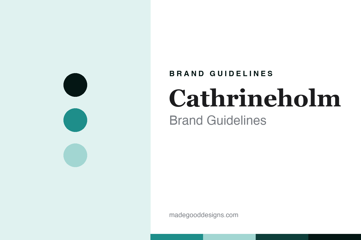
Cathrineholm Brand Guidelines
The historical Norwegian enamel icon.
Aa
Two constants: a Scandi-teal palette and a Scandi-heritage-serif register. Abstract homage — not a Cathrineholm product or mark; no vessel silhouette, no Lotus motif, and no logo is reproduced.
The historical Norwegian enamel icon
Cathrineholm is the historical Norwegian enamel maker behind mid-century Scandinavian design, no longer trading.
Cathrineholm closes the enamel round as its history — the Norwegian enamel works, in Halden, whose mid-century enamelled-steel holloware became one of the icons of Scandinavian design, and which no longer operates as a maker. Cathrineholm made enamel, in the past tense, and its answer to a round about the enamel object is memory — a mid-century Norwegian icon that lives on among collectors rather than on a shelf. A brand, historical.
Its identity is the historical Norwegian enamel icon. The mid-century design, the Norwegian works and the defunct status are the story here. A brand, historical. The historical Norwegian enamel icon.
(Honest notes, so the story stays precise, and the status stays honest. Cathrineholm was a Norwegian enamel works in Halden — the Cathrineholm mechanical works, foundry and enamel factory — that made enamelled-steel holloware, and we report its history rather than a current catalogue. On its status, the honest heart of this entry, it is no longer a trading maker: there is no active manufacturer, and its former web address now redirects to a collectors’ community, so we frame it as historical and do not imply it still trades. On its design, the reason it is remembered, its forms are associated with the designer Grete Prytz Kittelsen, and its most famous pattern was designed by Arne Clausen — a specific, credited, copyrighted design that we discuss as design history but do not reproduce as our own. On where it was made, the star theme of this round, it was made in Norway, historically. On who owns it, a theme of this round, it is a defunct maker whose trademark and reproduction rights status we could not verify, and the people associated with it are written of in the past tense. Its designs are IP we describe but do not reproduce; there is no official brand hex; these tones are an unofficial interpretation.)
Colour
Cathrineholm lives, in memory, in a Scandi teal. Click a swatch to copy the hex.
Cathrineholm’s identity is historical, designed and Norwegian — a Scandi teal, an ink, a pale aqua, a deep teal, and a paper. The palette leans Scandi teal and pale aqua: a mid-century Scandinavian register that nods to the era rather than to the brand’s famous pattern. It signals a historical icon without copying it. The honest caveat: with no published brand hex, these values are an original, unofficial interpretation, and pointedly not the brand’s copyrighted pattern or colourway.
The lesson is a Scandi teal signals a historical, designed identity. Cathrineholm’s world is a glazed, designed object of the past. For designers, it is a reminder that an era’s tone can honour a historical icon without reproducing a credited, copyrighted motif — the tone of mid-century Scandinavia, not one specific pattern. Because these tones can fail as small text, keep type dark and let the colour live in the accents, palette and band. The takeaways: honour the history; credit the designers; state the defunct status; and never reproduce the motif.
Typography
The register is a Scandi-heritage serif — historical, editorial, designed.
Cathrineholm’s identity carries a historical, editorial, designed spirit — a design-history subject, not a graphics label. A Scandi-heritage serif captures the mood: refined, elegant and confident, the register of a mid-century icon. Set in a Scandi-teal palette, the Scandi-heritage serif feels historical and designed — exactly the personality Cathrineholm carries in memory. It is a designed object rather than a logo, mirroring enamelled steel. (Cathrineholm’s real pieces, and its credited copyrighted pattern, are things we describe but do not reproduce, and the exact typeface is not ours to use.) Because it is not ours to use, the honest description is “a Scandi-heritage-serif icon,” shown here in a stand-in. The type behaves like the brand: historical, editorial and designed.
Aa
A Scandi-heritage-serif icon — historical and designed. (Specimen set in Cormorant Garamond, a Scandi-heritage-serif STAND-IN; NOT the Cathrineholm logo, the Lotus motif or any vessel.)
The enamel
Cathrineholm stands for the historical Norwegian enamel icon.
Cathrineholm closes the enamel round as its history. A Scandi-teal palette, a Scandi-heritage serif and a Halden works make one thing — the historical Norwegian enamel icon — the whole identity: historical, designed and Norwegian. The mid-century design is the pitch, and the defunct status is the honest ending. The point is a Norwegian icon that lives on among collectors rather than on a shelf, and the round’s single most iconic enamel design story.
Put to work, the identity is history told straight, as memory — with the status stated, the designers credited, and the motif untouched. A maker in this spirit would honour the history, credit the designers, and state the defunct status. A reader in this spirit would keep the facts right: Cathrineholm was a Norwegian enamel works in Halden that made enamelled-steel holloware; it is no longer a trading maker, its former web address redirecting to a collectors’ community, so it is framed as historical; its forms are associated with the designer Grete Prytz Kittelsen, and its most famous pattern was designed by Arne Clausen — a credited, copyrighted design discussed here but not reproduced; it was made in Norway, historically; and it is a defunct maker whose rights status is unverified, its associated people written of in the past tense. Cathrineholm closes the round’s where-made thread as its historical case, beyond the genuine foundries, the origin-undisclosed brands and the offshore Dansk. The honest editorial moves are to state the defunct status plainly, to credit Kittelsen and Clausen, to write in the past tense, and to describe the famous pattern without reproducing it.
For designers and brand-builders, Cathrineholm completes the enamel: honour the history — and never reproduce the motif. The lessons: let a design history be the subject while stating plainly that the maker no longer trades; credit named designers; discuss a credited, copyrighted motif as history without reproducing it as your own; write of the past in the past tense; and never reproduce a vessel or its pattern. It is also a reminder to stay precise: Cathrineholm is the historical Norwegian enamel maker behind mid-century Scandinavian design, no longer trading — with the palette here an unofficial, deliberately-different interpretation. Read that way, Cathrineholm is less a shelf than a memory: designed, Norwegian, historical. The lesson for a brand is that a design history and an honest status reinforce each other, and stating the defunct status keeps the story earned. Cathrineholm made the-historical-Norwegian-enamel-icon the identity — proof that a memory can close a round about the enamel object, its most iconic design story.
Explore & save
Keep Cathrineholm’s identity on hand — save it to a board in the Made Good inspiration library.
Cathrineholm identity set
Pin the Scandi-teal palette and the Scandi-heritage-serif register to your own board.


