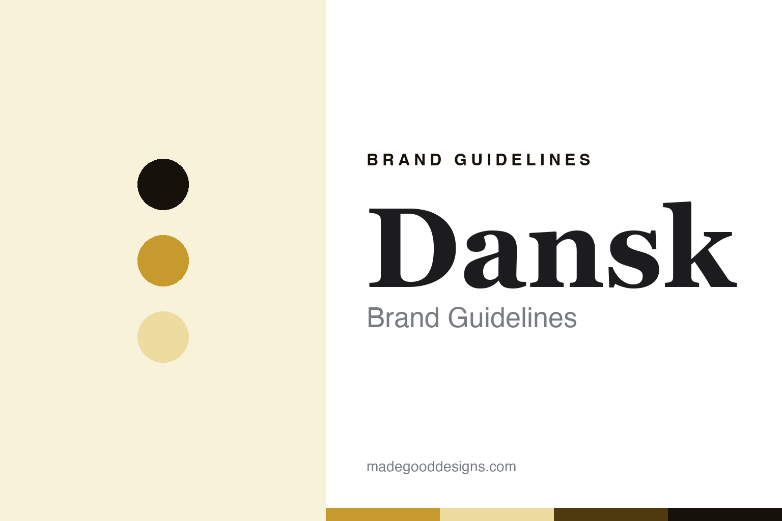
Dansk Brand Guidelines
Købenstyle, Quistgaard and an ownership collapse.
Aa
Two constants: a mustard-ochre palette and a mid-century-serif register. Abstract homage — not a Dansk product or mark; no Købenstyle silhouette or logo is reproduced.
Købenstyle, Quistgaard and an ownership collapse
Dansk is the Købenstyle enamelled-steel design icon by Jens Quistgaard, carried through a chain of owners to 2026.
Dansk brings the round its design icon — the American company, founded in 1954, whose Købenstyle enamelled-steel line, designed by Jens Quistgaard from 1955, is one of the most collected pieces of mid-century tableware, carried since through a long chain of owners to a 2026 buyer. Dansk makes enamelled steel among a wider range, and its answer to a round about the enamel object is design — a designed icon whose story is as much about who has owned it as how it is made. A brand, icon.
Its identity is Købenstyle, Quistgaard and an ownership collapse. The design icon, the offshore making and the chain of owners are the story here. A brand, icon. Købenstyle, Quistgaard and an ownership collapse.
(Honest notes, so the story stays precise, and the people stay in the right tense. Dansk, at dansk.com, makes the Købenstyle enamelled-steel line as its signature, alongside flatware and teak, and we report its performance language as the brand’s own marketing. It was founded in 1954 by Martha and Ted Nierenberg, in Great Neck, New York, and its chief designer for three decades was Jens Quistgaard, whose Købenstyle dates to 1955; the founders and Quistgaard have died, and are written of in the past tense. On where it is made, the star theme of this round, its modern pieces are made offshore, in countries including Thailand, Malaysia, the Philippines, China and India — an honest disclosure rather than a domestic claim. On who owns it, the theme that anchors this entry, its ownership has changed hands repeatedly: an acquisition in the mid-nineteen-eighties, then a drinks conglomerate in 1991, a tableware group in 2009, an online kitchen brand in 2021, and — after that owner’s bankruptcy — a design-portfolio company that acquired Dansk in 2026 for a reported sum around a quarter of a million dollars, planning archive reissues. Its designs — the Købenstyle silhouette — are Quistgaard IP we describe but do not reproduce; there is no official brand hex; these tones are an unofficial interpretation.)
Colour
Dansk lives in a mustard ochre. Click a swatch to copy the hex.
Dansk’s identity is icon, designed and owned — a mustard ochre, an ink, a pale wheat, a deep umber, and a paper. The palette leans mustard ochre and pale wheat: a warm, mid-century register that nods to a bright enamelled-steel surface rather than a loud logo colour. It signals a design icon. The honest caveat: with no published brand hex, these values are an original, unofficial interpretation, not first-party colours, and a general mid-century tone rather than a specific Købenstyle colourway.
The lesson is a mustard ochre signals an icon, designed identity. Dansk’s world is a glazed, designed object. For designers, it is a reminder that a mid-century tone can carry an enamel brand — the tone of an era, not a specific piece. Because these tones can fail as small text, keep type dark and let the colour live in the accents, palette and band. The takeaways: credit the designer; disclose the offshore making; trace the owners honestly; and treat any single hex as unofficial.
Typography
The register is a mid-century serif — icon, editorial, designed.
Dansk’s identity carries an icon, editorial, designed spirit — a mid-century design name, not a graphics label. A mid-century serif captures the mood: refined, warm and confident, the register of a designed icon. Set in a mustard-ochre palette, the mid-century serif feels icon and designed — exactly the personality Dansk carries. It is a designed object rather than a logo, mirroring enamelled steel. (Dansk’s real Købenstyle is Jens Quistgaard’s design, which we describe but do not reproduce, and the exact typeface is not ours to use.) Because it is not ours to use, the honest description is “a mid-century-serif icon,” shown here in a stand-in. The type behaves like the brand: icon, editorial and designed.
Aa
A mid-century-serif icon — icon and designed. (Specimen set in Playfair Display, a mid-century-serif STAND-IN; NOT the Dansk logo or the Købenstyle design.)
The enamel
Dansk stands for Købenstyle, Quistgaard and an ownership collapse.
Dansk brings the round its design icon. A mustard-ochre palette, a mid-century serif and a 1954 founding make one thing — Købenstyle, Quistgaard and an ownership collapse — the whole identity: icon, designed and owned. The design icon is the pitch, and the chain of owners is the story. The point is a designed icon whose tale is as much about who has held it as how it is made, in a round that tests where the enamel comes from.
Put to work, the identity is design told straight, as ownership — with the designer credited, the making disclosed, and the owners traced. A maker in this spirit would credit the designer, disclose the offshore making, and trace the owners honestly. A reader in this spirit would keep the facts right: Dansk makes the Købenstyle enamelled-steel line as its signature, with flatware and teak alongside; it was founded in 1954 by Martha and Ted Nierenberg in Great Neck, New York, with Jens Quistgaard its chief designer for three decades and Købenstyle dating to 1955; its modern pieces are made offshore, in countries including Thailand, Malaysia, the Philippines, China and India; and its ownership has passed through a mid-eighties acquisition, a drinks conglomerate in 1991, a tableware group in 2009, an online kitchen brand in 2021, and a design-portfolio company in 2026 after that owner’s bankruptcy, for a reported sum around a quarter of a million dollars. Dansk brings the round its design-icon and its offshore-honesty, and the most dramatic ownership story in the round. The honest editorial moves are to credit Quistgaard and the Nierenbergs in the past tense, to disclose the offshore making plainly, and to trace the chain of owners to the 2026 buyer.
For designers and brand-builders, Dansk continues the enamel: credit the designer — and trace the owners honestly. The lessons: let a designed icon be the brand while crediting the designer by name; disclose an offshore making rather than imply a domestic one; trace a chain of owners plainly, bankruptcy and all; describe a designed silhouette without reproducing it; and never reproduce a vessel. It is also a reminder to stay precise: Dansk is the Købenstyle enamelled-steel design icon by Jens Quistgaard, carried through a chain of owners to 2026 — with the palette here an unofficial interpretation. Read that way, Dansk is less a pot than an icon: designed, offshore-made, much-owned. The lesson for a brand is that a designed icon and an honest ownership trail reinforce each other, and disclosing the offshore making keeps the story earned. Dansk made Købenstyle-and-an-ownership-collapse the identity — proof that a design icon can carry a round, and its most-owned name.
Explore & save
Keep Dansk’s identity on hand — save it to a board in the Made Good inspiration library.
Dansk identity set
Pin the mustard-ochre palette and the mid-century-serif register to your own board.