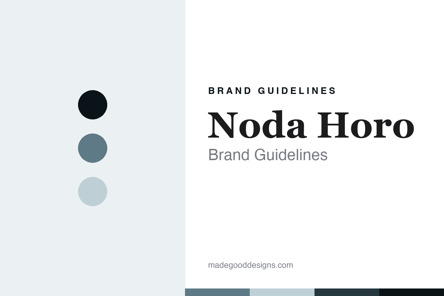
Noda Horo Brand Guidelines
The Japanese enamel foundry.
Aa
Two constants: a sumi-slate palette and an enamel-craft-serif register. Abstract homage — not a Noda Horo product or mark; no mug, plate or vessel silhouette or logo is reproduced.
The Japanese enamel foundry
Noda Horo is the Japanese enamel house that has made vitreous enamel in its own Tochigi foundry since 1934.
Noda Horo opens the enamel round as its purest maker — the Japanese house that, since 1934, has done one thing only: fuse vitreous enamel to steel, in its own foundry, with the white-glazed food-storage container as its signature. Noda Horo makes enamel and nothing but enamel, and its answer to a round about the enamel object is craft — a hand-finished enamel made in one Japanese foundry for ninety years. A brand, foundry.
Its identity is the Japanese enamel foundry. The single craft, the ninety-year devotion and the genuine Japanese making are the story here. A brand, foundry. The Japanese enamel foundry.
(Honest notes, so the story stays precise, and the making stays verified. Noda Horo, at nodahoro.com, makes vitreous-enamel kitchenware, with its white-series food-storage containers as heroes, alongside pots and kettles, and we report its performance language as the brand’s own marketing. It dates to 1934 and describes more than ninety years devoted solely to enamel-making. On where it is made, the star theme of this round, it is one of the round’s cleanest answers: it makes in its own foundry in Tochigi Prefecture, in Japan, hand-finished — a genuine heritage foundry rather than a badge. On who owns it, a theme of this round, it is an independent Japanese maker. Its designs are IP we describe but do not reproduce; there is no official brand hex; these tones are an unofficial interpretation.)
Colour
Noda Horo lives in a sumi slate. Click a swatch to copy the hex.
Noda Horo’s identity is foundry, made and quiet — a sumi slate, an ink, a pale mist, a deep slate, and a paper. The palette leans sumi slate and pale mist: a quiet, glazed register that nods to a white enamel surface and a soft rim rather than a loud logo colour. It signals a Japanese enamel foundry. The honest caveat: with no published brand hex, these values are an original, unofficial interpretation, not first-party colours.
The lesson is a sumi slate signals a foundry, made identity. Noda Horo’s world is a glazed, fired object. For designers, it is a reminder that a sumi slate and a soft pale mist can carry an enamel brand — the tone of a fired white surface. Because these tones can fail as small text, keep type dark and let the colour live in the accents, palette and band. The takeaways: fuse the enamel; make it in one foundry; keep it quiet; and treat any single hex as unofficial.
Typography
The register is an enamel-craft serif — foundry, editorial, quiet.
Noda Horo’s identity carries a foundry, editorial, quiet spirit — a single-craft maker, not a graphics label. An enamel-craft serif captures the mood: refined, calm and confident, the register of a hand-finished enamel. Set in a sumi-slate palette, the enamel-craft serif feels foundry and quiet — exactly the personality Noda Horo carries. It is a glazed object rather than a logo, mirroring vitreous enamel fused to steel. (Noda Horo’s real pieces are things we describe but do not reproduce, and the exact typeface is not ours to use.) Because it is not ours to use, the honest description is “an enamel-craft-serif foundry,” shown here in a stand-in. The type behaves like the brand: foundry, editorial and quiet.
Aa
An enamel-craft-serif foundry — foundry and quiet. (Specimen set in EB Garamond, an enamel-craft-serif STAND-IN; NOT the Noda Horo logo or any vessel.)
The enamel
Noda Horo stands for the Japanese enamel foundry.
Noda Horo opens the enamel round as its purest maker. A sumi-slate palette, an enamel-craft serif and a Tochigi foundry make one thing — the Japanese enamel foundry — the whole identity: foundry, made and quiet. The single craft is the pitch, and the genuine Japanese making is the proof. The point is a hand-finished enamel made in one foundry for ninety years, the round’s cleanest where-made answer.
Put to work, the identity is craft told straight, as making — with the foundry named and the devotion single. A maker in this spirit would fuse the enamel, make it in one foundry, and keep it quiet. A reader in this spirit would keep the facts right: Noda Horo makes vitreous-enamel kitchenware, its white-series food-storage containers the heroes, with pots and kettles alongside; it dates to 1934 and describes more than ninety years devoted solely to enamel; it makes in its own foundry in Tochigi Prefecture, in Japan, hand-finished; and it is an independent Japanese maker. Noda Horo anchors the round’s where-made thread on the genuine-heritage-foundry side with Emalco and Kockums, against the origin-undisclosed Falcon and Crow Canyon, the offshore Dansk and the historical Cathrineholm. The honest editorial moves are to date it to 1934, to say it makes in Tochigi, to note the single craft, and to describe it as independent.
For designers and brand-builders, Noda Horo opens the enamel: fuse the enamel — and make it in one foundry. The lessons: let a single craft be the whole brand; state a genuine where-made plainly, foundry and prefecture; let ninety years of devotion be the story; and never reproduce a vessel. It is also a reminder to stay precise: Noda Horo is the Japanese enamel house that has made vitreous enamel in its own Tochigi foundry since 1934 — with the palette here an unofficial interpretation. Read that way, Noda Horo is less a mug than a foundry: fired, Japanese, quiet. The lesson for a brand is that a single craft and a genuine foundry reinforce each other, and naming Tochigi keeps the story earned. Noda Horo made the-Japanese-enamel-foundry the identity — proof that one craft can open a round, its cleanest maker.
Explore & save
Keep Noda Horo’s identity on hand — save it to a board in the Made Good inspiration library.
Noda Horo identity set
Pin the sumi-slate palette and the enamel-craft-serif register to your own board.