Cbus Brand Guidelines
The building-industry super fund that says it started onsite.
Aa
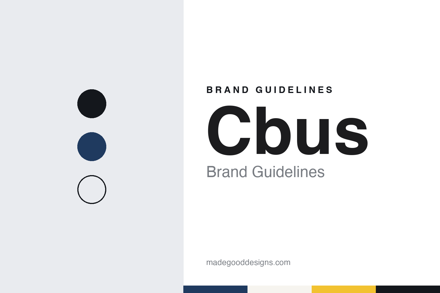
Two constants: a site navy, hi-vis yellow and concrete palette and a worksite sans register. Abstract homage — not a Cbus asset or mark; no logo, sticker or campaign image is reproduced.
Built onsite
A union fund for the building trades.
Cbus is short for Construction and Building Unions Superannuation, an Australian industry super fund. English Wikipedia says it was set up in 1984 by the Building Workers’ Industrial Union of Australia as a retirement savings vehicle for workers in construction and allied industries, and that Mavis Robertson oversaw its creation. It adds that some 30,000 members signed up in the first six months, with employers paying a small weekly contribution into each worker’s account.
The fund tells that story in its own words. Its “Who we are” page says Cbus “didn’t start in a boardroom. We started onsite,” when workers decided retirement should not be a luxury, and it quotes a long-time member recalling that persuading workers about super at first “was tough.” Those lines are the fund’s own account of its origins.
The trustee is United Super Pty Ltd, and the fund itself is formally the Construction and Building Unions Superannuation Fund; the Australian Business Register lists Melbourne as the trustee’s main business location. English Wikipedia says the directors are appointed in equal numbers from member and employer associations in the construction and building industries, with two independent directors. The fund’s website lists its sponsoring organisations, drawn from unions and employer groups, including the ACTU, the AMWU, the CFMEU and Master Builders.
Although the fund grew from one industry, it is no longer closed to outsiders. English Wikipedia describes Cbus as a public offer fund open to all members of the public, and says that, as a mutual structure, it keeps its profits for members; the fund’s own pages say “all our profits go to our members, not shareholders” and that it now has members “from across all industries.”
Colour
Hard hats, stickers and a capitalised name.
Cbus has long leaned on the worksite as its visual and verbal shorthand. The fund says that for many members “their CBUS is as important a part of their working life as their hard hats and boots,” and that its stickers and banners are displayed at worksites across Australia. That is the fund’s self-description.
The name itself has shifted in style. On its 2026 website and in its 2026 advertising the fund sets its name in capitals, CBUS, and pairs it with “Super” as CBUS Super, while English Wikipedia and the ABC write Cbus; this guide keeps the Cbus spelling in running text. The fund says it had more than 935,000 members as of 30 June 2026.
The most visible recent change is the campaign. Campaign Brief reported in February 2026 that the fund launched a brand campaign, “Build your something,” on 1 February 2026, created by the agency Shannon Behaviour Change, with media handled by Initiative. The magazine said the platform shifts the brand towards an “aspirational, optimistic promise” for younger members, and that it would run across television, video on demand, social, digital, audio and outdoor.
The creative idea, called “The Build,” is music-led, according to Campaign Brief: a track starts quietly when a member first joins the fund and builds layer by layer through life’s milestones until it “drops” at retirement. The hero film follows a character called Gus from his first super contribution through work and relationships to a retirement celebration, and the campaign signs off with the line “It all starts with the smart choice. CBUS Super. Build your something.” The website now closes its pages with a matching invitation, “Let’s build your something together.”
Beyond advertising, the fund’s pages cover super, retirement, investments, insurance and employer services, with calculators, information sessions, podcasts and a mobile app. It also owns Cbus Property, which it describes as a wholly owned developer of commercial, residential and retail projects that manages part of the fund’s property portfolio.
Typography
Design and documentation.
Australian superannuation funds and wealth firms present themselves to members as much as to the public, and a fund’s identity has to work inside an account as well as in an advertisement: on a login screen, in an app, on a yearly statement and in an annual report. The funds in this guide tend to use friendly sans-serif wordmarks, and their palettes often reach for teal, purple, orange and navy.
Their language is member-first. Industry funds describe themselves as run for members, and many carry their origins in their names: a trade, a sector, a state or an employer. Mergers have blurred those names over time, and several funds now carry names that no longer point to a single industry or state. Their websites often say which workers a fund was set up for, even after it has opened to everyone.
The pictures follow the same idea. Fund websites and reports tend to show members at work and at home in everyday settings rather than buildings or products. The pages themselves are practical: what super is, how to join or combine accounts, retirement income, insurance in super, and member tools such as calculators and retirement planners, with annual reports and governance pages for those who look further.
This guide sets out what can be checked about each fund or firm: when it was founded, how it merged, who owns or runs it, and how regulators have dealt with it, with figures for members and assets given only as a dated source states them. The palettes and typefaces shown are unofficial interpretations, and no logo or mark is reproduced.
Aa
A bold worksite sans, plain and direct. (Specimen set in Archivo, a sans STAND-IN; NOT the Cbus logo.)
Cbus
Regulators, a court case and a member-first message.
English Wikipedia records that in August 2024 the prudential regulator, APRA, required the trustee to commission an independent review of the skills of directors on its board; it says the review found the fund lacked proper systems for documenting whether some spending was in members’ financial interests.
The larger matter was a court case. In November 2024 the corporate regulator, ASIC, took the trustee to the Federal Court over long delays in handling members’ insurance claims, the ABC reported. The trustee admitted breaches of the law and apologised to members and claimants, and on 25 November 2025 the Federal Court approved a penalty and a compensation payment that ASIC and the trustee had agreed, bringing the case to a close. The court’s judgment, as quoted by the ABC, described the fund as one of Australia’s largest industry superannuation funds for the building, construction and allied industries and said it ought to have had more robust processes and systems in place.
The 2026 campaign, as Campaign Brief described it, presents super as a confidence-builder now rather than a far-off problem to solve for young people, and the fund’s marketing head told the magazine that the aim was to support members “all the way to a happy retirement.” The worksite story of the founding years and the life-building story of the new campaign share the same verb.
For a design guide, Cbus shows how an industry fund can turn the vocabulary of its founding trade into a brand system, from worksite stickers to a campaign about building a life. Compare Hostplus, another Melbourne industry fund rooted in one sector, and AustralianSuper. For this guide we use site navy, hi-vis yellow and concrete with a sans, an unofficial interpretation; no product or logo is reproduced.
Explore & save
Keep Cbus’s identity on hand — save it to a board in the Made Good inspiration library.
Cbus identity set
Pin the Cbus site navy, hi-vis yellow and concrete palette and the worksite sans register to your own board.