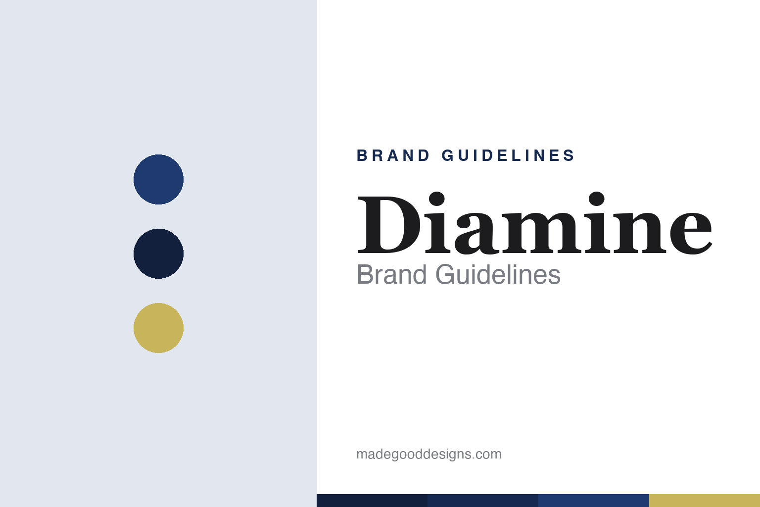
Diamine Brand Guidelines
One of Britain’s last surviving ink houses — and one of the broadest colour ranges in the pen world.
Aa
Two constants: an ink-blue and gilt palette and a heritage serif. Abstract homage — not the Diamine wordmark or logo.
One of Britain’s last ink houses
Diamine kept making ink when almost no one else did.
Diamine is a lesson in survival through range and value. It traces to 1864, when the firm was founded in England (as T. Webster & Co., after Thomas Webster) — with ink production long settled in Liverpool, where it remains. The Diamine ink name itself was launched in 1880, so the neat line “founded 1864 in Liverpool” is a small compression of a longer story; the honest framing is a British ink maker established in 1864 and Liverpool-based since the nineteenth century.
Today the company trades as Diamine Speciality Inks Ltd (renamed in 2005), and it markets itself, credibly, as one of the last surviving writing-ink producers in Britain. That is the whole story in a sentence: while the big pen houses folded their ink lines or outsourced them, Diamine kept mixing fountain-pen ink in Liverpool, in small batches, and turned that persistence into an enormous, affordable catalogue.
What Diamine is loved for is breadth. Its standard bottled range runs to well over a hundred colours — one of the widest single-brand ink libraries anywhere — sold in plain 30ml and 80ml glass bottles at prices that undercut nearly every rival. For a huge slice of the fountain-pen community, “just get the Diamine” is the default answer to “what ink should I try”: there is almost always a Diamine version of the colour you want, and it will be good and cheap. Alongside the core range sit the signature specials — the annual Inkvent advent calendar, the Shimmertastic shimmering inks, and the iron-gall Registrar’s Ink — each of which we cover below. (An honest note: Diamine has been reported as part of the M.B.F. Group, so the “independent” label is hedged; and no official brand hex or typeface is published.)
Colour
Diamine lives in an ink-blue-and-gilt palette. Click a swatch to copy the hex.
Diamine’s identity is traditional, bottled and characterful — a deep ink blue, near-black, and a warm gilt. The palette reads as the writing desk: the blue-black of a classic fountain-pen ink, the dark glass of a bottle, and the gilt of an old label. It’s a heritage world that signals craft, permanence and the pleasure of real ink. It’s an ink-blue-and-gilt palette that signals British ink tradition and everyday value. The honest caveat: because Diamine makes hundreds of colours and publishes no single official brand hex, the blue, near-black and gilt here are an original, unofficial interpretation of the house, not first-party values.
The lesson is an ink-blue-and-gilt palette signals heritage and craft. Diamine’s world reads as traditional and dependable. For designers, it’s a reminder that a deep, saturated core colour with a warm metallic accent conjures old-world quality and reliability. The takeaways: use a saturated heritage colour with a gilt accent for craft credibility; let a wide range live under one calm identity; and treat any single hex as unofficial when a brand’s whole point is colour.
Typography
The wordmark spirit is a heritage serif — bookish and British.
Diamine’s identity carries a traditional, bookish, British spirit — a “Diamine” wordmark whose calm lettering reads as an old stationer’s label. A heritage serif captures the mood: it’s classic and understated, matching a company that has quietly made ink in Liverpool since the nineteenth century. Set against an ink-blue palette, the serif feels literary and dependable — exactly the bottled-ink, writing-desk personality Diamine carries. It’s classic rather than flashy, mirroring a plain bottle of good ink. (Diamine’s real wordmark is a trademark we describe but don’t reproduce.) Because the exact mark isn’t ours to use, the honest description is “a heritage serif spirit,” not the Diamine logo. The type behaves like the brand: traditional, quiet and trustworthy.
Aa
A heritage serif spirit — bookish and British. (Specimen set in Spectral, a contemporary text serif; NOT the Diamine logo, which is a trademark.)
A vast range as the difference
Diamine wins on breadth and value.
Diamine is a lesson in owning a category through range and value rather than a single hero product. Most brands are built around one icon; Diamine is built around a library. Its advantage is that there is nearly always a Diamine version of whatever colour, effect or price point you need — over a hundred standard colours, the shimmering Shimmertastic line, the permanent iron-gall Registrar’s Ink, and, once a year, the Inkvent advent calendar that packs twenty-five inks (many of them exclusive) behind twenty-five doors and has become a genuine fountain-pen event. No single one of those is the “Diamine product”; the range itself is the product, and the low price makes experimenting with it painless. That is a durable moat: a rival can copy one colour, but copying a hundred colours at Diamine’s price, made in Britain, is another matter.
For designers and brand-builders, Diamine offers a clear takeaway: breadth plus value can be a stronger position than a single hero. The lessons: let a huge catalogue live under one calm, consistent identity so it never feels chaotic; use signature “events” (Inkvent) and named specialities (Shimmertastic, Registrar’s) to add drama to an otherwise plain range; and keep the facts precise — Diamine is a British ink house established in 1864, Liverpool-based, and one of the last surviving writing-ink makers in the country. It’s also a reminder to keep it honest: the 1864 founding was under the Webster name and the “Diamine” name came in 1880; the company is reported to sit within the M.B.F. Group; Registrar’s is an acidic iron-gall ink that isn’t suited to every pen; and no official brand hex or typeface is published, so the palette and type here are an interpretation. Diamine wins on breadth — proof that a deep, affordable range can be the difference.
Explore & save
Keep Diamine’s identity on hand — save it to a board in the Made Good inspiration library.
Diamine identity set
Pin the ink-blue-and-gilt palette and the heritage-serif spirit to your own board.


