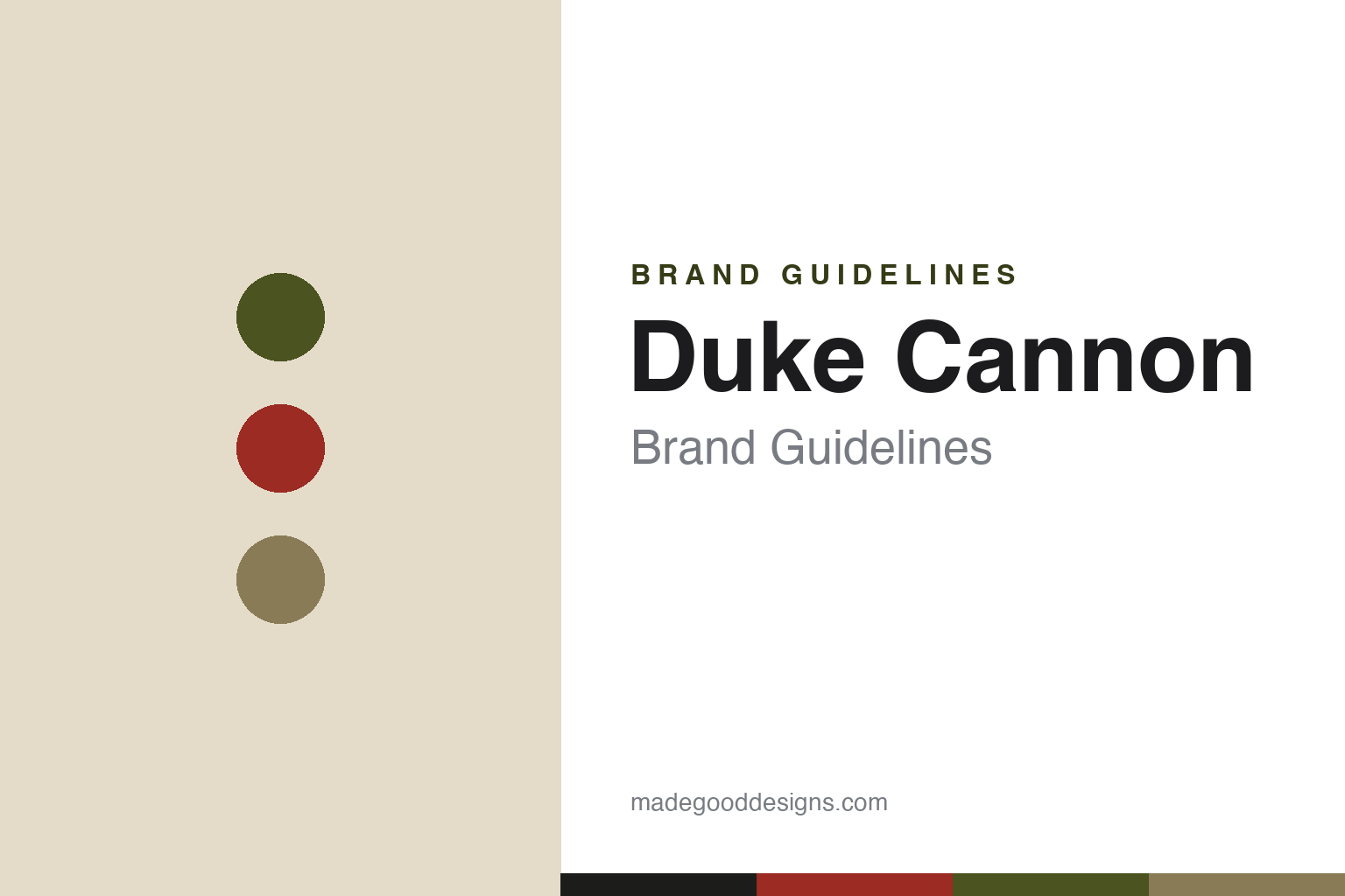
Duke Cannon Brand Guidelines
Rugged, military-inspired grooming for hard-working men — since 2011.
Aa
Two constants: a olive-and-red military palette and a stencil display. Abstract homage — not the Duke Cannon wordmark or logo.
Grooming for hard-working men
Duke Cannon makes rugged, military-inspired grooming.
Duke Cannon is a lesson in a strong, single-minded persona. It was founded in 2011 in Minneapolis by Sam Swartz and Anthony Albanese — former big-brand marketers who launched it as a rugged, deadpan-funny reaction to “teenage-targeted body wash.” The pitch: grooming goods “tested by hard-working men, not boy bands,” for men who “watch sports, drink beer, use power tools.” “Duke Cannon” itself is a fictional rugged-man persona, not a real historical figure.
Its flagship is the Big Ass Brick of Soap — an oversized (~10 oz) bar “large enough for hard-working hands,” its shape modeled on the brick soap issued to U.S. G.I.s during the Korean War. Military heritage runs through the range: Cold Shower cooling products, the Bloody Knuckles Hand Repair Balm, a paracord Tactical Scrubber, and WWII-inspired limited editions. Through its Veterans Fund, it donates a portion of profits (reported around 5%) to veteran causes and partners.
The design is unapologetic military surplus: olive drab, black, and red, with utilitarian stencil type and a “Supply Co.” quartermaster aesthetic. (Honest notes: the founders are Sam Swartz and Anthony Albanese (not “Spina”), and it was founded in Minneapolis (not Memphis); it is a 2011 startup that draws on military heritage, not an actual historical military supplier, and “Duke Cannon” is a persona; the original soap’s heritage is Korean War brick soap (WWII is a separate limited-edition theme); the donation figure is brand-reported (~5%); it is PE-backed by Main Post Partners since 2020, not fully independent; and no official brand hex is published.)
Colour
Duke Cannon lives in an olive-and-red military palette. Click a swatch to copy the hex.
Duke Cannon’s identity is rugged, utilitarian and military — an olive drab, a stencil khaki, a gunmetal near-black, a surplus red, and an aged canvas. The palette reads like an army-surplus depot: field-olive, stencil stamps, and a warning-red accent. It signals hard-working, no-nonsense masculinity rather than polish or fashion. The honest caveat: with no published brand hex, these tones are an original, unofficial interpretation, not first-party values.
The lesson is an olive-and-red palette signals rugged military utility. Duke Cannon’s world reads as tough and utilitarian. For designers, it is a reminder that olive drab, khaki and gunmetal with a surplus-red accent evoke military surplus and hard work, matching a brand built on a rugged persona. The takeaways: use olive drab and khaki with one warning red for military utility; borrow stencil/depot cues; and treat any single hex as unofficial when there is no published spec.
Typography
The wordmark spirit is a stencil display — bold and utilitarian.
Duke Cannon’s identity carries a bold, utilitarian, military spirit — a “Duke Cannon Supply Co.” wordmark whose sturdy, stencil-like forms match a rugged persona. A bold stencil display captures the mood: it is tough and functional, the register of an army depot or ammo crate rather than fashion. Set against an olive-and-red palette, the stencil display feels rugged and no-nonsense — exactly the Big-Ass-Brick-of-Soap, hard-working-men personality Duke Cannon carries. It is bold rather than delicate, mirroring an oversized bar of soap. (Duke Cannon’s real wordmark is a trademark we describe but do not reproduce, and the exact typeface is not something we assert.) Because the specific mark is not ours to use, the honest description is “a stencil display spirit,” not the Duke Cannon logo. The type behaves like the brand: bold, utilitarian and military.
Aa
A stencil display spirit — bold and utilitarian. (Specimen set in Big Shoulders Display, a bold display sans; NOT the Duke Cannon logo, which is a trademark.)
A committed persona as the difference
Duke Cannon stands for rugged masculinity.
Duke Cannon is a lesson in committing fully to a persona. From the oversized soap to the stencil packaging to the deadpan, tongue-in-cheek copy and the veteran support, everything reinforces one clear character: rugged, hard-working, unpretentious masculinity. That total commitment — a “brand voice you can hold in your hand” — makes Duke Cannon instantly recognisable and lets it stand out in a category full of sleek, minimalist grooming. The persona is the product, and the military-heritage story gives it substance beyond the joke.
For designers and brand-builders, Duke Cannon offers a clear takeaway: a fully committed persona can define a brand in a crowded category. The lessons: pick a clear character and express it in product, packaging and voice without flinching; give the persona substance (military heritage, veteran support) so it isn’t just a gag; and let the design (stencil, olive drab) reinforce the story. It is also a reminder to keep the facts honest: Duke Cannon was founded in 2011 in Minneapolis by Sam Swartz and Anthony Albanese, is a persona-led brand drawing on Korean War soap heritage, and is PE-backed by Main Post Partners since 2020 — with the palette here an unofficial interpretation. Duke Cannon committed to a persona — proof that a strong character can be the difference.
Explore & save
Keep Duke Cannon’s identity on hand — save it to a board in the Made Good inspiration library.
Duke Cannon identity set
Pin the olive-and-red palette and the stencil-display spirit to your own board.


