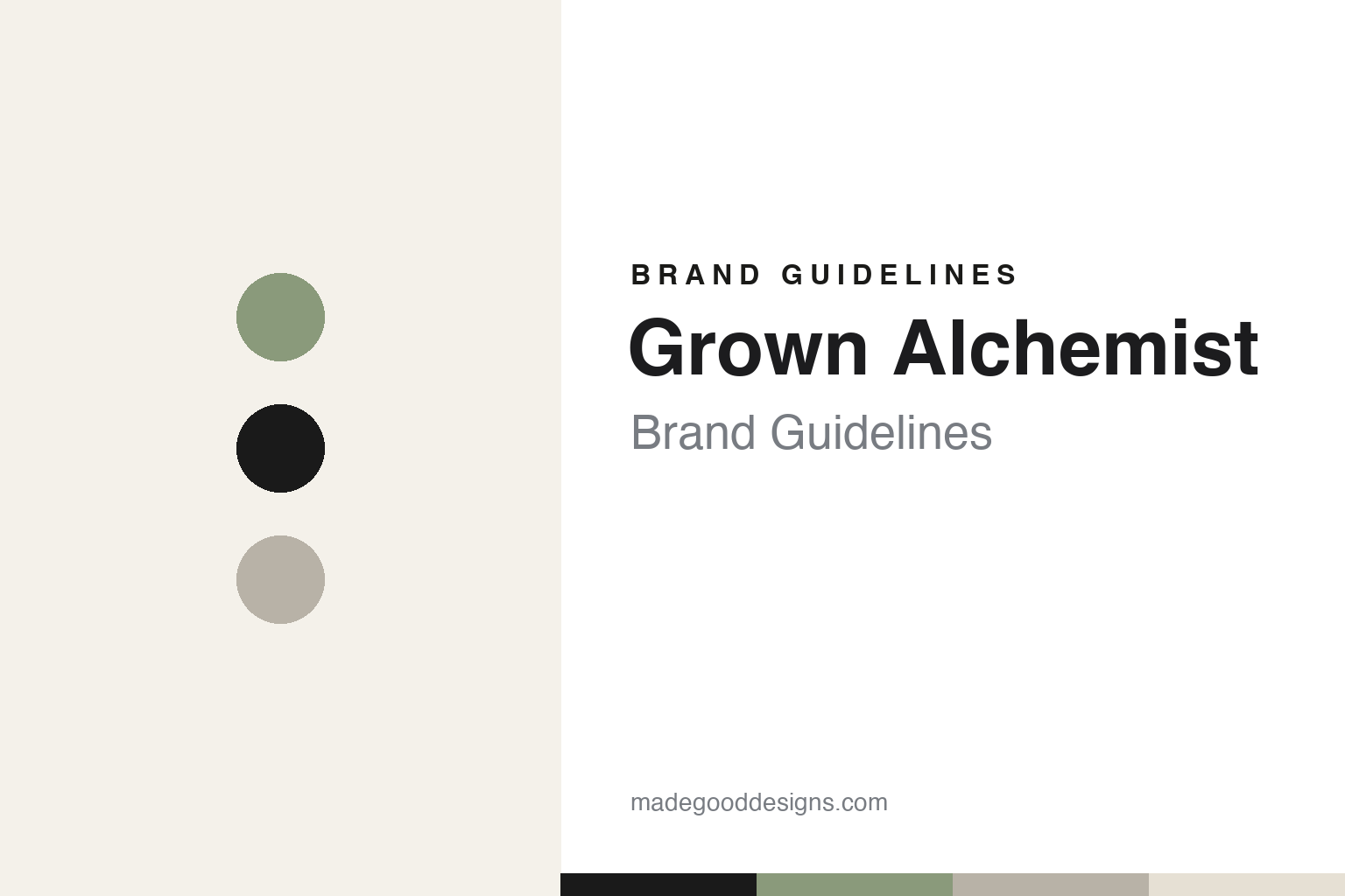
Grown Alchemist Brand Guidelines
Design-led, science-meets-nature clean skincare from Melbourne.
Aa
Two constants: a off-white-and-sage palette and a minimal sans. Abstract homage — not the Grown Alchemist wordmark or logo.
Two brothers, two disciplines
Grown Alchemist merged science, nature and design.
Grown Alchemist is a lesson in design and formulation together. It was founded in 2008 in Melbourne, Australia by brothers Jeremy and Keston Muijs, who had previously run a creative and brand consultancy. Frustrated that corporate clients wouldn’t take formulation risks, they built their own brand — Jeremy leading the business as CEO, Keston leading an in-house design team. That business-plus-design pairing defines it.
Its positioning is “cosmeceutical, clean skincare” — high-performance, results-driven natural and botanical formulations, science meeting nature, unisex and skin-health-focused. Its products carry a distinctive naming convention (hyphenated actives with “+numbers”), led by the Hydra-Repair Day Cream, alongside serums, cleansers and a well-known Chamomile & Rosewood hand cream.
The design is the signature: a strikingly minimalist, apothecary-modern identity — clean sans-serif typography, generous white space, and a restrained neutral palette — widely praised and driven by a founder-led design team. (Honest notes: the founders are brothers Jeremy (business/CEO) and Keston (design) Muijs — not a “biochemist brother”; the science comes from formulation partners and lab work, not a founder-chemist; it was founded in 2008; on ownership, L’Occitane acquired a majority stake in 2022 but sold Grown Alchemist in 2024 to André Hoffmann (majority) and CEO Anna Teal (minority), so it is no longer part of L’Occitane; and no official brand hex is published.)
Colour
Grown Alchemist lives in an off-white-and-sage minimalist palette. Click a swatch to copy the hex.
Grown Alchemist’s identity is minimal, clean and botanical — an off-white, a warm paper neutral, an ink near-black, a muted sage, and a soft taupe-grey. The palette reads like a modern apothecary: restrained neutrals with a single botanical sage, clinical yet warm, letting typography and white space lead. It signals design-led, science-meets-nature skincare rather than colour or clutter. The honest caveat: with no published brand hex, these tones are an original, unofficial interpretation, not first-party values.
The lesson is an off-white-and-sage palette signals design-led clean skincare. Grown Alchemist’s world reads as minimal and considered. For designers, it is a reminder that a restrained neutral system with one botanical accent (sage) conveys both clinical performance and natural calm, matching a brand where design is a founder-led discipline. The takeaways: build on neutrals with one botanical accent for clean-skincare calm; let typography and white space carry the design; and treat any single hex as unofficial when there is no published spec.
Typography
The wordmark spirit is a minimal sans — clean and considered.
Grown Alchemist’s identity carries a minimal, considered, design-led spirit — a “Grown Alchemist” wordmark whose clean forms reflect a founder-led design team. A minimal sans captures the mood: it is precise and modern-apothecary, the register of considered design rather than ornament. Set against an off-white-and-sage palette, the minimal sans feels clean and intentional — exactly the science-meets-nature personality the brand carries. It is restrained rather than decorative, mirroring products presented with clarity. (Grown Alchemist’s real wordmark is a trademark we describe but do not reproduce, and the exact typeface is not something we assert.) Because the specific mark is not ours to use, the honest description is “a minimal sans spirit,” not the Grown Alchemist logo. The type behaves like the brand: minimal, considered and design-led.
Aa
A minimal sans spirit — clean and considered. (Specimen set in Outfit, a minimal geometric sans; NOT the Grown Alchemist logo, which is a trademark.)
Design as a discipline as the difference
Grown Alchemist stands for designed skincare.
Grown Alchemist is a lesson in treating design as a core competency. Founded by two brothers from a creative consultancy, it built a founder-led, in-house design team and made minimalist, apothecary-modern packaging a central part of the brand — so it stands out in a crowded clean-skincare market on design as much as on formulation. Paired with genuine “cosmeceutical clean” performance and a unisex, science-meets-nature positioning, that design discipline gave a Melbourne brand a distinctive, enduring identity — enough to attract, and then move beyond, L’Occitane ownership.
For designers and brand-builders, Grown Alchemist offers a clear takeaway: design as a founder-led discipline can differentiate a skincare brand. The lessons: build design capability in-house rather than outsourcing the brand’s face; keep the system minimal so it reads as considered; and back the look with real formulation performance. It is also a reminder to keep the facts honest: Grown Alchemist was founded in 2008 in Melbourne by brothers Jeremy and Keston Muijs (business and design, not a chemist), and is now owned by André Hoffmann and Anna Teal after L’Occitane sold it in 2024 — with the palette here an unofficial interpretation. Grown Alchemist made design a discipline — proof that design can be the difference.
Explore & save
Keep Grown Alchemist’s identity on hand — save it to a board in the Made Good inspiration library.
Grown Alchemist identity set
Pin the off-white-and-sage palette and the minimal-sans spirit to your own board.


