Edward Henry Potthast spent his twenties drawing on lithographic stones in a Cincinnati print shop, and his paintings still think like printed images: a clear horizon, flat bands of sea and sand, and small figures placed like type on a page. Edward Potthast is remembered above all for crowded summer beaches, painted in a pale, chalky key with flicks of red, yellow and violet. Three of his beach paintings are flagged public domain or CC0 by the Art Institute of Chicago and the Cleveland Museum of Art, and they appear in this guide. For more cleared historic images, browse the MGD museum inspiration collection.
Who was Edward Henry Potthast?
The Metropolitan Museum of Art and the Art Institute of Chicago both record him as American, 1857–1927. Biographies give his birth in Cincinnati on 10 June 1857 and his death in his New York studio on 9 March 1927. Gallery and museum biographies agree that he studied at the McMicken School of Design in Cincinnati from about 1870 and worked as a lithographer for the Strobridge Lithographing Company, a Cincinnati firm that printed posters and commercial work.
Around 1881–82 he went to Europe. Biographies place him first in Antwerp and then in Munich, where his teachers are named as Nikolaus Gysis and Ludwig von Loefftz. He returned to Cincinnati in 1885 and went back to lithography while taking evening classes. A second stay in Europe, dated to 1887 in several accounts, took him to Paris and to the artists’ colony at Grez-sur-Loing near Barbizon, where painters worked outdoors in changing light.
He moved to New York in the mid-1890s; accounts give 1895 or 1896. The Dayton Art Institute and other biographies record his election to the National Academy of Design as an associate in 1899 and as a full academician in 1906.
A dated outline of key works
- 1896, The Century, July. A lithographed magazine poster at the Met, 53.1 by 38.2 cm, from the decade when illustrated monthlies commissioned artists’ posters.
- About 1900, Figures at a Fountain. A black Conté crayon drawing at the Met, 55.9 by 74.9 cm.
- About 1910, In the Surf and Beach Study. Two oil sketches on the front and back of one panel, 31.8 by 40.7 cm, at the Cleveland Museum of Art.
- 1910, the Grand Canyon. The Phoenix Art Museum records that the Atchison, Topeka and Santa Fe Railway sent five painters, Potthast among them, to the canyon in November 1910; the Hickory Museum of Art’s account of Elliott Daingerfield’s trip names the same party.
- About 1915, A Holiday. Oil on canvas, 76.4 by 101.8 cm, Art Institute of Chicago, Friends of American Art Collection.
What to look at in an Edward Potthast beach scene
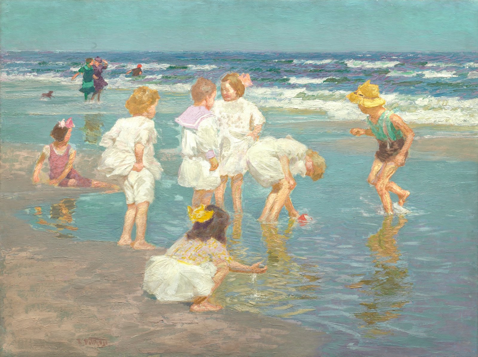
The high horizon as a stack of bands. In A Holiday the canvas divides into horizontal strips: a hazy sky, a deep blue-violet line of sea, white surf, a mirror of wet sand and a dry beige foreground. Each band has its own colour and its own brushwork, so the scene reads as a layered layout before you see any figure.
Figures as a loose cluster. The children in A Holiday are arranged in an open ring around a tide pool, each turned a different way, with a few adults and a small dog pushed back into the surf. Nobody sits at the exact centre. The eye travels from figure to figure, the way a reader scans a well-spaced grid of images.
White as a colour. Most of the children wear white, but none of it is pure white. The dresses are built from cream, pink, lilac and pale yellow strokes that pick up the sky and the sand.
Reflections that repeat the composition. The wet sand doubles every leg and dress in softer, broken strokes. It is a simple way to fill the lower half of the picture without adding new objects.
Palette: sea-glass tones measured from the scans
Quantising the Art Institute of Chicago’s scan of A Holiday to six colours gives a sea-glass teal (#8AB4AF), a grey-green shadow (#788F8F), two wet-sand beiges (#9D8D77 and #A99C84), a pale cream (#E1E0C7) and a sandy khaki (#BCB497). These values are measured from the museum’s scan of this canvas, not from the original pigments, and they shift with lighting and photography. What the figures show is how close in value the main colours sit: the picture is mostly mid-to-light tones, with the strong accents (a red pail, two yellow hats, pink hair ribbons) taking up very little area.
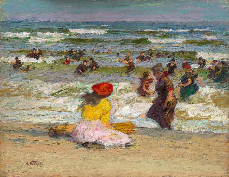
The Cleveland Museum of Art’s scan of In the Surf is darker and warmer. Six-colour quantising gives olive grey (#838478), a deep umber (#5F5849), ochre sand (#BB9E6F), grey-green (#8F968B), straw (#C1AE84) and a parchment light (#CFC5AD). Here the accent is the girl’s red hat and yellow top in the foreground, a single hot spot against a crowd of dark bathing costumes. To try these pairings in your own work, paste the values into the colour palette generator.
Technique: the panel sketch and the lithographer’s eye
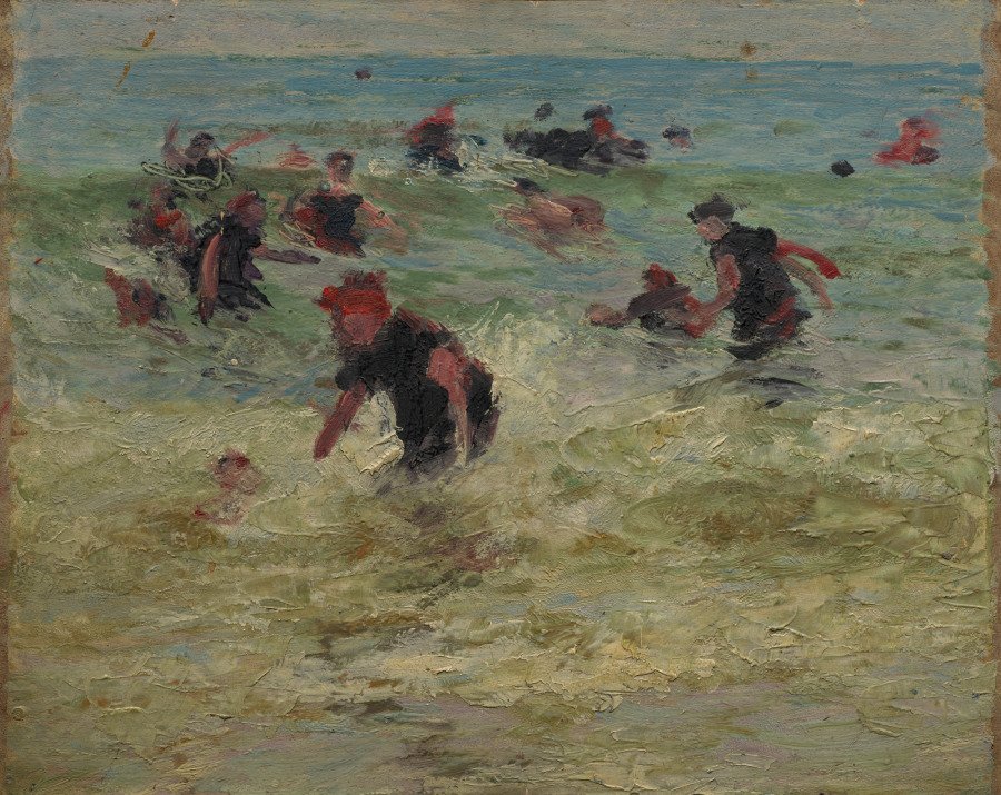
The Cleveland panel is a useful window into his method. It is small, about 32 by 41 cm, and painted on both sides, with a finished-looking surf scene on the front and a rougher study of bathers on the back. The paint in In the Surf is thick and dragged, with whole waves laid in a single loaded stroke and figures reduced to a few dabs of dark and red. The verso is even more abbreviated: heads are spots, arms are single lines of colour, and the sea is a field of scraped greens.
Both sides carry the kind of decisions a designer makes in a thumbnail: where the horizon goes, where the darks cluster, where the one bright note sits. The signature, visible in the scans, is a small cursive “E. Potthast” placed low in the left corner of the sand, out of the way of the action.
His early training matters here. Commercial lithography in the 1870s and 1880s meant separating an image into flat areas of colour that could be printed one stone at a time. His 1896 Century poster at the Met shows that he kept working in printed formats after his move to New York. The habit of thinking in clear zones of colour carries over into the banded beaches. For the wider history of the magazine poster, see our guide to vintage posters.
Where he fits
Potthast belongs to the generation of American painters who absorbed French plein-air practice and applied it to home subjects: parks, resorts and the beaches around New York. Gallery biographies connect his beach pictures to Coney Island and Rockaway Beach, and his subjects also included figures at leisure in Central Park. For the movement behind his broken brushwork, see our guide to Impressionism. For a contemporary who painted sunlit figures outdoors in New England, compare our guide to Frank Weston Benson.
How designers can borrow from Edward Potthast
- Build layouts in horizontal bands. Sky, sea, surf and sand give four clear zones. A landing page or poster can use the same idea: a quiet top band for the headline, a busier middle band for imagery, and a calm base for text.
- Keep values close, then add one hot accent. Most of A Holiday sits in pale teal and beige. A single red or yellow note does the work of a call-to-action button.
- Tint your whites. Replace pure white backgrounds with a cream such as the measured #E1E0C7 and see how much warmer the page feels.
- Scatter rather than centre. An open cluster of small figures or objects, each turned differently, feels more relaxed than a symmetrical arrangement. It works well for editorial illustration and social graphics.
- Sketch on both sides of the board. His double-sided panel is a reminder to keep thumbnails quick and disposable. Explore several compositions fast before committing to one.
Frequently asked questions
Who was Edward Potthast?
Edward Henry Potthast (1857–1927) was an American painter born in Cincinnati. He worked as a lithographer, studied in Antwerp and Munich, and from the mid-1890s lived in New York, where he painted beach scenes, park scenes and landscapes.
What is Edward Potthast known for?
For sunny beach scenes of children and bathers painted in bright, broken colour, such as A Holiday (about 1915) at the Art Institute of Chicago and the double-sided panel In the Surf and Beach Study (about 1910) at the Cleveland Museum of Art.
Did Edward Potthast paint the Grand Canyon?
Yes. The Phoenix Art Museum records that he was one of five painters the Santa Fe Railway sent to the Grand Canyon in November 1910, alongside Thomas Moran, Elliott Daingerfield, Frederick Ballard Williams and DeWitt Parshall.
Is Edward Potthast’s work public domain?
The three paintings in this guide are flagged public domain by the Art Institute of Chicago and CC0 by the Cleveland Museum of Art. Other works, including the Met’s drawing and poster, are not flagged public domain in the Met’s records, so check each work with its holding institution. See our guide to public domain art for background.