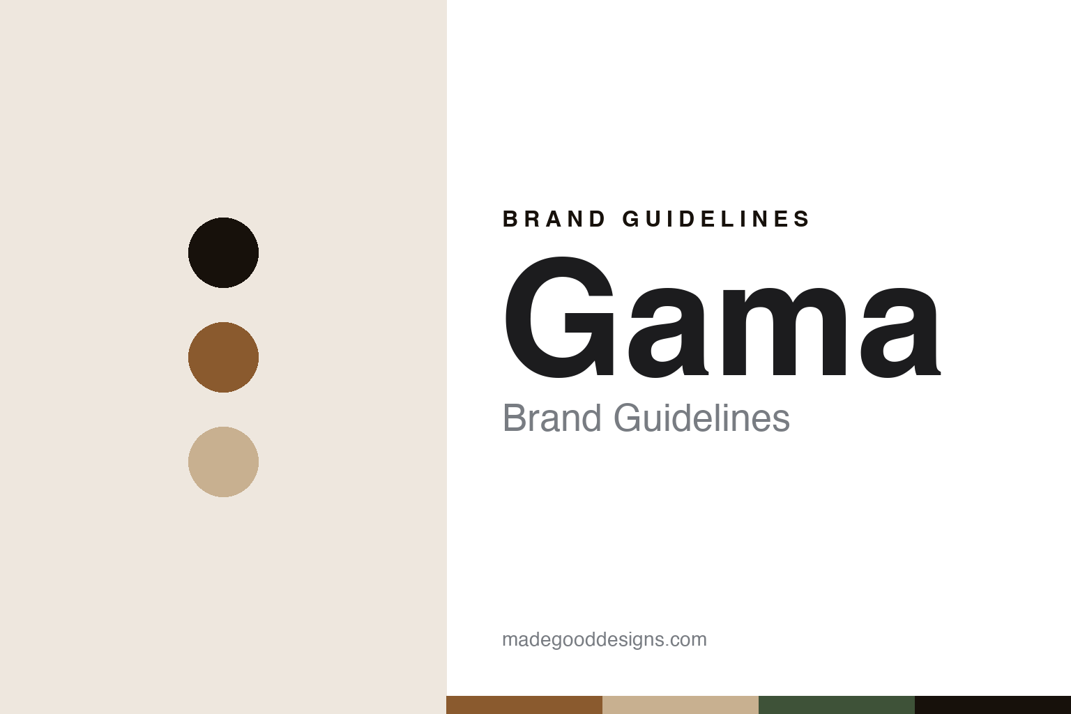
Gama Brand Guidelines
The heritage that never stopped.
Aa
Two constants: an ebonite-brown palette and a heritage sans register. Abstract homage — not a Gama pen or wordmark.
The heritage that never stopped
Gama has hand-turned ebonite pens in Chennai since 1928 — a heritage that never went dormant.
Gama is a lesson in an unbroken heritage as the identity. The pen brand of Gem & Co, a Chennai family firm since 1928, it has hand-turned ebonite pens for nearly a century without a break — no revival needed, a heritage that simply kept going. A pen, hand-turned in India across generations.
Its identity is the heritage that never stopped. Gama’s hand-turned, made-in-Chennai ebonite pens, from a family that has never left the trade, are the work it is known for. A continuity, made a signature. A South-Indian pen house that endured.
(Honest notes, so the story stays precise. Gama is the pen brand of Gem & Co, established in 1928 in the George Town district of Chennai by M. C. Cunnan, with pen-making from the 1920s; it is run today by his grandson, Pratap Kumar. The name comes from “the Great Gama,” a legendary wrestler, chosen for the pens’ sturdy girth — not from Gujarat. It is genuinely handmade in India, hand-turned from ebonite (and acrylic) at a rate of only a few pens a day. One honest caveat: the nibs are third-party — German JoWo units on higher models, stock steel on basic ones — so the Indian making is the ebonite body, not the nib. It is distinct from other Tamil Nadu ebonite makers such as Ranga and ASA. Its designs are its IP, described but never reproduced, and there is no official brand hex — these tones are an unofficial interpretation. This is design commentary and does not promote any product.)
Colour
Gama lives in an ebonite-brown palette. Click a swatch to copy the hex.
Gama’s identity is warm, enduring and Indian — an ebonite brown, an ink, a cream, a green, and a chalk. The palette leans ebonite brown and cream: the register of hand-turned hard rubber aged by time. It signals continuity and craft over polish. The honest caveat: with no published brand hex, these values are an original, unofficial interpretation, not first-party colours.
The lesson is an ebonite-brown palette signals a warm, enduring identity. Gama’s world is a hand-turned, made-in-Chennai, century-old object. For designers, it is a reminder that a warm brown and a soft cream can carry a brand built on continuity — the brown of aged ebonite and the cream of turned hard rubber. Because these tones can fail as small text, keep type dark and let the colour live in the accents, palette and band. The takeaways: never stop; turn it by hand; keep it in Chennai; and treat any single hex as unofficial.
Typography
The register is a heritage sans — warm, plain, enduring.
Gama’s identity carries a warm, plain, enduring spirit — a workshop object, not a luxury one. A heritage sans captures the mood: even, unfussy and steady, the register of a family workshop of nearly a century. Set in an ebonite-brown palette, the heritage sans feels warm and plain — exactly the personality Gama carries. It is enduring rather than showy, mirroring a hand-turned ebonite pen made the same way for decades. (Gama’s real designs and wordmark are things we describe but do not reproduce, and the exact typeface is not ours to use.) Because it is not ours to use, the honest description is “a heritage-sans spirit,” shown here in a stand-in. The type behaves like the maker: warm, plain and enduring.
Aa
A heritage-sans spirit — warm and enduring. (Specimen set in Hanken Grotesk, a heritage-sans STAND-IN; NOT the Gama wordmark or any pen design.)
An unbroken heritage as identity
Gama stands for the heritage that never stopped.
Gama is a lesson in making an unbroken heritage the identity. An ebonite-brown palette, a heritage sans and hand-turned pens make near-a-century of continuity the whole maker — warm, enduring and Indian. The continuity is the differentiator. The differentiator is a genuine, rare thing — a family firm that has hand-turned ebonite pens in Chennai since 1928 without a break, needing no revival.
Put to work, the identity is continuity as design. A maker building in this spirit would keep a craft going across generations, keep the making at home, and let endurance be the story, so the customer buys into a living heritage rather than a nostalgia act. It would treat the family line as the brand. It would be honest that the nib is bought in. The lesson Gama teaches is that an unbroken heritage can build a brand: the continuity gives it authenticity, and the Indian making gives it depth. The heritage is the personality, and the endurance is the proof.
For designers and brand-builders, Gama offers a clear takeaway: endurance itself can be the story. The lessons: never stop; turn it by hand; keep it in Chennai; and be honest about the nib. It is also a reminder to stay precise: Gama is the pen brand of Gem & Co, established 1928 in Chennai by M. C. Cunnan and run today by his grandson, hand-turning ebonite pens without a break — with the palette here an unofficial interpretation. Gama made the unbroken heritage the maker — proof that continuity can be the difference.
Explore & save
Keep Gama’s identity on hand — save it to a board in the Made Good inspiration library.
Gama identity set
Pin the ebonite-brown palette and the heritage-sans register to your own board.