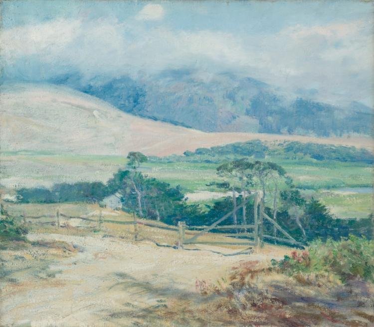
Guy Rose painted light the way a designer sets a colour system: a narrow family of cool greens, blues and creams, with warm notes used sparingly. The Cleveland Museum of Art holds his Carmel Hills, painted around 1918 to 1920, and it is a useful object to study: a gate, a few trees and a pale slope sit under hills that dissolve into cloud. This guide looks at what to notice in that painting and in his wider work, outlines his career from museum and scholarly sources, and ends with ways to borrow his approach in layouts, illustrations and brand palettes.
Who was Guy Rose?
Biographical summaries agree that Rose was born in San Gabriel, California, in 1867, into a landowning family, and that the town of Rosemead carries the family name. He studied art in San Francisco before travelling to France in 1888, where accounts place him at the Académie Julian in Paris. In the 1890s he worked in New York as an illustrator, which is worth remembering: he understood reproduction, clear silhouette and the page as a format before he settled into landscape.
His years at Giverny are given differently by different sources. One account says he and his wife Ethel bought a cottage there in 1899; another says they were living there by 1904 and stayed until about 1912, while a third has him returning to Southern California in 1914. All the sources agree on the broad outline: a long stay in France close to the Impressionist circle, then a permanent return to California in the mid-1910s. He settled in Pasadena, taught at the Stickney Memorial Art School there, and died in Pasadena in 1925. The Crocker Art Museum states that lead poisoning later forced him to give up painting in oils.
A short dated outline
- 1867. Born in San Gabriel, California.
- 1888. Goes to France; accounts place him at the Académie Julian, Paris.
- 1890s. Works as an illustrator in New York, and paints in France.
- 1899 or 1904 to about 1912. Lives and works at Giverny; sources give different start and end dates.
- Mid-1910s. Returns to Southern California and paints at Laguna Beach and La Jolla. Solo exhibitions at the Los Angeles County Museum of History, Science and Art are recorded for 1916, 1918 and 1919.
- c. 1918–1920. Carmel Hills, oil on canvas, 53 by 61 cm (20⅞ by 24 in.), Cleveland Museum of Art, bequest of Mrs. Henry A. Everett for the Dorothy Burnham Everett Memorial Collection, 1938. Cleveland dates it c. 1918–1920; a Wikimedia Commons record gives a broader range, c. 1914–1920.
- 1919 and 1920. One biography records his Carmel pictures at the Carmel Arts and Crafts Club annual exhibitions.
- 1925. Dies in Pasadena.
What to look at in Carmel Hills
Atmosphere as hierarchy. The painting is built in bands. Cloud and hills at the top are the palest and bluest; the middle band of green fields is cooler than the foreground; the nearest ground is a warm, dry cream. Each band is slightly stronger in contrast than the one behind it, which is atmospheric perspective used as a layout rule: the closer something is, the more it is allowed to speak.
A small, dark anchor. The darkest values sit in a compact cluster of trees and a fence around the gate in the lower middle. In a page of soft colour, that cluster is where the eye lands first. The gate also gives a diagonal against the gentle horizontals, so the picture is not static.
Broken brushwork. Close up, the hill slope and cloud are made of short, dry touches rather than blended gradients. The surface has texture without detail, a quality designers chase when they add grain or paper noise to flat vector fields.
Restraint in warm accents. A few red and pink notes in the right foreground are the only strong warm marks. They work because everything else is cool, the same logic as one accent colour in an interface.
The measured palette
These hex values were measured from the museum’s scan of this painting using a six-colour PIL quantise, not taken from the original pigments, and they will shift with the scan and your screen. Approximate shares of the image follow.
- #a7bfc0, a pale grey-blue, about 20 per cent of the sampled pixels: cloud and distant hill.
- #617d78, a deep grey-green, about 19 per cent: trees and shaded hill.
- #c6cec7, a pale grey-green, about 16 per cent: highlights and mist.
- #a1a999, a sage grey, about 16 per cent: fields.
- #7aa4a8, a mid blue-green, about 15 per cent: sky and far slopes.
- #c3c1b0, a warm putty, about 15 per cent: dry ground in the foreground.
Notice how narrow the range is. Every swatch leans grey, and the only real contrast comes from the single dark green. You can load these into the colour palette generator to test them as interface or packaging colours, or sample your own reference with the image colour picker in the same tools section. For a wider view of how his generation handled outdoor colour, see our guide to Impressionism.
Technique: oil, plein air and the Giverny years
Rose worked in oil on canvas, and the Cleveland record confirms the medium for Carmel Hills. His time near Giverny placed him among the American painters who followed Monet’s interest in light and outdoor work; for the French painter’s own methods, see our guide to Claude Monet. The visible result in Rose’s California pictures is a habit of laying colour in small, distinct touches and keeping the shadows coloured rather than black. The Crocker Art Museum’s account of his later health, with lead poisoning ending his oil painting, is a reminder of how physically demanding the materials were.
Rose is often grouped with other painters of the California landscape in the early twentieth century. For a neighbour in subject if not in style, our guide to William Wendt covers the more solid, structured side of the same terrain, while the MGD museum inspiration collection gathers public-domain reference images you can study and reuse.
Signature and presentation
The Cleveland record lists no inscriptions for Carmel Hills, and any signature is too small to read in the museum’s web scan. That is itself a useful note for designers: the painting presents as a field of colour with no text at all. If you adapt it, any lettering you add will be the only hard-edged graphic element, so choose a quiet, open sans or serif and place it over the pale sky area at the top rather than over the busy foreground.
How designers can borrow from Guy Rose
- Build depth with temperature, not shadows. Put pale, cool colours in the background and warm, drier tones near the viewer. It works in landscape illustration, hero images and map-style graphics.
- Use one dark cluster as the anchor. In a soft layout, a single compact dark shape, such as an icon, a logotype or a photo crop, gives the eye a place to begin.
- Keep the palette narrow. Six greyed colours were enough to describe a whole hillside. Start brand palettes with a narrow family and add one accent.
- Leave the sky for the headline. The pale top third of the painting is calm space. Set headlines or short copy there and keep the textured part for the image.
- Add texture, not detail. Dry-brush marks, grain or a soft paper overlay give a surface life without adding information, which suits backgrounds and packaging.
- Study before you reproduce. Describe and learn from works, but check the rights status of any painting with its holding museum. The Cleveland Museum of Art lists Carmel Hills as CC0.
Frequently asked questions
Who was Guy Rose?
Guy Rose (1867–1925) was an American painter born in San Gabriel, California. He trained in San Francisco and Paris, worked as an illustrator in New York, spent years in France near Giverny and settled in Pasadena in the mid-1910s.
Which Guy Rose painting is in the Cleveland Museum of Art?
Carmel Hills, an oil on canvas of about 1918 to 1920, measuring 53 by 61 cm. It came to the museum in 1938 as a bequest of Mrs. Henry A. Everett for the Dorothy Burnham Everett Memorial Collection.
What colours did Guy Rose use?
In Carmel Hills, the colours measured from the museum’s scan are soft greys, blue-greens and putty tones, with a single deep grey-green for the trees and small warm touches in the foreground. These are measurements of the scan, not the original pigments.
Is Guy Rose’s work public domain?
Rose died in 1925, and the Cleveland Museum of Art flags Carmel Hills as CC0 (open access), which is why it is shown here. Other works may have different rights holders, so check each museum record before reusing an image.

