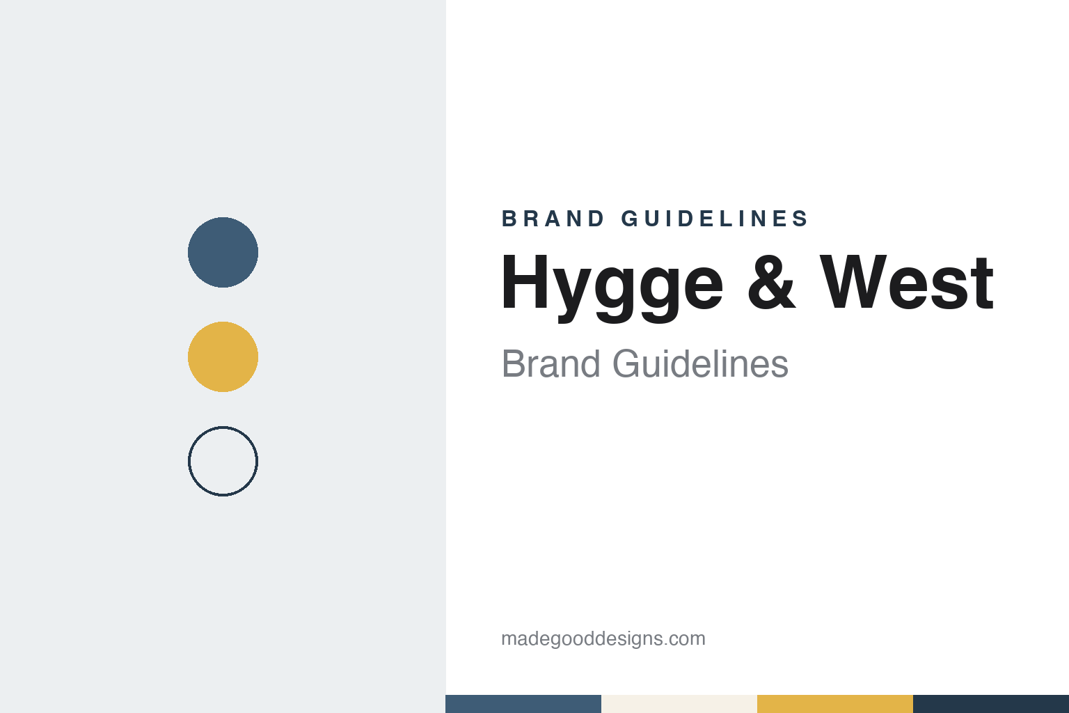
Hygge & West Brand Guidelines
Two friends, a lot of pattern and a roster of artists.
Aa
Two constants: a slate blue, mustard and oat palette and a geometric sans register. Abstract homage — not a Hygge & West product or mark; no pattern, logo or packaging is reproduced.
Two friends
From importer to pattern house.
Hygge & West was founded in 2008 by Aimee Lagos and Christiana Coop, whom the company describes as lifelong friends. In August 2018 Architectural Digest, in its AD PRO section, said the two had been friends since elementary school and that they began the company as an importer before venturing into design. At that time the magazine described the business as based in San Francisco.
The company states its founding goal plainly on its website: to create “well designed, affordably priced, accessible wallpaper.” It now calls itself a boutique wallpaper and home goods company that believes in “the power of pattern” to help people express themselves, and it sells wallpapers alongside bedding and shower curtains.
The founders split the work between them. According to the company, Aimee Lagos leads product design and development and works with artists, brands and manufacturers, as well as handling logistics and finance; Christiana Coop runs the customer-facing side, including social media, customer service, marketing and press. In the 2018 Architectural Digest interview, Lagos said she deals more with the manufacturing side while Coop handles much of the customer service. The company names Ola Supernat as creative director, its first full-time employee, responsible for a consistent brand experience across web, print and packaging, and the designer of several of its wallpaper collections.
The website’s copyright line names Propitious Jackson Inc. as the company behind the store.
Colour
A roster of artists, printed in the USA.
Hygge & West’s catalogue is built on collaboration. The company says it creates exclusive collections of wallpaper, bedding and shower curtains with artists, designers, illustrators and brands, and among the partners it names are Rifle Paper Co., Schoolhouse, Heath Ceramics and Coral & Tusk, along with CB2, Justina Blakeney, Julia Rothman and PATCH NYC. Its designers page adds illustrators such as Dinara Mirtalipova and Annie Brady, an Irish surface pattern designer based in Providence, as well as the designer and author Ingrid Fetell Lee of The Aesthetics of Joy.
One such project shows how the collaborations work. In 2018 Architectural Digest described a line made with Tilton Fenwick, the New York interior design duo of Suysel dePedro Cunningham and Anne Maxwell Foster, which brought versions of their second fabric line for Duralee onto the wall. The Tilton Fenwick pair said Hygge & West’s founders helped narrow down the patterns, rescaled the Angelina scallop for wallpaper and persuaded them to add metallics, since, they said, the company’s top sellers tended to have a little metallic in them. Pattern names in the line included Pombal, Soldo, Florebela and Bruno.
Production is spelled out on the company’s help pages. It offers its patterns in three formats. Its traditional wallpapers are hand screen printed in Chicago on American-made paper, which the company says gives them a hand-painted look and texture and offers the widest choice of pattern and colour. Its pre-pasted papers are digitally printed on PVC-free paper and, the company says, are GREENGUARD Gold certified. Its peel-and-stick papers are also digitally printed, with an adhesive backing that can be removed and repositioned. The site’s footer states that its wallpapers are made in the USA, and the company says its shower curtains are made by a family-owned company in Portugal.
Typography
Design and documentation.
Wallpaper and wallcovering makers sell surfaces that are hard to judge from a small sample, so most of them present their work through finished rooms. Company sites typically pair each design with a flat pattern image and a room set, and many add project stories from hotels, shops and private houses. Fromental’s pages group bespoke designs by collection, by collaboration and by colour family, while Muraspec’s home page runs a series of short project stories from hotels, bars and homes.
Naming does a lot of the work. Makers organise their output into named collections, and the names often signal a source or a mood rather than a technical detail: Fromental lists collections such as Chinoiserie and Modern Chinois, and Muraspec trade write-ups from 2013 describe ranges named Artemis, Osaka and Verona. Collaborations with designers and other houses are usually given collection names of their own, as with Hirondelles, made by Fromental with Lalique and reported by Tatler in 2019.
Technique is described in plain terms. Makers set out how a design is produced, whether by hand painting, hand embroidery, screen printing or digital printing, and where the work is done. Fromental’s craftsmanship page explains how silk is sized, painted and backed with rice paper in its Chinese studios, and Muraspec states that its wallcoverings are designed and manufactured in the UK; trade magazines often repeat the specification details, such as backing and weight, that contract buyers ask for.
Corporate pages fill in the rest: who founded the business, who owns it now and where its studios and showrooms are. Some firms are still run by their founders, while others have passed through several owners; Muraspec, for example, now describes itself as employee-owned. The guides in this group set those facts out from dated sources, alongside each maker’s own account of its collections.
Aa
A light geometric sans for a friendly, pattern-first brand. (Specimen set in Josefin Sans, a sans STAND-IN; NOT the Hygge & West logo.)
Hygge & West
Pattern shown in real rooms.
Photography is central to how Hygge & West presents itself. The company says it shows its products “in real spaces by real people,” and that photographs from customers make up the majority of its online content; its website invites customers to send pictures of finished projects for its social channels and keeps a customer gallery. In the 2018 Architectural Digest interview, Aimee Lagos said the company always wants its photography to push the limits a little and “not just be a flat wall shot,” and that working with interior designers on the Tilton Fenwick line let it bring more dimensionality to its styling than before.
The same idea runs into print. In 2018 the company published a book, Hygge & West Home: Design for a Cozy Life, which it describes as featuring homes, in-depth interviews and tips for making a cosy life. On its website the company frames pattern as a way to “bring joy” into people’s lives and to create “happy, beautiful homes,” and says that the strongest patterns tell a story while leaving room for customers to create their own.
The brand voice is warm and informal. The company refers to itself as H&W, introduces its team with short descriptions of each person’s role, written in the same light tone, and describes pattern as something that “forges connection.” Its website pairs that tone with practical material for buyers, such as a wallpaper calculator, installation guides, a resource library and a trade programme for design professionals, and it encourages customers to order samples because colours read differently on screens and in different rooms. It also advises that colours can vary between production lots, so it stresses ordering the correct number of rolls for a job.
For a design guide, Hygge & West shows how a small company can build a recognisable look out of other people’s patterns, by choosing collaborators carefully and presenting their work in lived-in rooms. Compare Flavor Paper, an American wallpaper studio known for screen printing, and Tempaper, a removable-wallpaper company launched the same year. For this guide we use slate blue, mustard and oat with a sans, an unofficial interpretation; no product or logo is reproduced.
Explore & save
Keep Hygge & West’s identity on hand — save it to a board in the Made Good inspiration library.
Hygge & West identity set
Pin the Hygge & West slate blue, mustard and oat palette and the geometric sans register to your own board.