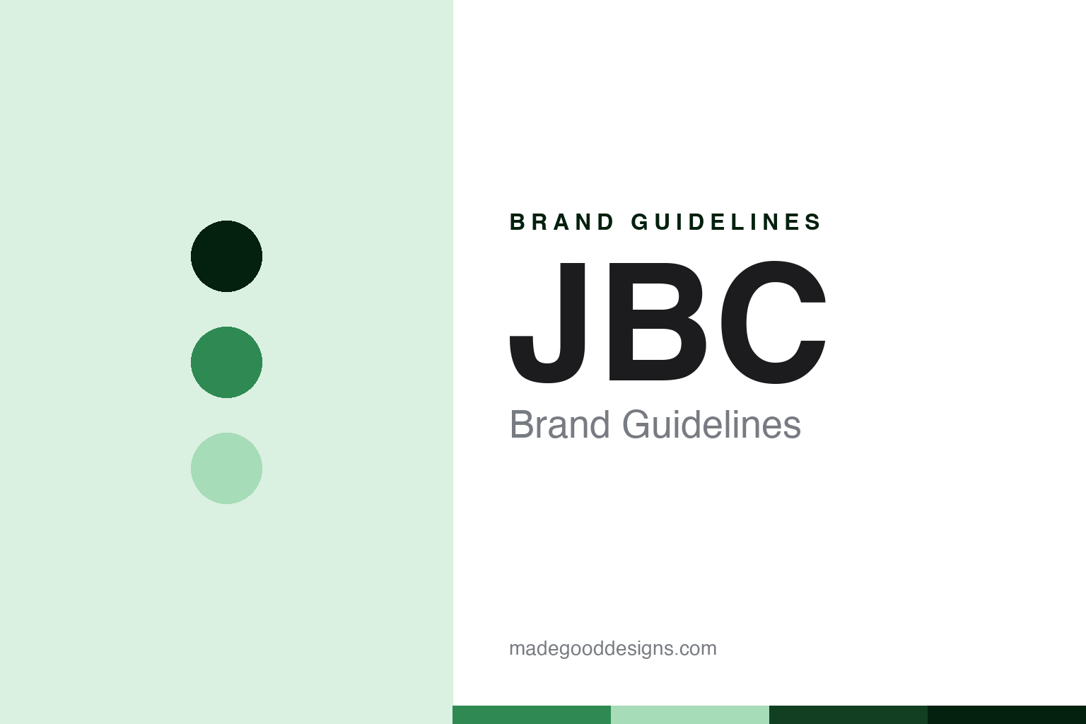
JBC Brand Guidelines
The Spanish premium iron.
Aa
Two constants: a JBC-green palette and a premium-sans register. Abstract homage — not a JBC product or mark; no iron, station or logo is reproduced.
The Spanish premium iron
JBC is an independent Barcelona-area maker, in soldering since 1929 — whose professional stations are prized for how fast the tip recovers its working temperature.
JBC follows Hakko as the round’s premium node — an independent Spanish maker with a long heritage, prized among professionals for how quickly its tips recover their working temperature. Its answer to a round about who owns the irons is the independent-premium one: a family-scale European specialist at the high end.
Its identity is the Spanish premium iron. The 1929 heritage, the independent ownership and the fast-recovery reputation are the story here. Premium, Spanish, fast. The Spanish premium iron.
(Honest notes, so the origin, the ownership and the reputation are framed accurately, with attribution. JBC sells professional soldering and rework stations as its heroes — its CD stations and Nano and Advanced lines; we report its language as the brand’s own. On origin: JBC is a Spanish company based in the Molins de Rei area near Barcelona, with a heritage in soldering since 1929. On ownership: it is an independent, privately held company. On the reputation, attributed: it is a premium professional maker known for very fast tip heat-up and recovery, meaning the tip returns to working temperature quickly, used in electronics manufacturing and repair, which we treat as its documented positioning. On the making: Spain, kept high-level. Its designs and the JBC name are IP we describe but do not reproduce; there is no official brand hex; these tones are an unofficial interpretation.)
Colour
JBC lives in a JBC green. Click a swatch to copy the hex.
JBC’s identity is premium, Spanish and fast-recovery — a JBC green, an ink, a pale green, a deep green, and a paper. The palette leans JBC green and deep green: a precise, professional register that nods to a high-end European tool rather than a loud logo colour. It signals the Spanish premium iron — premium, Spanish and fast-recovery. The honest caveat: with no official brand hex, these values are a professional, unofficial interpretation, not first-party colours.
The lesson is a JBC green signals a premium, professional identity. JBC’s world is the professional soldering line. For designers, it is a reminder that a precise green and a pale green can carry a premium, professional brand — a professional tone held as an accent, not a product shot. Because a mid hue can fail as small text, keep type dark and let the colour live in the accents, palette and band. The takeaways: place the origin near Barcelona and date the heritage to 1929; note the independent ownership; attribute the fast-recovery reputation; and say made in Spain. For a designer, the lesson is that a premium identity is carried as much by restraint as by colour: a single confident green, a precise register, and generous space read as “professional” more reliably than any ornament, and the credibility comes from attributing the performance claim to the maker rather than presenting a marketing figure as an independent test. A heritage line dated to 1929 does real work here too — it signals continuity, which for a professional-tools audience reads as reliability, provided the date is the company’s own and the manufacturing is described rather than over-claimed.
Typography
The register is a premium sans — premium, Spanish, fast-recovery.
JBC’s identity carries a premium, Spanish spirit — a European specialist at the high end. A premium sans captures the mood: clean, exact and refined, the register of a professional tool. Set in a JBC-green palette, the premium sans feels precise and considered — exactly the personality JBC carries. It behaves like a made, engineered thing rather than a loud logo, mirroring a heat-arc and a tip-ring. (JBC’s real products and the name are things we describe but do not reproduce, and the exact typeface is not ours to use.) Because it is not ours to use, the honest description is “a premium-sans brand,” shown here in a stand-in. The type behaves like the brand: premium, Spanish and fast-recovery.
Aa
A premium-sans brand — precise and considered. (Specimen set in Sora, a premium-sans STAND-IN; NOT the JBC logo or products.)
The soldering node
JBC stands for the Spanish premium iron.
JBC sits third in the round as its premium node. A JBC-green palette, a premium sans and a 1929 heritage make one thing — the Spanish premium iron — the whole identity: premium, Spanish and fast-recovery. The 1929 heritage is the pitch, the independent ownership is the frame, and the fast-recovery reputation is the substance. The point is a family-scale European specialist at the high end, in a round about who owns the irons.
Put to work, the identity is the brand told straight, the origin placed and the reputation attributed. A brand in this spirit would place the origin near Barcelona and date the heritage to 1929, note the independent ownership, attribute the fast-recovery reputation, and say made in Spain. A reader in this spirit would keep the facts right: JBC sells professional soldering and rework stations; it is a Spanish company near Barcelona, in soldering since 1929; it is independent; and it is prized for fast tip recovery. JBC sits after Hakko and before Metcal. The honest editorial moves are to place the origin, to date the heritage, to note the ownership, and to attribute the reputation.
For designers and brand-builders, JBC carries the soldering node: attribute a performance reputation — and place a European specialist. The lessons: a brand can hold the premium end as an independent specialist, here JBC; an origin is placed in the Molins de Rei area near Barcelona, with a heritage in soldering since 1929; an ownership is noted as independent and privately held; a reputation is attributed, a premium professional maker known for very fast tip heat-up and recovery, meaning the tip returns to working temperature quickly, used in manufacturing and repair; and a making is stated as Spain. It is also a reminder to stay precise: JBC is the independent, Spanish premium brand of the soldering aisle — with the palette here an unofficial interpretation. The hook is that performance: JBC is the Spanish premium iron, an independent Barcelona-area maker, in soldering since 1929, whose professional stations are prized for how fast the tip recovers its working temperature. Read that way, JBC is less a single station than the Spanish premium iron: premium, Spanish, fast-recovery. The lesson for a brand is that attributing a performance reputation and placing a European specialist reinforce the honesty, and dating the heritage keeps it earned. JBC made the-Spanish-premium-iron the identity — proof that an honestly-attributed premium can anchor a node.
Explore & save
Keep JBC’s identity on hand — save it to a board in the Made Good inspiration library.
JBC identity set
Pin the JBC-green palette and the premium-sans register to your own board.