Lovepop Brand Guidelines
Two naval architects, kirigami and a 2014 Harvard Square start.
Aa
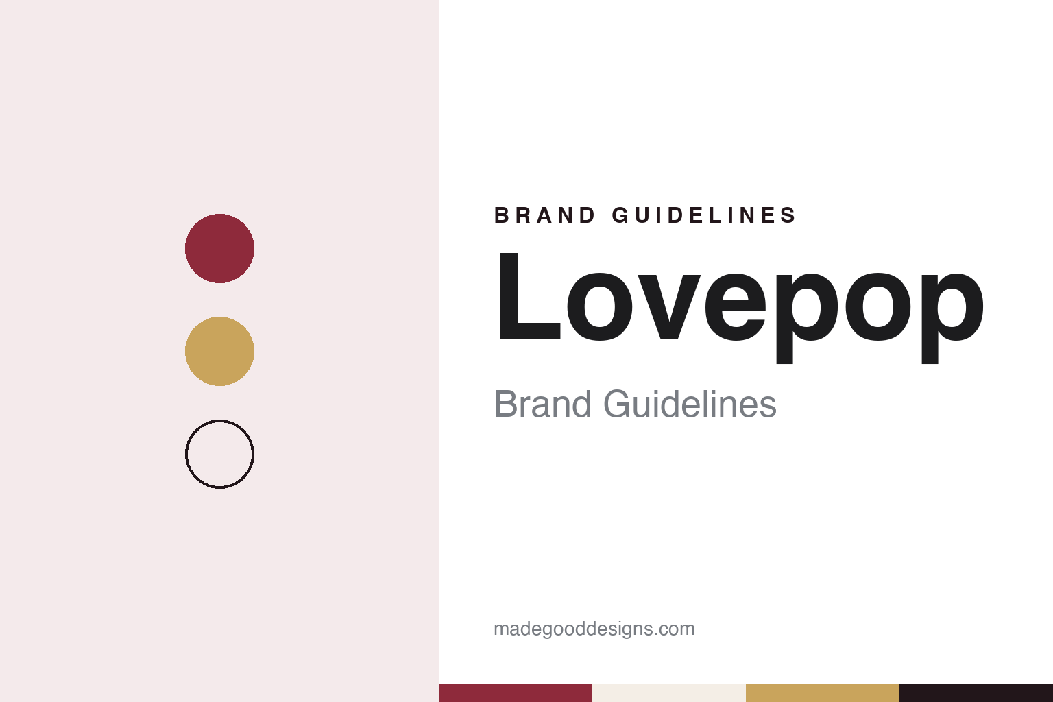
Two constants: a berry red, gilt and white palette and a Warm serif register. Abstract homage — not a Lovepop product or mark; no card, sculpture or logo is reproduced.
Lines plan to pop-up
Two ship designers and a school trip.
Lovepop is an American maker of pop-up greeting cards, paper flower bouquets and pop-up gifts. Its founders, Wombi Rose and John Wise, met as students at the Webb Institute, a college on Long Island, where both studied naval architecture and marine engineering, The Harvard Crimson reported in July 2021. The two later met again as students at Harvard Business School, and on a school trip to Vietnam they came across kirigami, a paper art related to origami in which the paper is cut as well as folded.
The connection they saw was technical. Rose explained it to the Crimson: when a ship is designed, a three-dimensional shape is sliced into planes, and the lines where those planes meet form what naval architects call a lines plan. The sliceform style of kirigami, he said, follows the same process in miniature. Make: magazine, whose writer came across the cards at a Lovepop stand in Boston’s South Station, in May 2016 described the same idea and said the founders’ first designs were drawn in AutoCAD and Rhino and cut on a Silhouette cutter, before they moved to a laser cutter after four or five designs; the paper models were then assembled by hand.
Rose and Wise launched the company in 2014. The founders were frank about their motive. Rose told Make: that the greeting card market had grown stale, and that sending or receiving a card, once a personal event, had come to feel like an obligation; the pair wanted a card people would remember after opening it. Wise said that designing large ships means working closely by the rules, while cards leave room for invention in the subject, the shapes, the base structure and the cover. The Crimson places the start in a basement in Harvard Square; Make: and StarWars.com both say it was launched out of the Harvard Innovation Lab. The company’s own account is the same in outline: two friends from Webb, a business-school trip to Vietnam and kirigami combined with an engineering background.
Colour
Slicegami, Shark Tank and shops.
The founders gave their methods a name. Make: reported in 2016 that they call the collection of processes and elements behind their cards “Slicegami”, and quoted Rose as saying that most of what they had learned in naval architecture class could be applied to making cards. The same article noted that hiring was hard at first, because most designers had not been trained to think in hull lines and production engineering.
A year after launch, according to the Crimson, the founders appeared on the American television series Shark Tank, and the investor Kevin O’Leary backed the business. Rose told the paper in 2021 that O’Leary was still helping to promote the company.
Licensed ranges followed. StarWars.com, the Lucasfilm website, reported in December 2018 that Lovepop’s Star Wars series had been released earlier that year, and described a holiday design with R2-D2 in a Santa hat. It explained the studio’s process through the card engineer Jozef Karpiel, who joined as the founders’ earliest card designer: a technical planning sheet comes first, and an artist then adds the illustrations. Folding techniques, he said, take their names from the cards that introduced them, so that a pop-up tree gave its name to a “tree fold”.
The company also moved into shops of its own. In July 2021 the Crimson reported that Lovepop had opened its largest store so far in Harvard Square, in a space previously occupied by the card and stationery chain Papyrus, selling cards, flower bouquets and giant pop-up gifts. It was the fifth physical store the company had opened since the start of 2020, the paper said, though Rose noted that most sales still came through its website.
Typography
Design and documentation.
Greeting card brands sell something small and personal, and the way they present themselves follows from that. Card shops lean on the card wall: rows of designs grouped by occasion, from birthdays and anniversaries to weddings and Christmas, with signage that sets the tone before a shopper reaches the shelves. When The Guardian compared two British card chains on the same London afternoon in January 2012, it judged them on range, pricing, staff and the feel of the shop as much as on the cards themselves.
Online card services present the same product through photographs and screens. Each card appears as the company chooses to photograph it, and the design often matters more than the brand around it. Some services credit the illustrators and photographers behind their cards, and a marketplace such as Thortful builds its whole offer around independent creators, presenting the range by maker as well as by occasion.
Personalisation is the shared interface. Websites, apps and in-store kiosks let buyers add names, photos and messages, choose whether a card goes straight to the recipient or to themselves, and see a posting cut-off for same-day dispatch. Several companies describe these steps plainly on their own sites and app listings, together with how and where cards are printed, which paper they use and whether cards are sold wrapped.
Behind the shop fronts sit corporate pages and public records. Company registers show who owns a card business, when it was incorporated and what it was once called, and they can tell a quieter story than the brand voice: a cheeky high-street name may be a founder-held family company, and a young app may sit on a company formed a year before its public launch. This guide sets out what can be checked about each brand and marks what rests on the company’s own word.
Aa
A warm serif — the voice of a keepsake card. (Specimen set in Fraunces, a serif STAND-IN; NOT the Lovepop logo.)
Lovepop
Designed in Boston, cut and folded in Vietnam.
Where the cards are made is stated clearly in the sources. StarWars.com wrote in 2018 that the cards are designed by Boston-based engineers and handcrafted in Vietnam using sliceform kirigami, the same art form that inspired the founders. Make: described the early cards in 2016 as laser-cut and assembled by hand. Lovepop calls its products handcrafted.
The company describes its mission as creating “one billion magical moments”, with an approach it sums up as imagination meeting engineering. It says its products are sold online and at retail locations across the United States, and that it has created hundreds of designs since 2015. Its website in November 2026 was selling a 2026 holiday catalogue and showed the brand trading under the Lovepop name.
The Make: article also recorded a project with The Possible Project, a Boston organisation in which high-school students build their own businesses: students learned 3D modelling and designed cards for Lovepop, with part of the proceeds returning to the programme and to the student.
The identity follows from the object. A Lovepop card arrives flat in a plain envelope and opens into a layered paper sculpture, so the brand’s visual language is one of white paper, crisp cut lines and illustrated colour added by artists over an engineered structure.
For a design guide, Lovepop shows how a card brand can grow out of an engineering method rather than an illustration style. Compare Papyrus, whose former Harvard Square shop Lovepop took over, and Punkpost, another American card company built around artists. For this guide we use a berry red, gilt and white with a serif, an unofficial interpretation; no product or logo is reproduced.
Explore & save
Keep Lovepop’s identity on hand — save it to a board in the Made Good inspiration library.
Lovepop identity set
Pin the Lovepop berry red, gilt and white palette and the Warm serif register to your own board.