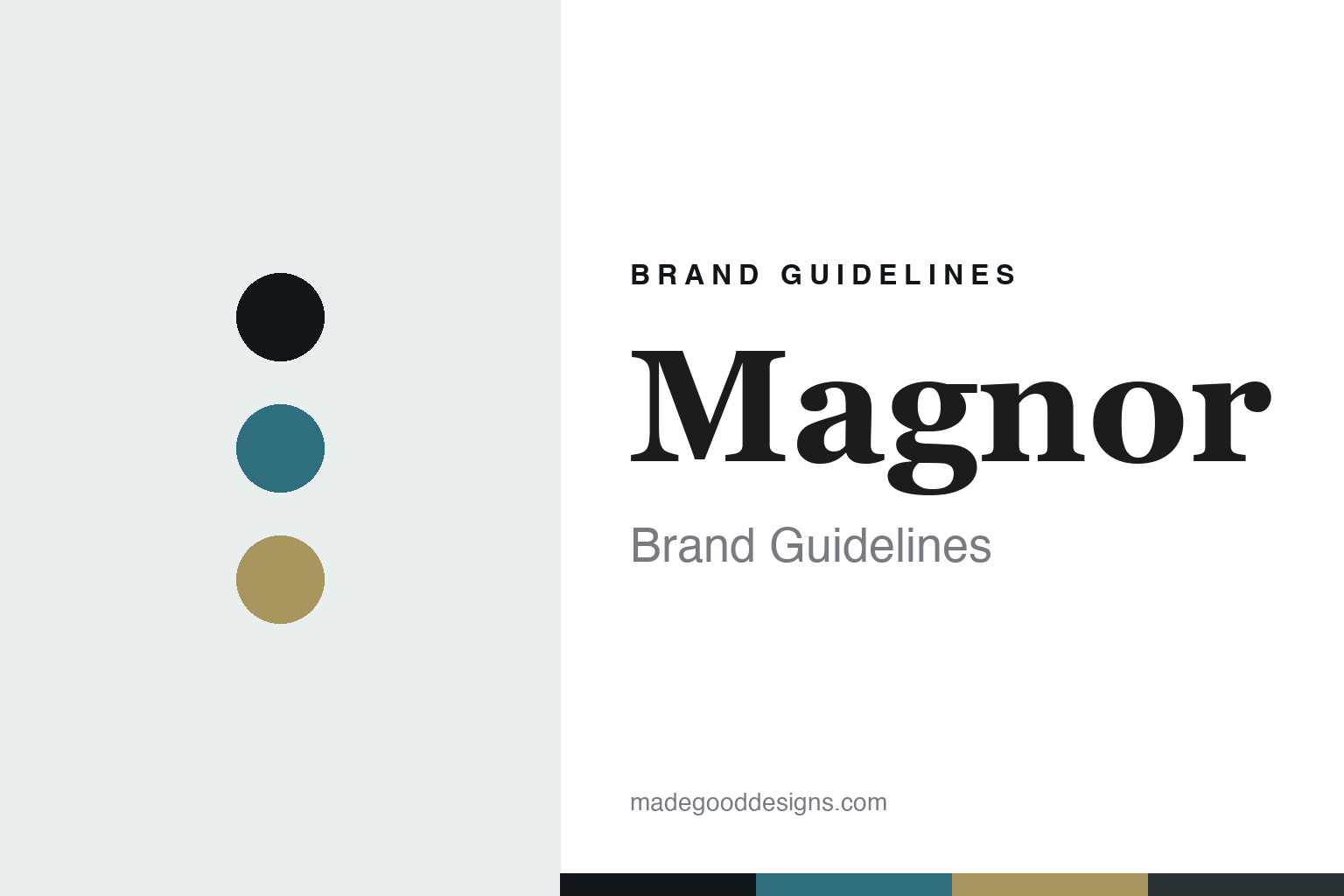
Magnor Brand Guidelines
The northern glassworks.
Aa
Two constants: a fjord-teal-and-gold palette and a refined serif register. Abstract homage — not a Magnor piece or wordmark.
The northern glassworks
Magnor has mouth-blown glass in a small Norwegian border town since 1896.
Magnor is a lesson in a place as the identity. A Norwegian glassworks in the small town of Magnor, near the Swedish border, it has mouth-blown glass and crystal for well over a century — a northern glasshouse still firing.
Its identity is the northern glassworks. Magnor’s mouth-blown glass and crystal tableware — made by hand in Norway, in heritage and contemporary designer collections — is the work it is known for. Glass from the north. The breath, still Norwegian.
(Honest notes: Magnor Glassverk is a Norwegian glassworks in the town of Magnor, in Eidskog municipality near the Swedish border, founded in 1896 — originally as a branch of the Swedish Eda/Geijersfors works, and restarted several times over its history; it marked 130 years in 2026, with hand glassblowing continuing on-site. Its signature is mouth-blown Norwegian glass and crystal — tableware and giftware, in heritage lines and two designer collections a year with figures such as Per Spook and Vebjørn Sand. On production, two honest nuances: the core hand-blown glass and crystal are genuinely made in Magnor, Norway — which the company openly acknowledges is costly — but the range also includes porcelain and other giftware that Norway does not produce industrially, so those lines are almost certainly imported; verify per product before assuming “made in Norway.” On ownership, it is not independent — it is owned by Home Brands AS, part of the Homeco group in Bryne, alongside brands like Modern House and Sabor. So we don’t call it “always independent,” and we don’t imply everything is Norway-made. Its designer collaborations and collection names are IP we describe but don’t reproduce. There’s no official brand hex — these tones are an unofficial interpretation. This is design commentary and does not promote any product.)
Colour
Magnor lives in a fjord-teal-and-gold palette. Click a swatch to copy the hex.
Magnor’s identity is northern, crafted and enduring — a fjord teal, an ink, a gold, a graphite, and a frost. The palette leans fjord teal and gold — the register of cool Nordic light and the warm gleam of hand-blown glass. It signals place and craft rather than novelty. The honest caveat: with no published brand hex, these tones are an original, unofficial interpretation, not first-party values.
The lesson is a fjord-teal-and-gold palette signals a northern glassworks. Magnor’s world is a northern, crafted, enduring object. For designers, it is a reminder that a place — a small Norwegian town keeping glassblowing alive — can be the whole identity, and that a cool, Nordic palette signals that origin. Because a mid teal can fail as small text, keep type dark and let the colour live in the accents, palette and band. The takeaways: keep the blowing local; commission designers; honour the place; and treat any single hex as unofficial.
Typography
The register is a refined serif — northern, crafted, enduring.
Magnor’s identity carries a northern, crafted, enduring spirit — a hand-blown, heritage object. A refined serif captures the mood: it is elegant and calm, the register of a heritage glasshouse. Set in a fjord-teal-and-gold palette, the refined serif feels northern and crafted — exactly the personality Magnor carries. It is enduring rather than trendy, mirroring mouth-blown Norwegian glass. (Magnor’s real pieces, collections and wordmark are works we describe but do not reproduce, and the exact typeface is not ours to use.) Because it is not ours to use, the honest description is “a refined serif spirit,” shown here in a stand-in. The type behaves like the brand: northern, crafted and enduring.
Aa
A refined serif spirit — northern and crafted. (Specimen set in Cormorant Garamond, a refined serif STAND-IN; NOT the Magnor wordmark.)
A place as identity
Magnor stands for the northern glassworks.
Magnor is a lesson in making a place the identity. A fjord-teal-and-gold palette, a refined serif and a mouth-blown glass make a northern glassworks the whole brand — northern, crafted, enduring. The place is the differentiator. The differentiator is origin: a small Norwegian town that has kept hand glassblowing alive for well over a century, at real cost.
Put to work, the identity is a place as design. A house building in this spirit would protect its core craft — keeping the glass genuinely mouth-blown on-site — while commissioning designers to keep the collections current, so the town’s tradition stays alive rather than merely remembered. The lesson Magnor teaches is that a place plus real craft can build a brand: a genuine origin, on-site glassblowing, and a refined, northern design language give it an authority a generic homeware label can’t claim. The place is the story, and the breath is the proof it is still real.
For designers and brand-builders, Magnor offers a clear takeaway: let a place and a craft carry the object. The lessons: keep the blowing local; commission designers; honour the place; and be honest about the story. It is also a reminder to stay accurate: Magnor is group-owned by Home Brands, not “always independent,” and while its glass and crystal are genuinely blown in Norway, its porcelain and giftware lines are almost certainly imported — the palette here is an unofficial interpretation. And it is a reminder that made-where honesty cuts both ways: the mouth-blown Norwegian glass is a genuine boast worth stating plainly, precisely because not everything in the range is Norway-made. Magnor made the northern glassworks the brand — proof that a place can be the difference.
Explore & save
Keep Magnor’s identity on hand — save it to a board in the Made Good inspiration library.
Magnor identity set
Pin the fjord-teal-and-gold palette and the refined-serif register to your own board.