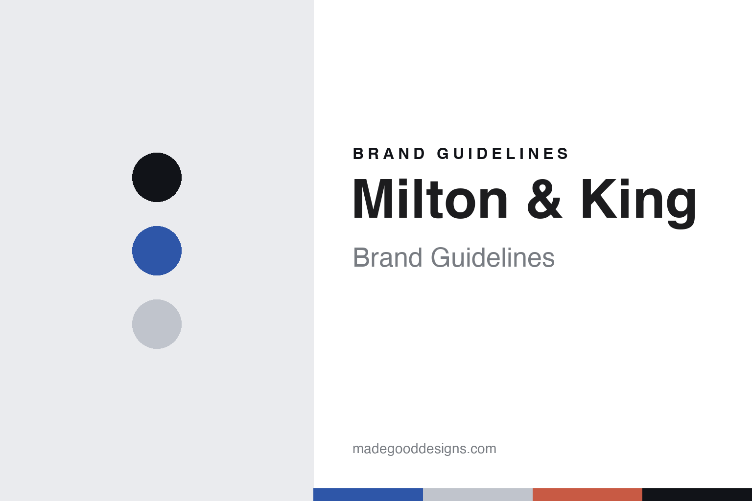
Milton & King Brand Guidelines
Printed where you are.
Aa
Two constants: a cobalt palette and a modern sans register. Abstract homage — not a Milton & King design or wordmark.
Printed where you are
Milton & King is an Australian-founded house that prints its wallpaper on demand, in the region you order from.
Milton & King is a lesson in honest geography as the story. An Australian-founded wallpaper house, it holds no backstock — it prints each order on demand, in the region you order from, so an American order is printed in Texas and an Australian order in Australia. A wallpaper, printed where you are.
Its identity is on-demand printing. Milton & King’s made-to-order designer wallpaper and murals, printed regionally, are the work it is known for. A method, made a signature. A brand that prints only what is bought.
(Honest notes, so the story stays precise. Milton & King was founded in 2012 in Brisbane by the brothers Richard and Bryce Capp — the name comes from their parents’ middle names, Milton and King, not from a “King” family. It is genuinely multi-country: a US base in Dallas, Texas, plus Australian operations and a UK creative studio. On where it is made we are precise: it prints on demand, with no backstock, so US orders are printed and shipped from Dallas — a large share of total production — and Australian orders are printed in Australia; we describe it as Australian-founded and printed regionally, never simply “made in Australia.” It should not be confused with the furniture brand King Living. Its designs are its IP, and there is no official brand hex — these tones are an unofficial interpretation. This is design commentary and does not promote any product.)
Colour
Milton & King lives in a cobalt palette. Click a swatch to copy the hex.
Milton & King’s identity is modern, confident and direct — a cobalt, an ink, a mist, a coral, and a chalk. The palette leans cobalt and coral: the register of a bold, contemporary, direct-to-customer maker. It signals confidence and clarity over convention. The honest caveat: with no published brand hex, these values are an original, unofficial interpretation, not first-party colours.
The lesson is a cobalt palette signals a modern, confident identity. Milton & King’s world is an on-demand, designer, contemporary object. For designers, it is a reminder that a strong cobalt and a warm coral can carry a brand built on a method — the cobalt of a bold modern voice and the coral of a friendly accent. Because these tones can fail as small text, keep type dark and let the colour live in the accents, palette and band. The takeaways: print on demand; make regionally; be direct; and treat any single hex as unofficial.
Typography
The register is a modern sans — clean, confident, direct.
Milton & King’s identity carries a clean, confident, direct spirit — a contemporary object, not a traditional one. A modern sans captures the mood: even, quirky and current, the register of a direct-to-customer wallpaper brand. Set in a cobalt palette, the modern sans feels clean and confident — exactly the personality Milton & King carries. It is direct rather than fussy, mirroring an on-demand, made-to-order model. (Milton & King’s real designs and wordmark are things we describe but do not reproduce, and the exact typeface is not ours to use.) Because it is not ours to use, the honest description is “a modern-sans spirit,” shown here in a stand-in. The type behaves like the maker: clean, confident and direct.
Aa
A modern-sans spirit — clean and confident. (Specimen set in Space Grotesk, a modern-sans STAND-IN; NOT the Milton & King wordmark or any wallpaper design.)
Honest geography as identity
Milton & King stands for printing where you are.
Milton & King is a lesson in making honest geography the story. A cobalt palette, a modern sans and on-demand murals make a print-where-you-are model the whole maker — modern, confident and direct. The geography is the differentiator. The differentiator is a genuine model — printing each order on demand in the region it is bought, so the answer to “where is it made” is honestly “near you,” not one fixed country.
Put to work, the identity is honest geography as design. A maker building in this spirit would print only what is ordered, place production close to the customer, and be plain that “where” depends on the market, so the customer buys into a responsive model rather than a false single origin. It would treat its regional printing as a feature, not a thing to hide. It would name its founders and the origin of its name accurately. The lesson Milton & King teaches is that honest geography can build a brand: the on-demand model gives it flexibility, and the honesty gives it credibility. The geography is the personality, and the model is the proof.
For designers and brand-builders, Milton & King offers a clear takeaway: print close to the customer, and say so. The lessons: print on demand; make regionally; be direct about where; and keep the story accurate. It is also a reminder to stay precise: Milton & King is an Australian-founded house started in 2012 by the Capp brothers, printing designer wallpaper on demand in the region you order from — with the palette here an unofficial interpretation. Milton & King made honest geography the maker — proof that “printed where you are” can be the difference.
Explore & save
Keep Milton & King’s identity on hand — save it to a board in the Made Good inspiration library.
Milton & King identity set
Pin the cobalt palette and the modern-sans register to your own board.


