Nando’s Brand Guidelines
A Johannesburg chicken takeaway that became a British high-street fixture.
Aa
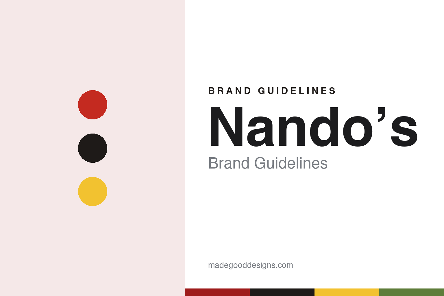
Two constants: a chilli red, ember black and sunflower palette and a hand-lettered register. Abstract homage — not a Nando’s product or mark; no rooster, logo or bottle is reproduced.
Chickenland
Two friends, a takeaway and a renamed shop in Johannesburg.
Nando’s began in 1987 in Rosettenville, a suburb in the south of Johannesburg. English Wikipedia says its founders were Fernando Duarte, who was born in Portugal, and Robert Brozin, who was born in South Africa. The pair ate at a Portuguese-Mozambican takeaway called Chickenland, liked its chicken with peri-peri, bought the business and renamed it. The Observer told the same story in May 2010, describing Duarte as a Portuguese national and Brozin as his friend. The name comes from Nando, a short form of Fernando.
Money and ownership came from a third figure. Dick Enthoven helped set up Nando’s in 1987 by giving the founders a start-up loan, Restaurant Online reported in November 2020. By 1989 there were three outlets in Johannesburg and one in Portugal, and in 1992 Capricorn Ventures International acquired the chain, according to English Wikipedia. The restaurants are owned by the Enthoven family through Yellowwoods, a holding company based in Luxembourg, the encyclopaedia and the 2020 report both say.
The business grew in several directions at once. English Wikipedia dates the first Australian restaurant to 1990, at Tuart Hill in Western Australia, and the first Canadian one to 1994. The Observer noted in 2010 that two restaurants had opened in Washington DC. By December 2024 the group’s key markets, besides the UK, included Australia, the US, Canada and India, while several countries in the Middle East and southern Africa were run by franchisees, Restaurant Online reported. Its global accounts are filed under Nando’s Group Holdings, and its British restaurants under a company still called Nando’s Chickenland Limited, the same report said: the original shop’s name survives in the paperwork.
Colour
Peri-peri, a rooster and rooms that do not match.
The product is narrow by design. Chicken is marinated in peri-peri sauce for 24 hours before it is flame-grilled, using a recipe based on the Portuguese galinha à africana way of barbecuing chicken, The Observer reported in 2010. Diners pick a cut (quarter, half, whole or wings) and a heat level, from lemon and herb through medium and hot to extra hot. The paper traced peri-peri to the piri-piri marinade made by Portuguese settlers in Africa with local chillies, and said Nando’s favoured chillies from Mozambique. Bottled sauces and marinades were already sold in British supermarkets in 2010, it added.
The mark draws on Portugal. English Wikipedia says the logo shows the Rooster of Barcelos, one of Portugal’s most common symbols, and The Observer described a “friendly red logo” and a neon Portuguese rooster in the window of a west London branch. The company’s own writing has a recognisable habit too: in April 2026 Restaurant Online reported a “PERi-Red” plaque and “PERi-PERi” sauce bottles, the brand’s spelling with lower-case i’s.
The rooms are the other half of the identity. English Wikipedia says the UK business worked with the branding and design agency Harrison, which advised designing each restaurant individually so that no two were the same. The Observer saw that in 2010: the South Bank branch had high, arched ceilings, King’s Cross had an outdoor space and Brixton was wide and low. Walls carry South African art that the company commissions, the paper said.
Service follows its own pattern. Guests order at the counter, staff bring the food and everyone at a table is served together, while customers fetch their own cutlery, drinks and sauces, The Observer reported. Diners can stay as long as they like, the paper added, and the moving about gives the rooms a busy, fluid feel.
Typography
British fast-casual chains.
Britain’s fast-casual and restaurant-group chains sit between the quick-service counter and the traditional sit-down restaurant. Many of them began as a single London room and grew into groups of dozens or hundreds of sites, and their identities are built as much from the room, the menu and the tone of voice as from a logo. Wagamama’s website, for example, describes its format through communal benches, open kitchens and food served in bowls as soon as it is ready.
The format often comes from somewhere else. Some chains borrow a setting from abroad — a Tokyo ramen bar, a Bombay Irani café, a street-food stall — and rebuild it for British high streets, shopping centres and railway stations. The restaurant guide Harden’s, writing in 2018, credited one such chain with popularising communal, canteen-style dining in Britain. Others are built around a single dish, such as a burger, a bowl of noodles or a plate of sushi, and keep the menu short enough to repeat across many sites.
Naming is usually plain and descriptive. Dishes are listed by what they are, sometimes in the language of the food’s home country, and restaurants are named after their street or district. Some groups give each site its own story or decorative theme; others keep every branch close to a single template so that a guest knows what to expect anywhere in the estate.
Ownership is part of the story. Founders often appear on the companies’ own pages, while trade titles such as Restaurant Online record the private-equity owners, listed groups, takeovers and restructurings that follow. This guide sets out what can be checked about each brand — who founded it, who owns it, and where it trades — and marks clearly what rests only on the company’s own word.
Aa
A loose, hand-lettered script with a market-stall feel. (Specimen set in Kalam, a handwriting STAND-IN; NOT the Nando’s logo or typeface.)
Britain since 1992
From two west London takeaways to 500 restaurants.
Nando’s reached Britain in 1992, with restaurants in the west London suburbs of Ealing and Earls Court, English Wikipedia says; Restaurant Online named Ealing as the first in April 2026. The early UK business focused on takeaway food and struggled, according to the encyclopaedia, until Dick Enthoven put his son Robby Enthoven in charge; Restaurant Online reported in 2020 that he joined the board in 1993. The model then shifted to the mixed counter-and-table service described above.
That shift shaped the British brand. In South Africa Nando’s was seen more as a takeaway, The Observer reported in 2010, and it was only when the UK business put its restaurants first that the brand took off there; by then around four-fifths of its food was eaten in. The paper counted 220 UK restaurants in May 2010 and noted that the chain had almost no advertising presence in Britain, relying on prime sites and word of mouth, in contrast to its television advertising in South Africa and Australia.
The estate kept growing. Restaurant Online put the UK operation at more than 300 restaurants in November 2020. In April 2026 the title reported that Nando’s UK & Ireland had opened its 500th restaurant, a 72-cover site in Leatherhead, Surrey: 427 in England, 35 in Scotland, 14 in Wales, 11 in Northern Ireland and 13 in the Republic of Ireland. The same report said the business employed more than 20,000 people, whom it calls Nandocas. In November 2020 the Enthoven family’s Yellowwoods also took a majority stake in Wahaca, the London Mexican chain, Restaurant Online reported.
For a design guide, Nando’s shows how a chain can keep one tight product and one borrowed national symbol while letting every room look different, so that the brand reads as consistent without its restaurants being identical. Compare Wahaca, its sister business under the same owner, and KFC, another chicken chain with a long-running mark. For this guide we use chilli red, ember black and sunflower with a hand-lettered script, an unofficial interpretation; no product or logo is reproduced.
Explore & save
Keep Nando’s’s identity on hand — save it to a board in the Made Good inspiration library.
Nando’s identity set
Pin the Nando’s chilli red, ember black and sunflower palette and the hand-lettered register to your own board.