Nesmuk Brand Guidelines
The luxury knife of Solingen.
Aa
Two constants: a gold palette and a luxe-serif register. Abstract homage — not a Nesmuk blade, finish or wordmark.
The luxury knife of Solingen
Nesmuk is a modern Solingen house making ultra-thin, high-end kitchen knives by hand in Germany.
Nesmuk is a lesson in the luxury object as the identity. A modern Solingen house, it makes some of the most exclusive kitchen knives in the world — extremely thin blades, black diamond-like-carbon finishes, Damascus and one-off pieces, at prices from the hundreds into the thousands of euros. Its answer to how a modern independent knife is made is a luxury one: apply obsessive hand-work and rare materials to a kitchen knife and position it as a collector’s object. A knife made to be the most, not the many.
Its identity is the modern maker at the luxury apex. Nesmuk’s thinness, its black DLC blades and its Solingen hand-work are the work it is known for. An extreme, made a signature. A house that treats a chef’s knife like haute horlogerie.
(Honest notes, so the story stays precise. Nesmuk is a modern, independent Solingen maker — the safest framing, since the commonly cited 2008 founding and a named founder are not confirmed on its own pages, though its own “ten years in Solingen” messaging supports a twenty-first-century founding. It is 100 per cent handmade in Solingen, Germany. Its lines include the ultra-thin high-carbon Soul, the black diamond-like-carbon (DLC) Janus, Damascus, and one-off Unikate, with prices roughly from four hundred to several thousand euros. Its “most exclusive in the world” framing is the brand’s own positioning, which we report as a claim rather than a fact. The name echoes “Nessmuk,” the pen name of the nineteenth-century American outdoorsman George Washington Sears — the brand spells it with one “s” — which we present as an evocative reference rather than a documented company statement. Its designs and marks are its IP, described but never reproduced, and there is no official brand hex — these tones are an unofficial interpretation. This is design commentary and does not promote any product.)
Colour
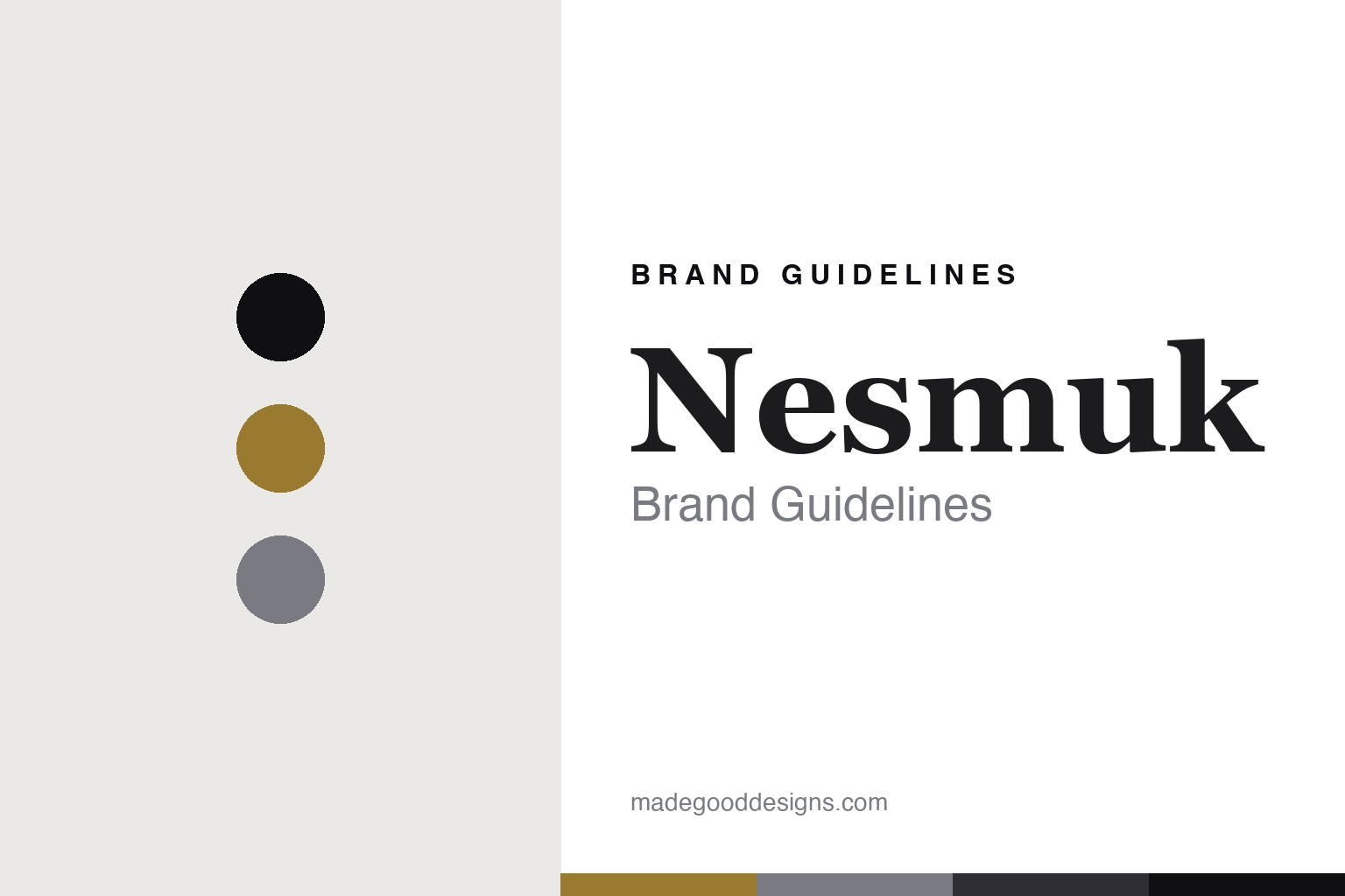
Nesmuk lives in a gold-and-onyx palette. Click a swatch to copy the hex.
Nesmuk’s identity is exclusive, dark and precise — a gold, an ink, a steel, an onyx, and a chalk. The palette leans gold and onyx: the register of a black-bladed knife and a gilded, collectible object. It signals luxury and rarity over everyday use. The honest caveat: with no published brand hex, these values are an original, unofficial interpretation, not first-party colours.
The lesson is a gold-and-onyx palette signals a luxury, made-in-Solingen identity. Nesmuk’s world is an ultra-thin, black-DLC, made-in-Germany collector’s object. For designers, it is a reminder that a restrained gold and a deep onyx can carry a brand built on the apex of a category — the gold of an exclusive object and the black of a diamond-like blade. Because these tones can fail as small text, keep type dark and let the colour live in the accents, palette and band. The takeaways: pursue the apex; keep the hand-work at home; frame superlatives as your own claims; and treat any single hex as unofficial.
Typography
The register is a luxe serif — refined, high-contrast, exclusive.
Nesmuk’s identity carries a refined, high-contrast, exclusive spirit — a luxury object, not an everyday tool. A luxe serif captures the mood: elegant, precise and rarefied, the register of a collector’s piece. Set in a gold-and-onyx palette, the luxe serif feels refined and high-contrast — exactly the personality Nesmuk carries. It is exclusive rather than utilitarian, mirroring an ultra-thin, high-end blade. (Nesmuk’s real designs and marks are things we describe but do not reproduce, and the exact typeface is not ours to use.) Because it is not ours to use, the honest description is “a luxe-serif spirit,” shown here in a stand-in. The type behaves like the maker: refined, high-contrast and exclusive.
Aa
A luxe-serif spirit — refined and exclusive. (Specimen set in EB Garamond, a luxe-serif STAND-IN; NOT the Nesmuk wordmark or any blade design.)
The new bladesmiths
Nesmuk stands for the luxury apex.
Nesmuk is a lesson in making the luxury apex the identity. A gold-and-onyx palette, a luxe serif and an ultra-thin black blade make one thing — a kitchen knife made as a collector’s object — the whole maker: exclusive, dark and precise. The apex position is the differentiator. The differentiator is deliberate extremity: the thinnest blade, the rarest finish, the highest price, so the knife competes on exclusivity rather than value.
Put to work, the identity is luxury as design. A maker building in this spirit would push a familiar object to an extreme of material and finish, keep the hand-work at home to justify the price, and be honest that “the most exclusive” is a positioning, not a proven fact. It would treat rarity and one-off pieces as the point. A brand learning from it would make sure the object can actually cut, not merely impress, so the luxury rests on real performance rather than only on price and finish. It would say plainly it is handmade in Solingen. A brand learning from it would remember that the apex is a lonely, demanding place: once you claim to be the most, every piece has to justify it, and a single ordinary knife undermines the whole position. Extremity, in other words, is a promise that has to be kept with every piece that leaves the workshop. The lesson Nesmuk teaches is that the apex can build a brand: the extremity gives it distinction, and the Solingen hand-work gives it substance. The luxury is the personality, and the ultra-thin blade is the proof.
For designers and brand-builders, Nesmuk holds the luxury pole in this round about the new bladesmiths: push the object to an extreme, and back the price with real hand-work. The lessons: pursue the apex; keep the making home; own your superlatives as claims; and never reproduce a protected design. It is also a reminder to stay precise: Nesmuk is a modern, independent Solingen house making ultra-thin, high-end knives by hand in Germany — with its founding framed as modern rather than pinned to an unverified year, and the palette here an unofficial interpretation. Nesmuk made the luxury apex the maker — proof that extremity can be the difference.
Explore & save
Keep Nesmuk’s identity on hand — save it to a board in the Made Good inspiration library.
Nesmuk identity set
Pin the gold-and-onyx palette and the luxe-serif register to your own board.