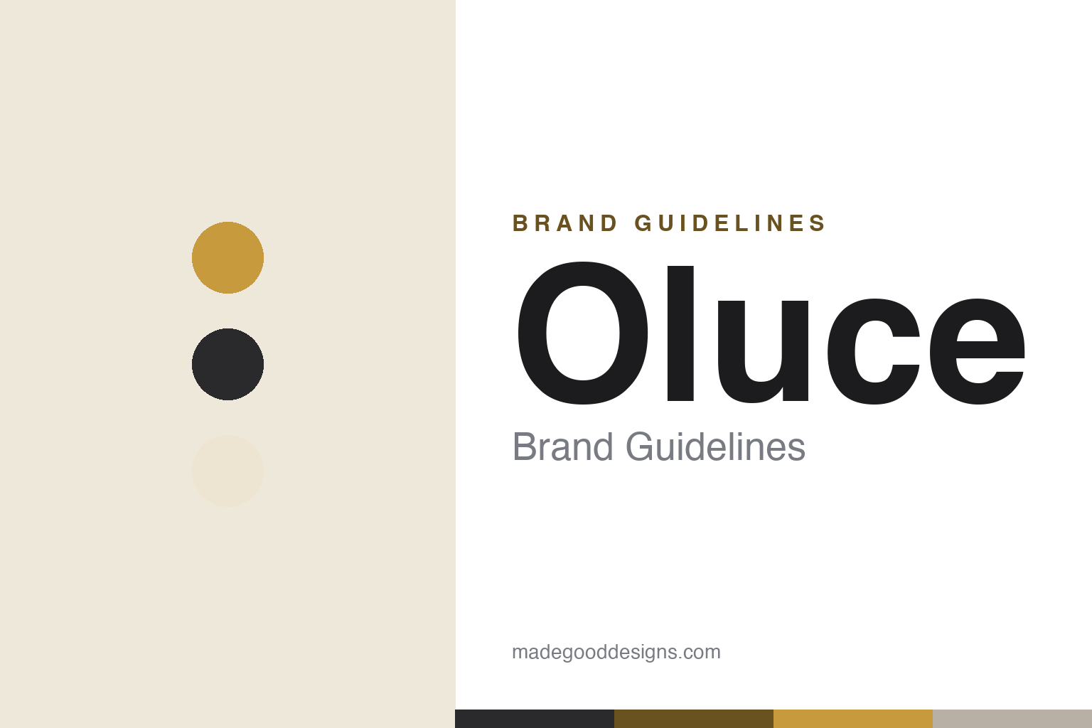
Oluce Brand Guidelines
Italy’s design-lighting heritage — Magistretti’s Atollo, and Joe Colombo’s radical lamps.
Aa
Two constants: a warm gold-and-opaline palette and a clean geometric sans. Abstract homage — not the Oluce wordmark.
The lamp as archetype
Oluce made the lamp iconic.
Oluce is a lesson in turning a lamp into an archetype. The Italian house was founded in 1945 by Giuseppe Ostuni — and it describes itself as the oldest Italian design-lighting company still in operation (an honest note: that “oldest” line is a widely-repeated brand self-description, not an independently audited record). Its international breakthrough came with the Luminator lamp at the 1951 Milan Triennale. (Two more honest notes: no official brand hex is published, and the wordmark typeface is undocumented.)
Its icon is a piece of pure geometry. The Atollo by Vico Magistretti — designed 1977, winner of the Compasso d’Oro in 1979 — reduces a table lamp to a cylinder, a cone and a hemisphere, an “archetypal” form so elemental it became one of the most recognisable lamps ever made. (A precise note worth getting right: the design is 1977, the award is 1979 — don’t conflate them.)
Before Atollo, Oluce was the laboratory of the radical designer Joe Colombo (often with his brother Gianni). His lamps for Oluce are landmarks: the Spider (1965), which won Oluce’s first Compasso d’Oro in 1967; the Coupé (1967), a piece of which sits in MoMA; and the perspex Acrilica (model 281). Oluce also worked with Marco Zanuso (the 275 lamp) and, today, Nendo, Toshiyuki Kita and others. On ownership, a precise fact: Oluce passed from Ostuni to the Verderi family around the 1970s, and remains family-led, based in the Milan area (San Donato Milanese). The lamp as archetype.
Colour
Oluce lives in a warm gold-and-opaline palette. Click a swatch to copy the hex.
Oluce’s identity leans on warm, elemental, Italian tones — the opaline white of a lamp diffuser, the brass-gold of the Atollo, deep charcoal and warm neutral greys. The palette reads as timeless and refined: the colours of classic Italian design-lighting, warm and calm, letting the archetypal forms speak. It’s a considered, heritage-modern world that signals craft, permanence and quiet confidence. It’s a warm palette that signals timelessness, craft and Italian design. The honest caveat: Oluce publishes no official brand hex, so the gold, opaline and charcoal here are an original, unofficial interpretation of its lamps, not first-party values.
The lesson is a warm, elemental palette signals timelessness. Oluce’s gold-and-opaline world reads as refined and enduring. For designers, it’s a reminder that a restrained, material-led palette can express permanence — the look of objects meant to last decades. The takeaways: use warm, elemental tones for timelessness; let iconic form lead; and treat specific hexes as unofficial when there’s no published spec.
Typography
The wordmark is a clean geometric sans — elemental and modern.
Oluce’s identity carries a clean, elemental, modern spirit — an “oluce” wordmark whose even, geometric letterforms read as timeless and Italian. A geometric sans captures the mood: it’s pure and confident, matching a house whose masterpiece reduces a lamp to a cylinder, cone and hemisphere. Set against a warm gold-and-opaline palette, the type feels elemental and refined — exactly the archetypal, heritage-modern personality Oluce cultivates from Atollo to Joe Colombo’s radical lamps. It’s clean and geometric rather than decorative or fussy, mirroring objects reduced to their essential forms. Because the exact wordmark face isn’t publicly documented, the honest description is “a geometric sans spirit,” not a named font. The type behaves like the brand: clean, elemental and modern.
Aa
A geometric sans spirit — elemental and modern. (Specimen set in Figtree, a clean geometric sans in the spirit of the Oluce identity; the real face is undocumented.)
The archetype as the difference
Oluce reduced the lamp to essentials.
Oluce is a lesson in designing the essential form. Where many lamps chase novelty, Oluce’s enduring differentiator — crystallised in Magistretti’s Atollo — is reduction to an archetype: a cylinder, a cone, a hemisphere, so elemental that the object stops looking like a product of its decade and starts looking like the Platonic idea of a table lamp. That pursuit of the essential runs through the house, from Joe Colombo’s radical, forward-looking Spider and Coupé to today’s restrained collaborations. It’s why Oluce’s icons don’t date: an archetype has no era. Backed by a long heritage (from 1945) and museum recognition (Coupé at MoMA), it makes Oluce a house that competes on timelessness rather than trend. The lesson is that reducing a thing to its essential form can produce something more lasting than any styling. Anyone can restyle a lamp; Magistretti found its archetype. Reduce to essentials, and the object outlives its era. Design the idea of the thing.
For designers and brand-builders, Oluce offers a clear takeaway: the pursuit of the essential can be a durable identity. The lessons: reduce to archetypal form (Atollo’s cylinder-cone-hemisphere); back radical talent early (Joe Colombo); and keep the facts precise — Oluce was founded in 1945 by Giuseppe Ostuni, the Atollo is Magistretti’s 1977 design (Compasso d’Oro 1979), and the house passed to the Verderi family. It’s also a reminder to keep it honest: the “oldest Italian lighting company” line is a self-description, and no official brand hex or typeface is published, so the palette and type here are an interpretation. Oluce reduced the lamp to essentials — proof that the archetype can be the difference.
Explore & save
Keep Oluce’s identity on hand — save it to a board in the Made Good inspiration library.
Oluce identity set
Pin the warm palette and the geometric-sans spirit to your own board.


