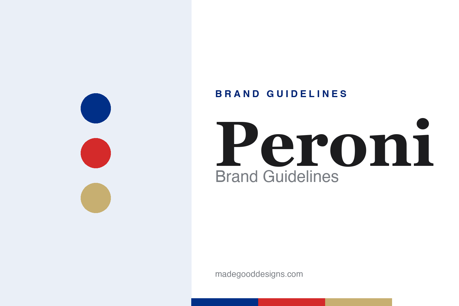
Peroni Brand Guidelines
A blue ribbon, a heritage crest and la dolce vita — Italian lager styled for the export shelf.
Aa
Two constants: a blue-and-gold palette and a mid-century serif. Abstract homage — not the Peroni crest, ribbon or wordmark.
The blue ribbon
Peroni Nastro Azzurro sells Italian style — and names itself after a speed record.
Peroni’s premium export brand is Nastro Azzurro — Italian for “Blue Ribbon” — and the identity is built around a blue ribbon device, a heritage crest/shield carrying the 1846 founding date (and an alchemy-style symbol from the original Birra Peroni bottles), and a gold-bordered wordmark. The “Peroni” lettering is a custom typeface — not in any public font library — drawing on mid-century Italian advertising styling (older versions used a serif face); treat any specific font attribution as unverified. One honest caveat on the marks: a 2024 packaging redesign (agency Smith & Lumen) reworked the identity and removed the blue ribbon from the main pack, so “a blue ribbon on every bottle” is now dated.
The naming story is the good one, and it’s confirmed: Nastro Azzurro is named after the “Blue Riband” (in Italian, Nastro Azzurro) — the transatlantic speed record won by the Italian ocean liner SS Rex in 1933 — lending the beer an association with Italian speed, engineering and glamour. The company itself was founded in 1846 by Francesco Peroni in Vigevano (Lombardy) and later moved to Rome in 1864 under his son Giovanni Peroni (so it was founded in Vigevano, not Rome); the Nastro Azzurro lager launched in 1963. Positioning has always leaned on “Italian style” and la dolce vita, with premium export imagery and long-running ties to Italian fashion and design. On ownership, the key fact: Peroni is now owned by Japan’s Asahi Group Holdings — when AB InBev acquired SABMiller in 2016, it divested Peroni (with Grolsch and Meantime) to Asahi, so Peroni is not an AB InBev or SABMiller brand today.
Colour
Peroni runs on Italian blue and gold. Click a swatch to copy the hex.
The palette is blue and gold, with red and white completing an Italian, tricolour-adjacent scheme. The blue is the star — the “Nastro Azzurro” blue ribbon — reading as premium, sophisticated and distinctly Italian; gold adds a note of quality and export prestige; red and white supply the national colour cues. It’s a palette designed to look stylish and continental on a shelf far from Italy, supporting Peroni’s premium-import positioning. The honest caveat: Peroni publishes no official public brand hex; the values in circulation (a cobalt near #002374, a red around #E42849, a gold near #C7AF71) come from design blogs, not brand guidelines, so treat them as approximate. Blue-and-gold is the ownable core; the Italian cues do the rest.
The lesson is colour as a passport. Peroni’s blue-and-gold, with its Italian cues, signals “stylish Italian import” instantly — colour used to sell an origin and a lifestyle, not just a name. For designers working on export or premium-positioned brands, it’s a reminder that a palette can communicate provenance and aspiration: the right blue and gold say “sophisticated, continental, premium” before any copy is read. The takeaways: use colour to reinforce the origin story and positioning you’re selling; keep an ownable core (the blue ribbon blue) even as national cues support it; and present specific hexes as approximate whenever the official spec isn’t public.
Typography
The wordmark is a mid-century serif — Italian advertising, distilled.
Peroni’s custom wordmark draws on mid-century Italian advertising — a refined, slightly retro serif styling that evokes the glamour of post-war Italy, la dolce vita and classic export design. That heritage feel is deliberate: it positions Peroni as a stylish, authentically Italian import with real history behind it (the 1846 founding, the crest, the alchemy symbol from the original bottles). Because the lettering is bespoke rather than a downloadable font, it stays distinctive and ownable, part of the premium package. (Since it’s custom, the honest description is “a mid-century-style serif,” not a named typeface — spotter guesses are unverified.) The type behaves like the brand: elegant, continental and quietly confident about where it comes from.
Aa
A refined, mid-century serif — Italian and elegant. (Specimen set in Cormorant Garamond, a serif in the spirit of Peroni’s wordmark styling; the real lettering is custom.)
Style as the story
Peroni exported Italian style — and named it after a record-breaking ship.
Peroni is a study in selling an origin and a lifestyle. The blue ribbon, the heritage crest, the mid-century serif and the blue-and-gold palette all package a lager as Italian style — la dolce vita, design, fashion and glamour — which is exactly how a domestic Italian beer became a global premium import. The Nastro Azzurro / SS Rex story ties the brand to Italian speed and engineering prestige; the fashion and design sponsorships keep it culturally continental; and the 1846 heritage lends authenticity. It’s a brand whose real product is a feeling of Italian sophistication, delivered through consistent visual and cultural cues.
For designers, Peroni offers a clear lesson: a strong, consistent lifestyle and origin story can elevate an everyday product into a premium one. The takeaways: identify the cultural association your brand can credibly own (here, Italian style) and express it through palette, type, imagery and partnerships; anchor it in genuine heritage (a real founding date, a real naming story) rather than invented glamour; and keep the cues consistent so “Italian sophistication” becomes shorthand for the brand. It’s also a reminder to keep your facts current and correct: Peroni was founded in Vigevano (not Rome), Nastro Azzurro launched in 1963, the SS Rex naming is real, the 2024 redesign changed the packaging, and the brand is Asahi-owned today. Peroni turned Italian style — and a speed record — into one of the world’s most successful premium import lagers.
Explore & save
Keep Peroni’s identity on hand — save it to a board in the Made Good inspiration library.
Peroni identity set
Pin the blue-and-gold palette and the type spirit to your own board.


