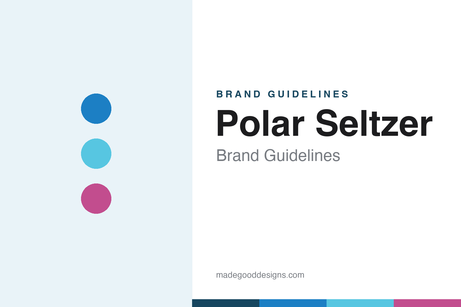
Polar Seltzer Brand Guidelines
Family made since 1882.
Aa
Two constants: a clean, cool palette with playful flavour colour, and a friendly geometric wordmark. Abstract homage — not the Polar wordmark, bear or can art.
The 140-year seltzer
Polar is old, independent, and quietly beloved.
Polar Seltzer is a lesson in heritage that stays playful. Made by Polar Beverages of Worcester, Massachusetts — founded in 1882 by Dennis M. Crowley and still independently owned by the Crowley family, now into a fourth generation — it is one of the largest independent soft-drink bottlers in the US. Its seltzer is a simple, unsweetened sparkling water: no sugar, no sweeteners, no sodium, no caffeine, summed up as “just water, bubbles, and great taste.”
What made a 140-year-old regional brand nationally famous is the opposite of simple: its cult limited-edition flavours. The whimsical “Impossibly Good” collection — mythical “mystery” flavours like Unicorn Kisses, Mermaid Songs, Dragon Whispers and Yeti Mischief, sold in small “SeltzerJr” cans — plus rotating seasonal summer and winter packs, turned Polar into something fans hunt, trade and review online.
(Honest notes: this is the Massachusetts company Polar Beverages — not the unrelated Empresas Polar of Venezuela; the seltzer is genuinely unsweetened, unlike some sweetened rivals; “Impossibly Good” is the name of the flavour collection, while the brand’s line is “Family Made Since 1882”; and no official brand hex is published.)
Colour
Polar lives in a cool base with playful flavour colour. Click a swatch to copy the hex.
Polar’s identity is clean, cool and quietly playful — a Polar blue, an arctic cyan, a flavour berry, a snow white, and an ink. The base is icy and calm, matching the “Polar” name, while the limited-edition flavours bring in bright, whimsical colour and collectible artwork. It signals a trustworthy, refreshing everyday seltzer that still knows how to have fun. The honest caveat: with no published brand hex, these tones are an original, unofficial interpretation, not first-party values.
The lesson is a calm base lets special editions pop. Polar’s everyday world is cool and clean; its seasonal drops are where the colour and character come out. For designers, it is a reminder that a restrained core identity gives limited runs room to be loud and collectible without breaking the brand. The takeaways: keep the core palette cool and consistent; save vivid, illustrative colour for special editions; and treat any single hex as unofficial — using a deep polar navy for small text so the cool blues stay clean.
Typography
The wordmark spirit is a friendly geometric sans — clean and approachable.
Polar’s identity carries a clean, friendly, heritage-yet-fun spirit — a bold “POLAR” wordmark and a long-standing polar-bear icon, paired with whimsical, illustrative flavour art. A friendly geometric sans captures the mood: it is clear and approachable, the register of a trusted family bottler that still names a flavour “Unicorn Kisses.” Set against cool blues and playful accents, the clean type feels dependable and warm — exactly the everyday-but-charming personality Polar carries. It is approachable rather than luxurious, mirroring a can you keep by the case. (Polar’s real wordmark, the bear device and the coined flavour names are trademarks and trade dress we describe but do not reproduce, and the exact typeface is not something we assert.) Because the specific mark is not ours to use, the honest description is “a friendly geometric spirit,” not the Polar logo. The type behaves like the brand: clean, friendly and quietly fun.
Aa
A friendly geometric spirit — clean and approachable. (Specimen set in Poppins, a geometric sans; NOT the Polar logo, which is a trademark.)
Staying culturally current for 140 years
Polar stands for old-and-new at once.
Polar Seltzer is a lesson in keeping a heritage brand young. A family bottler founded in 1882 could easily read as dated; instead Polar stays culturally current by pairing a dependable, unsweetened core product with a steady stream of collectible, whimsically named limited editions. Scarcity plus imagination — a “Yeti Mischief” you can only get for a while — gives an everyday seltzer the energy of a drop. The differentiator is playful reinvention on a stable base.
For designers and brand-builders, Polar offers a clear takeaway: heritage and novelty can reinforce each other. The lessons: keep the core identity calm, trusted and consistent; use limited editions as the place to experiment with colour, illustration and voice; and lean on genuine longevity (“Family Made Since 1882”) as credibility. It is also a reminder to stay accurate: this is the Massachusetts Polar Beverages, the seltzer is unsweetened, and “Impossibly Good” is a flavour collection rather than a corporate slogan — with the palette here an unofficial interpretation. Polar stayed itself and stayed surprising — proof that heritage can still feel fresh.
Explore & save
Keep Polar Seltzer’s identity on hand — save it to a board in the Made Good inspiration library.
Polar Seltzer identity set
Pin the cool base palette, the flavour brights and the friendly geometric spirit to your own board.


