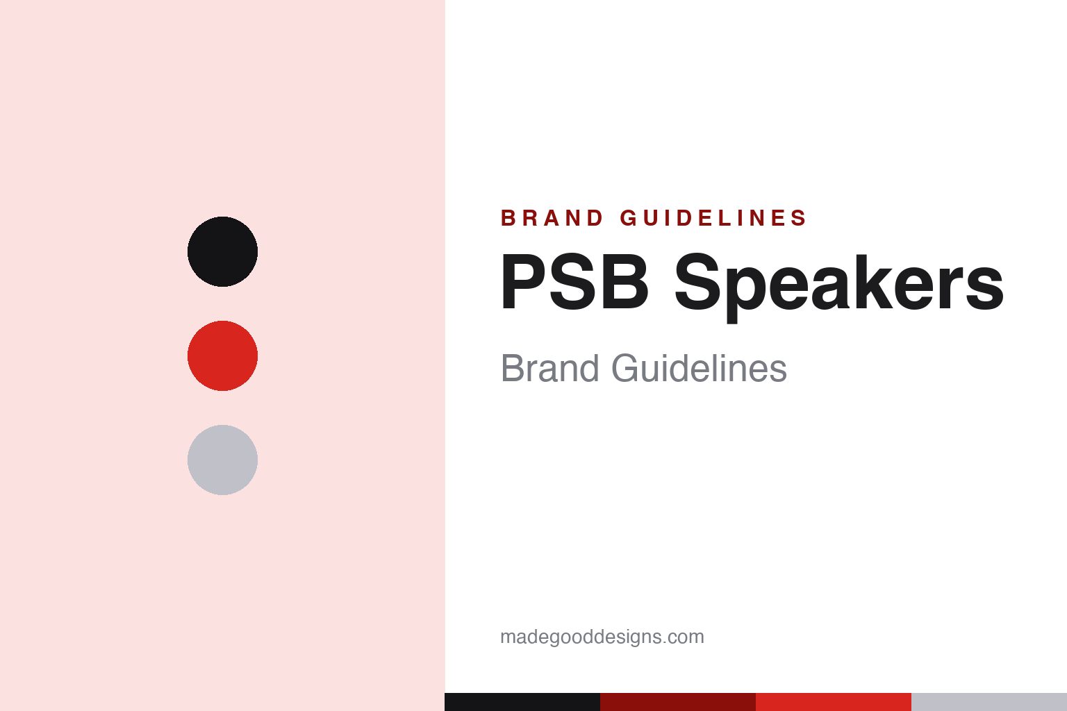
PSB Speakers Brand Guidelines
Canadian loudspeakers voiced in a government science lab — research-driven ‘True to Nature’ sound since 1972.
Aa
Two constants: a red-and-black palette (with silver) and a neutral sans. Abstract homage — not the PSB wordmark.
Voiced by science
PSB designs speakers by research.
PSB Speakers is a lesson in research-driven design as a brand identity. It was founded in 1972 by Canadian speaker designer Paul Barton, who began by building and selling affordable speaker kits (initially to university students). The name has a lovely origin: “PSB” stands for Paul and Sue Barton — Sue being his wife, high-school sweetheart and business partner of 50+ years. So the brand name literally encodes a marriage. (Honest caveats: no official brand hex is published — the red below is observed — and the wordmark typeface is undocumented.)
PSB’s defining practice is science-based, measurement-driven design. Paul Barton has a decades-long association with Canada’s National Research Council (NRC) in Ottawa, and PSB voices and measures its speakers in the NRC’s anechoic chambers. In 1974 Barton met the NRC psychoacoustician Floyd Toole, whose (and later Sean Olive’s) listener-preference research became the science behind the accurate, neutral “Canadian sound.” (Honest framing: Barton collaborated with and drew on that research — the landmark preference science matured over the following decades — rather than inventing it.) PSB sums up its goal as “True to Nature.”
PSB’s ranges span value to high-end — the Alpha, Imagine and flagship Synchrony series. On ownership: PSB is owned by Lenbrook (Pickering, Ontario), making it a sister brand to NAD and Bluesound — and remarkably, founder Paul Barton still serves as chief acoustics designer more than five decades on, a rare case of founder continuity in consumer audio. The identity is understated and confident — a bold “PSB” wordmark, black-and-white with a red accent. Speakers voiced by science.
Colour
PSB lives in red and black. Click a swatch to copy the hex.
PSB’s identity uses a confident red against black and white (with silver). The red reads as bold, purposeful and human — a warm accent that gives an engineering-led brand some energy and recognisability — while the black-and-white keeps it serious and understated, matching a company whose reputation rests on measurement, research and accurate sound. It’s a clean, purposeful scheme that signals substance and a science-first approach rather than flash, fitting the “True to Nature” philosophy. The red-and-black feels grounded and confident. The honest caveat: PSB publishes no official brand hex — the red, black and silver here are observed approximations, not first-party values.
The lesson is a confident accent over a serious base for a research brand. PSB’s red-and-black reads as substantive and purposeful, matching a measurement-driven ethos. For designers, it’s a reminder that an engineering brand can add a warm accent for humanity and recognisability. The takeaways: pair a confident accent with a serious base (red on black); let the research and accuracy lead; and treat specific colours as approximate when no official spec is published.
Typography
The wordmark is a neutral sans — precise and understated.
PSB’s bold, neutral “PSB” sans wordmark is precise and understated. The even, clean letterforms read as engineering-led, confident and no-nonsense, matching a brand built on measurement and NRC research rather than styling, and the restraint keeps the focus on the science and the accurate sound. Set in black-and-white with a red accent, the type feels grounded and trustworthy — exactly the “True to Nature,” research-first personality PSB cultivates. It’s neutral and precise rather than decorative, mirroring the measurement-driven, accuracy-focused design philosophy. Because the exact face is undocumented, the honest description is “a neutral sans,” not a named font. The type behaves like the brand: precise, understated and engineering-led.
Aa
A neutral sans — precise and understated. (Specimen set in Golos Text, a neutral sans in the spirit of the PSB wordmark; the real face is undocumented.)
Science as the brand
PSB lets research lead.
PSB is a lesson in science and research as an ownable brand identity. In a category full of subjective claims, PSB built its reputation on something rare and credible: measurement-driven design, voicing speakers in a government science lab (the NRC’s anechoic chambers) and grounding its “accurate sound” in decades of psychoacoustic listener-preference research. That research-first identity — “True to Nature” — is a genuine, defensible differentiator: it earns trust with buyers who value accuracy over marketing, and it’s backed by real, verifiable practice (the NRC connection, the Toole/Olive tradition). Add the human touch (the Paul + Sue Barton name, the founder still designing after 50+ years) and the family context (sister to NAD and Bluesound under Lenbrook), and you have a brand with both scientific credibility and a warm story. It’s proof that grounding a brand in genuine science — and doing it consistently for decades — can be a durable, ownable identity. Let the research lead.
For designers and brand-builders, PSB offers a clear takeaway: grounding a brand in genuine, verifiable science can be a durable, ownable identity. The lessons: build on real research and measurement (the NRC chambers, the preference-research tradition); own a clear philosophy (“True to Nature,” accurate sound); and add a human story (the Paul + Sue Barton name, founder continuity). It’s also a reminder to keep the facts precise — PSB was founded in 1972 by Paul Barton (the name = Paul + Sue Barton), voices speakers in Canada’s NRC anechoic chambers, follows a research-based “True to Nature” philosophy, and is a Lenbrook sister brand to NAD and Bluesound. PSB lets research lead — proof that science can be a brand.
Explore & save
Keep PSB Speakers’s identity on hand — save it to a board in the Made Good inspiration library.
PSB Speakers identity set
Pin the red-and-black palette and the neutral-sans spirit to your own board.


