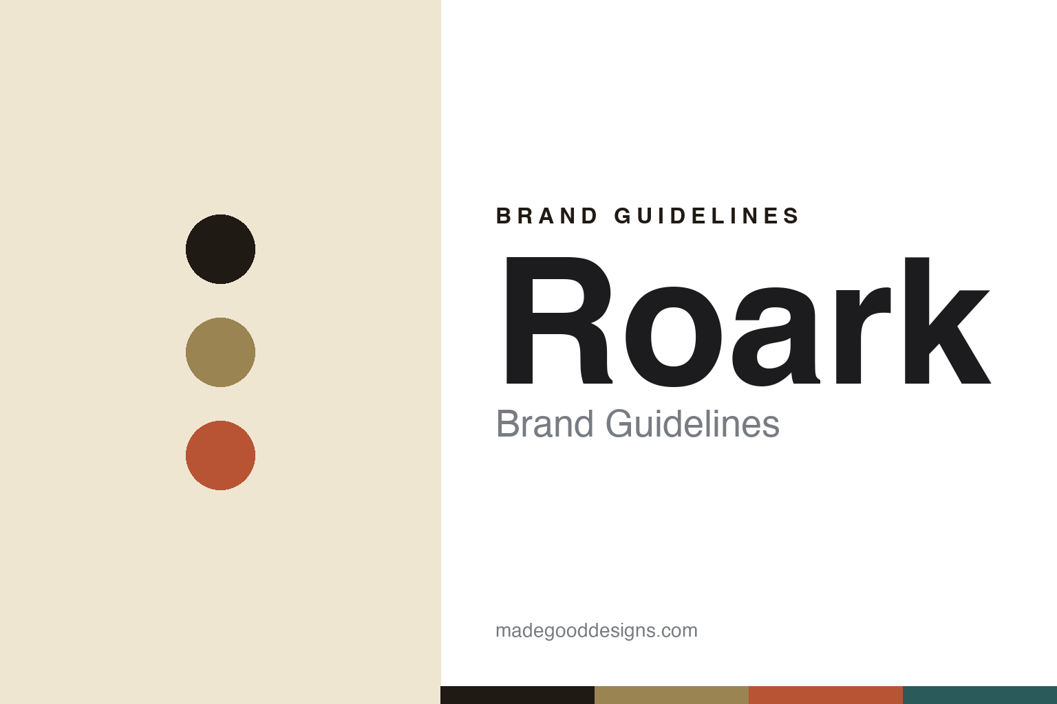
Roark Brand Guidelines
Run amok.
Aa
Two constants: an expedition palette and an expedition slab register. Abstract homage — not the Roark wordmark or logo.
Run amok
Roark tells stories born of adventure.
Roark is a lesson in storytelling as a brand. Founded around 2011 in Southern California, the independent label builds “travel-tailored gear” around a mythic, ever-wandering figure named Roark, whose travels inspire each collection — “authentic stories born of adventure and discovery.”
Its brand identity is adventurous, story-driven and rugged — expedition-ready gear tested across surf, run, hike and skate, with wanderlust graphic prints. Its Run Amok line is the running and trail expression of the brand, for the go-forth-and-explore runner who won’t sacrifice performance for a good-looking kit.
(Honest notes: it’s a Southern California brand and presents as independent — it is not owned by La Jolla Group. The founder and year (reportedly Ryan Hitzel, ~2011) are commonly cited but we hedge them. “Run Amok” is the running sub-line, not the whole company. There’s no official brand hex, so the tones here are an unofficial interpretation.)
Colour
Roark lives in an expedition palette. Click a swatch to copy the hex.
Roark’s identity is rugged, warm and adventurous — an ink, an expedition khaki, a rust, a deep teal, and a sand. The palette leans on expedition khaki and rust with a deep teal — the register of dusty trails, worn maps and far-flung travel. It signals adventure, story and wanderlust rather than gym athletics. The honest caveat: with no published brand hex, these tones are an original, unofficial interpretation, not first-party values.
The lesson is an expedition palette signals adventure and story. Roark’s world is a far-off expedition. For designers, it is a reminder that khaki, rust and deep teal read as rugged and wanderlust-driven — right for a brand built on travel storytelling. The takeaways: use warm expedition tones; add a deep teal; and treat any single hex as unofficial — using ink for small text so the palette stays rugged.
Typography
The register is an expedition slab — bold and rugged.
Roark’s identity carries an adventurous, rugged, story-driven spirit — expeditions, travel and wanderlust. A bold expedition slab captures the mood: it is sturdy and vintage, the register of an old expedition crate and a travel poster. Set in an expedition palette, the slab feels bold and rugged — exactly the personality Roark carries. It is weathered rather than slick, mirroring a well-travelled kit. (Roark’s real wordmark is a trademark we describe but do not reproduce, and the exact brand typeface is not ours to use.) Because the mark is not ours to use, the honest description is “an expedition slab spirit,” shown here in a stand-in. The type behaves like the brand: adventurous, rugged and story-driven.
Aa
An expedition slab spirit — bold and rugged. (Specimen set in Bevan, an expedition slab STAND-IN; NOT the Roark wordmark, which is a trademark.)
Adventure as identity
Roark stands for the wandering spirit.
Roark is a lesson in making adventure the identity. An expedition palette, travel storytelling and a mythic wandering namesake make wanderlust the whole brand — rugged, narrative, far-flung. The adventure is the differentiator. The differentiator is a rugged, story-driven, adventure identity.
For designers and brand-builders, Roark offers a clear takeaway: a story can be a brand. The lessons: build a narrative world (the wandering “Roark”); root gear in real journeys (surf, run, hike); and let prints tell the story. It is also a reminder to stay accurate: it’s independent (not La Jolla Group), “Run Amok” is the running line, and the palette here is an unofficial interpretation. Roark made adventure the brand — proof that a story can be the difference.
Explore & save
Keep Roark’s identity on hand — save it to a board in the Made Good inspiration library.
Roark identity set
Pin the expedition palette and the expedition-slab register to your own board.


