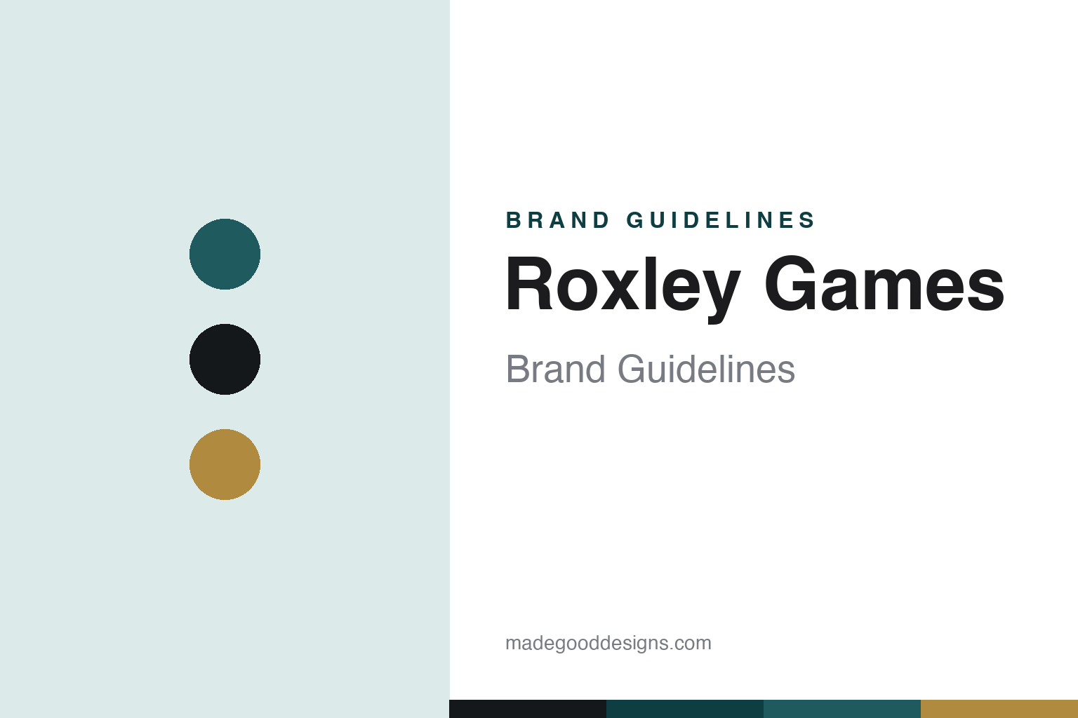
Roxley Games Brand Guidelines
Lavish, deluxe production — the Canadian home of the deluxe Brass editions.
Aa
Two constants: an industrial-teal and brass palette and an industrial sans. Abstract homage — not the Roxley wordmark or logo.
The deluxe edition, perfected
Roxley made premium production its signature.
Roxley Games is a lesson in production quality as a brand. It’s an independent Canadian publisher in Calgary, Alberta, led by Gavan Brown — a branding/graphic-design shop in the early 2010s that pivoted into game publishing (we hedge a single founding year). From the start its identity was lavish, deluxe production.
Its landmark is the pair of deluxe Brass editions: Brass: Lancashire and ⭐⭐⭐ Brass: Birmingham (2018) — beautifully produced reimplementations of Martin Wallace’s classic industrial-revolution economic game. Brass: Birmingham didn’t just sell well: in February 2023 it reached number one on BoardGameGeek, ending Gloomhaven’s multi-year reign — and has held the top of the hobby’s most-watched ranking since. It’s the game the entire community points to as “the best.”
Around Brass, Roxley built a catalogue defined by the same premium instinct: ⭐ Santorini (a gorgeous 3D building abstract), the popular Dice Throne combat-dice series, Radlands, and Iron Clays (premium clay poker-chip currency counters that exemplify the house style). Roxley’s whole proposition is that a great game deserves a great object — deluxe components, striking design, and Kickstarter editions people treasure. (Honest notes: Brass was designed by Martin Wallace — Roxley published the deluxe reimplementations; the founding year is hedged; a BGG #1 ranking is dynamic, so “reached and has held #1” is the honest phrasing; and no official brand hex is published.)
Colour
Roxley lives in an industrial-teal-and-brass palette. Click a swatch to copy the hex.
Roxley’s identity is rich, industrial and premium — an industrial teal, ink black, and a warm brass. The palette reads as Brass: the teal of canals and factories, the black of coal and iron, the brass of the industrial age and its premium metal components. It’s a considered, high-end world that signals quality, weight and craft. It’s an industrial-teal-and-brass palette that signals a premium-production publisher. The honest caveat: Roxley publishes no official brand hex, so the teal, ink and brass here are an original, unofficial interpretation, not first-party values.
The lesson is an industrial-teal-and-brass palette signals premium industrial craft. Roxley’s world reads as rich and weighty. For designers, it’s a reminder that a deep industrial tone with a warm metal accent (brass) conveys quality and heft — right for deluxe editions of an industrial-age game. The takeaways: pair a deep industrial tone with a metallic accent for premium heft; let the flagship’s theme set the palette; and treat any single hex as unofficial when there’s no published spec.
Typography
The wordmark spirit is an industrial sans — sturdy and premium.
Roxley’s identity carries a sturdy, premium, industrial spirit — a “Roxley” wordmark whose strong forms match deluxe editions of weighty games. An industrial sans captures the mood: it’s solid and confident, matching a publisher whose signature is production quality and the industrial-age Brass. Set against a teal-and-brass palette, the industrial sans feels premium and grounded — exactly the deluxe-Brass, premium-production personality Roxley carries. It’s sturdy rather than delicate, mirroring heavy metal components. (Roxley’s real wordmark is a trademark we describe but don’t reproduce.) Because the exact mark isn’t ours to use, the honest description is “an industrial sans spirit,” not the Roxley logo. The type behaves like the brand: sturdy, premium and industrial.
Aa
An industrial sans spirit — sturdy and premium. (Specimen set in Oswald, an industrial sans; NOT the Roxley logo, which is a trademark.)
Production as the difference
Roxley makes objects worth owning.
Roxley Games is a lesson in treating the physical object as part of the design. In a hobby where the same game can exist in many editions, Roxley competes by making the best possible version — deluxe components, striking graphic design, thoughtful upgrades (those Iron Clays currency chips) — so that a Roxley edition is the one collectors want on the shelf. That instinct paid off spectacularly with Brass: Birmingham, where a beautifully produced reimplementation of a respected older game became the number-one-ranked board game in the world. Production quality isn’t decoration for Roxley; it’s the value proposition — the reason to buy their version. It’s a reminder that in a category of physical objects, how something is made can be as important as what it does.
For designers and brand-builders, Roxley offers a clear takeaway: the quality of the physical object can be a genuine competitive advantage. The lessons: invest in production and presentation so your edition is the definitive one; pick great designs to elevate (Brass) rather than only chasing new IP; and keep the facts precise — Roxley is a Canadian publisher known for premium deluxe editions, and Brass: Birmingham is a long-running BGG #1. It’s also a reminder to keep it honest: Brass was designed by Martin Wallace (Roxley published the deluxe versions); the founding year is hedged; BGG rankings change (it “reached and has held #1”); and no official brand hex is published, so the palette here is an interpretation. Roxley makes objects worth owning — proof that production can be the difference.
Explore & save
Keep Roxley Games’s identity on hand — save it to a board in the Made Good inspiration library.
Roxley identity set
Pin the industrial-teal-and-brass palette and the industrial-sans spirit to your own board.