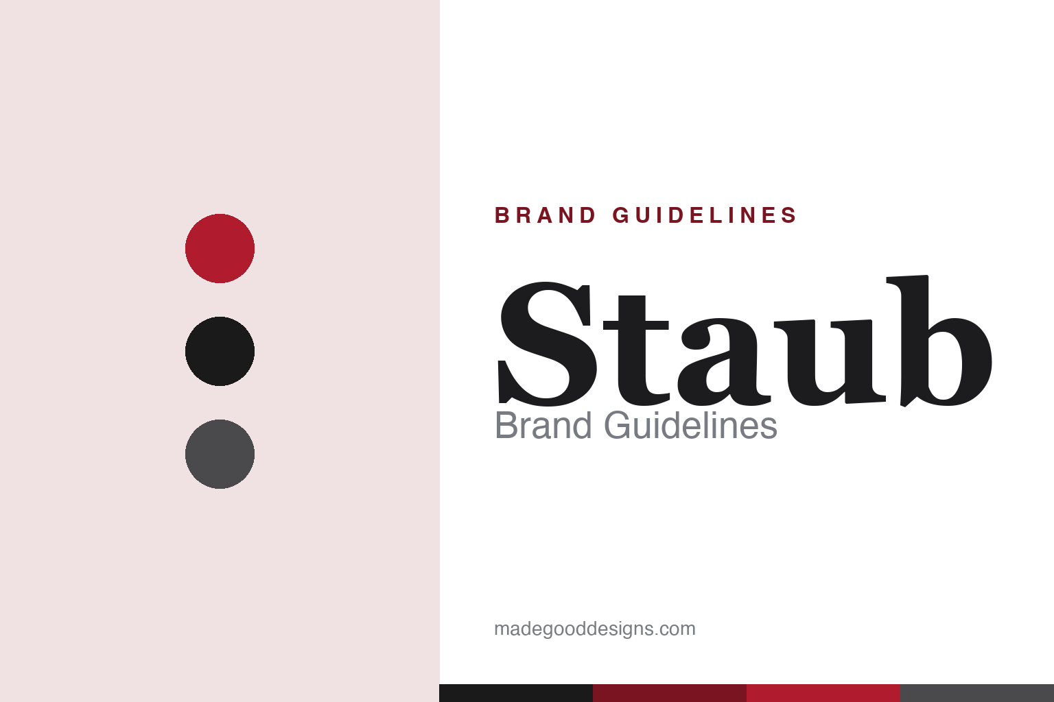
Staub Brand Guidelines
French cast iron since 1974 — the matte-black interior, the self-basting lid, and a chef’s counterpoint to the cream.
Aa
Two constants: a rich grenadine-and-matte-black palette and an elegant French serif. Abstract homage — not the Staub wordmark.
The chef’s cast iron
Staub made cast iron matte black.
Staub is a lesson in owning a distinctive design detail. It was founded in 1974 by Francis Staub (born 1950, from Colmar) in Turckheim, Alsace, France, where he designed and distributed enamelled cast-iron cocottes under his own name. (An honest note: founding origin is Alsace, but Staub’s cast iron is now produced in Merville, northern France — don’t place current manufacturing in Alsace. Two more: no official brand hex is published, and the wordmark typeface is undocumented.)
Staub’s signature is a set of distinctive design choices that separate it from the more familiar Le Creuset. Most important is the matte-black enamel interior (versus Le Creuset’s light, sand-coloured smooth interior) — a genuinely different look and cooking surface, and the single most important distinction to get right. The flagship La Cocotte (Dutch oven) has a flat lid lined with self-basting spikes (“picots”) so condensation collects and rains back down evenly onto the food — a continuous internal basting cycle Staub markets as its “chistera” system. A signature metal knob (oven-safe to high heat) replaces the usual plastic one. These details give Staub a darker, more professional, chef-oriented positioning.
That chef pedigree is real and traceable: through the Nomar foundry it acquired in 1988, Staub produced cookware bearing Paul Bocuse’s signature (so the Bocuse link is via that foundry and signature line, not a claim that Bocuse founded or designed Staub). Since June 2008, Staub has been owned by Zwilling J.A. Henckels, operating as an independent brand within the group. The identity is rich and refined — a STAUB wordmark, iconic colours with catalogue names like Grenadine (its iconic red), Cherry, Matte Black and Graphite Grey, and the line “French Cast Iron Since 1974.” Cast iron, made a chef’s tool.
Colour
Staub lives in grenadine and matte black. Click a swatch to copy the hex.
Staub’s identity leans on rich, deep tones — its iconic Grenadine red, matte black, and graphite greys — anchored by the distinctive matte-black enamel that defines the brand. The palette reads as sophisticated, culinary and professional: darker and more chef-oriented than the bright, cheerful colours of its rivals, matching a brand built on serious cooking and heirloom-quality craft. Its catalogue does span a wide range of colour names (Grenadine, Cherry, Basil, French Blue, Graphite Grey and more), but the core identity is that deep, matte, grown-up world. The honest caveat: Staub publishes no official brand hex, so the grenadine and matte black here are observed approximations, not first-party values.
The lesson is a deep, matte palette can signal serious craft. Staub’s grenadine-and-black world reads as culinary and professional — matching heirloom-quality cast iron. For designers, it’s a reminder that richer, darker colour can communicate seriousness and quality where brightness would read as casual. The takeaways: use deep, matte tones for a professional-craft brand; let one iconic colour lead (Grenadine); and treat specific hexes as approximate when no official spec is published.
Typography
The wordmark is an elegant French serif spirit — refined and culinary.
Staub’s identity carries a refined, French, culinary spirit — an elegant feel befitting heirloom-quality French cast iron. A warm serif captures it well: the graceful letterforms read as sophisticated, crafted and professional, matching a brand built on serious cooking and distinctive design (the matte-black interior, the self-basting lid), and the restraint lets the deep colours and the craft speak. Set against a grenadine-and-matte-black palette, the type feels considered and premium — exactly the chef’s-tool personality Staub cultivates. It’s elegant and culinary rather than casual, mirroring the professional cookware. Because the exact wordmark face is undocumented, the honest description is “an elegant French serif spirit,” not a named font. The type behaves like the brand: refined, culinary and crafted.
Aa
An elegant French serif spirit — refined and culinary. (Specimen set in Spectral, an elegant serif in the spirit of the STAUB identity; the real wordmark is undocumented.)
Owning the detail
Staub won on the details.
Staub is a lesson in differentiating on distinctive design details. Enamelled cast-iron cookware is a centuries-old, crowded category dominated by a famous name (Le Creuset) — so Staub carved out a strong position not by being cheaper, but by owning a set of specific, meaningful differences: the matte-black enamel interior, the self-basting spiked lid, the oven-safe metal knob, and a darker, more professional colour and design language. Each detail is real and functional (the picots genuinely baste; the matte interior is a different cooking surface), and together they add up to a coherent identity — the “chef’s” cast iron — that justifies a premium and earns a devoted following. It’s a case study in how, even in a mature category with a dominant leader, a challenger can win by owning distinctive, defensible design details rather than competing head-on. Own the details, and you own a position.
For designers and brand-builders, Staub offers a clear takeaway: distinctive, functional design details can carve out a strong position against a category leader. The lessons: differentiate on specific, meaningful details (the matte interior, the self-basting lid, the metal knob); build a coherent identity from them (the professional “chef’s” cast iron); and let a rich, grown-up palette express it. It’s also a reminder to keep the facts precise — Staub was founded in 1974 by Francis Staub in Alsace (now made in Merville), is defined by its matte-black interior and self-basting cocotte, links to Paul Bocuse via the 1988 Nomar foundry, and has been owned by Zwilling since 2008. Staub won on the details — proof that owning distinctive design can carve out a position.
Explore & save
Keep Staub’s identity on hand — save it to a board in the Made Good inspiration library.
Staub identity set
Pin the grenadine-and-black palette and the French-serif spirit to your own board.
Source & notes
Frequently Asked Questions
What font can I use to match the Staub look?
This guide describes Staub’s type as “An elegant French serif spirit — refined and culinary”. Its type specimen is set in Spectral from Google Fonts as a stand-in; Spectral is not Staub’s own lettering.
What colours are in the Staub palette?
This guide shows Staub’s palette as Grenadine #B01B2E, Matte Black #1A1A1A, Graphite Grey #4A4A4C, Cherry #8A1420 and White #FFFFFF. It notes the values are approximate rather than official Staub codes.
When was Staub founded?
Staub was founded in 1974, in Alsace. Its signature, per this guide: Matte-black interior.
Who owns Staub?
Staub is owned by Zwilling (2008). Its signature, per this guide: Matte-black interior.