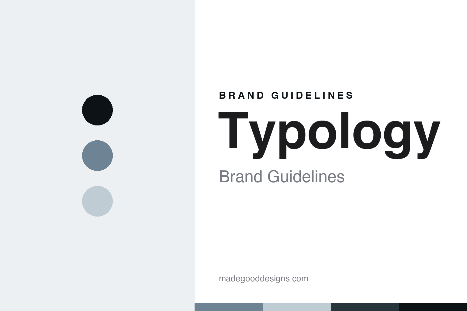
Typology Brand Guidelines
The ingredient-transparent skincare of Paris.
Aa
Two constants: a clinical-grey palette and an ingredient-sans register. Abstract homage — not a Typology product or mark.
The ingredient-transparent skincare of Paris
Typology is the minimalist Paris DTC skincare house of Made.com founder Ning Li.
Typology brings the round radical minimalism — the Paris direct-to-consumer skincare house, founded by Ning Li, who also founded the furniture brand Made.com, whose short, transparent formulas are labelled by active ingredient. Typology makes minimalist, ingredient-transparent skincare, and its answer to a round about the clean shelf is a philosophy: fewer ingredients, higher standards, with serums named for what is in them. A brand, transparent.
Its identity is the ingredient-transparent skincare of Paris. Typology’s ingredient transparency, its founder and its made-in-France line are the story here. A brand, transparent. The ingredient-transparent skincare of Paris.
(Honest notes, so the story stays precise, and the claims stay the brand’s own. Typology, at typology.com, makes minimalist, ingredient-transparent skincare, direct to consumer, with serums organised by active ingredient and labelled with lab-style codes, plus cleansers, moisturisers and tinted products, under the philosophy fewer ingredients, higher standards, and we report its clean, vegan and efficacy language as the brand’s own marketing. It was founded in 2019 in Paris by Ning Li, previously the founder of Made.com, so we say 2019 and name Ning Li. On where it is made, a theme of this round, the brand states it is made in France, formulated through partner laboratories, which we attribute as its own statement. On ownership, it is founder-led and venture-backed, and we do not cite a specific figure or investor we could not verify. Its B Corp and cruelty-free certifications are the brand’s own claims, reported neutrally. Its name and its lab-code packaging system are IP we describe but do not reproduce; there is no official brand hex; these tones are an unofficial interpretation.)
Colour
Typology lives in a clinical grey. Click a swatch to copy the hex.
Typology’s identity is transparent, minimal and clinical — a clinical grey, an ink, a mist, a deep slate, and a paper. The palette leans clinical grey and mist: a cool, pared-back register that nods to a lab-code label and an ingredient-first philosophy rather than a loud palette. It signals ingredient-transparent skincare. The honest caveat: with no published brand hex, these values are an original, unofficial interpretation, not first-party colours.
The lesson is a clinical grey signals a transparent, minimal identity. Typology’s world is a pared-back, made object. For designers, it is a reminder that a clinical grey and a soft mist can carry a skincare brand — the tone of an ingredient label. Because these tones can fail as small text, keep type dark and let the colour live in the accents, palette and band. The takeaways: label by ingredient; keep it short; report claims as marketing; and treat any single hex as unofficial.
Typography
The register is an ingredient sans — transparent, minimal, plain.
Typology’s identity carries a transparent, minimal, plain spirit — ingredient-first skincare, not a fashion. An ingredient sans captures the mood: clean, clinical and confident, the register of a lab. Set in a clinical-grey palette, the ingredient sans feels transparent and minimal — exactly the personality Typology carries. It is a philosophy rather than a logo, mirroring a serum and a code. (Typology’s real lab-code labels are things we describe but do not reproduce, and the exact typeface is not ours to use.) Because it is not ours to use, the honest description is “an ingredient-sans skincare,” shown here in a stand-in. The type behaves like the brand: transparent, minimal and plain.
Aa
An ingredient-sans skincare — transparent and minimal. (Specimen set in Work Sans, an ingredient-sans STAND-IN; NOT the Typology logo.)
The clean shelf
Typology stands for the ingredient-transparent skincare of Paris.
Typology brings the round radical minimalism. A clinical-grey palette, an ingredient sans and a short formula make one thing — the ingredient-transparent skincare of Paris — the whole identity: transparent, minimal and clinical. The ingredient transparency is the philosophy, and the lab-code label is the design. The point is a serum named for what is in it, from a founder who did the same for furniture.
Put to work, the identity is a philosophy told straight, as design. A maker in this spirit would label by ingredient, keep it short, and report claims as marketing. A reader in this spirit would keep the facts right: Typology makes minimalist, ingredient-transparent DTC skincare, serums labelled by active ingredient, under fewer ingredients, higher standards; it was founded in 2019 in Paris by Ning Li, the founder of Made.com; the brand states it is made in France; and it is founder-led and venture-backed, with B Corp and cruelty-free claims of its own. Typology joins Nécessaire, Verso and Dieux on the round’s minimalist and transparent side, and it anchors the transparency thread with Dieux. The honest editorial moves are to date it to 2019, to name Ning Li and Made.com, to attribute the made-in-France and B-Corp claims, and to cite no funding figure. The lesson Typology teaches is that ingredient transparency can be a whole identity, and reporting the claims as marketing keeps it credible.
For designers and brand-builders, Typology continues the clean shelf: label by ingredient — and keep it short. The lessons: name a product for its active; keep formulas short and legible; report clean, vegan and made-in-France as your own claims; carry a founder’s prior playbook, like a DTC model, into a new category; and never reproduce a lab-code label. It is also a reminder to stay precise: Typology is the minimalist Paris DTC skincare house of Made.com founder Ning Li — with the palette here an unofficial interpretation. Read that way, Typology is less a bottle than a philosophy: ingredient-first skincare. The lesson for a brand is that transparency and honest claims reinforce each other, and attributing the made-in-France claim keeps the story earned. Typology made the-ingredient-transparent-skincare-of-Paris the identity — proof that a philosophy can define a brand. And the deeper lesson is that transparency is a design choice as much as a formulation one, because a lab-code label and a short ingredient list are, in the end, a way of showing the reader exactly what a product is, so the brand’s honesty and its minimalism are the same move, and the design carries the philosophy as plainly as the formula does.
Explore & save
Keep Typology’s identity on hand — save it to a board in the Made Good inspiration library.
Typology identity set
Pin the clinical-grey palette and the ingredient-sans register to your own board.