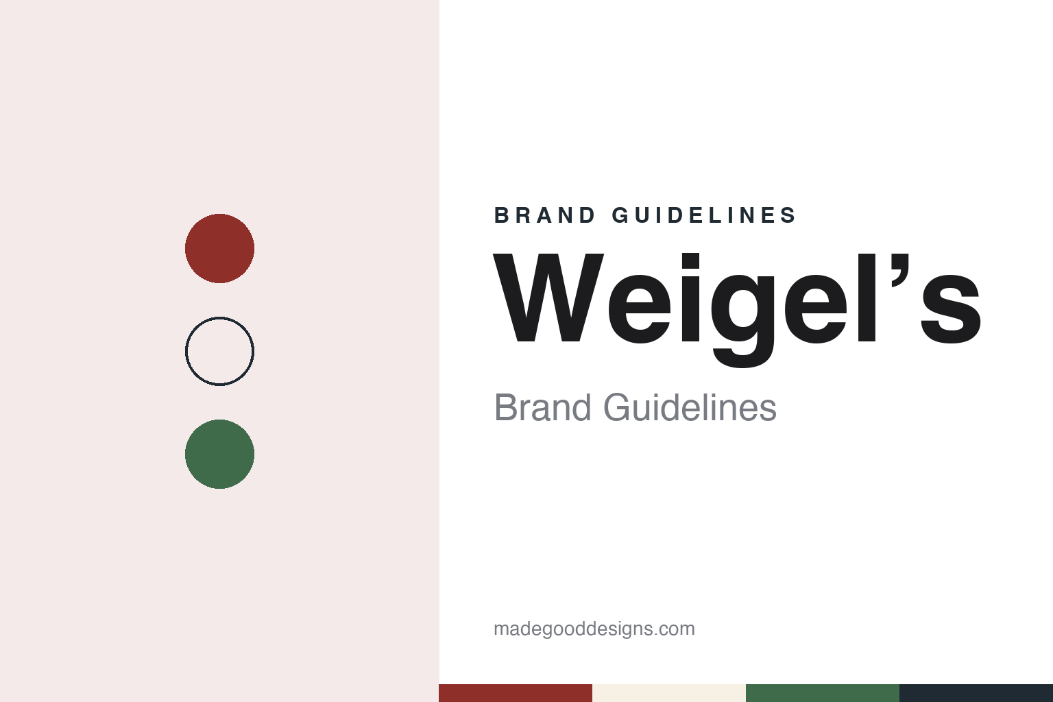
Weigel’s Brand Guidelines
A family dairy in Powell, the Jug O’ Milk drive-through and a Circle W.
Aa
Two constants: a barn red, milk white and pasture green palette and a dairy slab serif register. Abstract homage — not a Weigel’s product or mark; no sign, jug, logo or mascot is reproduced.
Broadacre Dairy
Four cows and a milk round.
Weigel’s is a dairy before it is a convenience chain. The company calls itself a hometown dairy “since 1931,” the year, it says, that the Weigel family went into the milk business with a “herd” of four cows. Its own history traces the family further back, to Carl Augustus Weigel, who came from Saxony and farmed first at Wartburg, Tennessee, and later near Knoxville; in the 1910s two of his grandsons bought a farm at Powell Station, today’s Powell, north of Knoxville. There, the company says, William Weigel Sr turned his share of the farm into Broadacre Dairy, and the barn built at that time is still in use.
Pasteurisation came early. The company says it bought a pasteurizer in 1936, when electricity reached Powell Station; English Wikipedia gives 1935 for the start of pasteurised bottling. Knox TN Today reported in April 2019 that the company was among the first in the region to distribute pasteurised milk. Management then passed to two brothers, Lynn B. and William W. Weigel, both of whom had studied at the University of Tennessee’s dairy school, according to the company and English Wikipedia. Knox TN Today reported in 2017 that the company was founded by Bill Weigel’s father and uncle in 1931.
The dairy grew through home delivery. The company says that by the 1940s it ran more than fifteen refrigerated delivery trucks on milk routes, and that by the 1950s the herd had passed 400 head. English Wikipedia adds that the plant was modernised in 1947, when ice cream and cottage cheese were added.
Colour
From milk round to Jug O’ Milk.
The shops began as an outlet for the milk. As home delivery faded, the company says, it devised the “Weigel’s Farm Store” for working families, and English Wikipedia says the brothers opened drive-through stores mainly to sell their returnable gallon jugs and other dairy products. Store Number 1, a 500-square-foot drive-through in Knoxville, opened on 9 December 1958, English Wikipedia says, the same year it gives for the Jug O’ Milk name. The company says Ellie the Cow first appeared on the Jug O’ Milk sign at that store.
Within three years the company had built ten more “Milk Depot Farm Stores,” it says. The next step came from Bill Weigel, who joined the business in 1960: Knox TN Today reported in December 2017 that he helped establish the drive-through Jug O’ Milk stores and opened the first walk-in milk store in 1964, which the paper called the first convenience store in Knoxville. The company’s timeline describes that store as 1,800 square feet.
Fuel and food followed. The company says the first self-serve petrol pumps went in at one of its farm stores in the 1970s, when it also brought in a shatterproof gallon jug and reached about thirty stores, all around Knoxville. Food arrived in the 1980s and made-to-order deli counters in the 1990s. In 2014, English Wikipedia says, Weigel’s opened its own bakery, Red Barn Foods, which supplies doughnuts, cookies and muffins to the stores, and later locations added made-to-order Weigel’s Kitchens.
Drinks became a signature too. The company says it brought the Icee frozen drink to the Knoxville market in the 1960s and later added Sharkee, an icy drink of its own, to every store. In the 1980s, it says, it joined the Knoxville Journal and the radio station WIVK in the Milk Fund, which supplies dairy and food to children, older people and families in need.
Typography
How roadside chains present themselves.
A motorway service area or a fuel-and-convenience chain has to be recognised at speed, from a slip road or a forecourt, and then again at the counter. The identities in this group are therefore spread across many surfaces: the roof sign and the forecourt canopy, the store fascia, the cup and the receipt, and a website where the company sets out who it is. The guides that follow look at what each company publishes about itself and what dated independent sources add.
In Britain the operator’s own name often sits above a row of partner brands. Moto’s website lists coffee, bakery, burger and food-hall partners alongside its own name and its own charging brand, Moto CHARGE, launched in 2026; English Wikipedia describes how Welcome Break’s 2006 wordmark set a green word and a white word on black, and how each site was given a mural of a local landmark. The operator’s mark becomes the frame, and the partners fill it.
Food sub-brands, mascots and member programmes carry much of the personality. Some chains put their own name on a food counter, as Welcome Break does with The Good Breakfast, and some gather offers into a named section of a website or an app, as Moto does with My Moto for families, business travellers, coach drivers and HGV drivers. Where a chain uses a mascot or a member programme, the guides describe it as the company presents it.
Ownership is part of the story too. Several of these businesses have passed between caterers, investment funds, pension schemes and fuel retailers, and some carry a different name in a neighbouring market, as Welcome Break’s Northern Ireland sites carry Applegreen’s. Each guide gives owners and site counts only as a dated source states them, and marks clearly what rests on the company’s own word.
Aa
A sturdy slab serif with a dairy-label feel. (Specimen set in Zilla Slab, a serif STAND-IN; NOT the Weigel’s logo.)
Weigel’s
A Circle W and a brick store.
The visual identity has its own entry in the company’s history. In the 1990s, it says, a new corporate identity introduced the Circle W, which it calls iconic, and a site on Topside Road became the first built with the new “Weigel’s Look”: a brick store with eight double-sided pumps, a style the company says it used for the next 36 stores. In the 2000s a 4,000-square-foot prototype store opened in Clinton, which later became the first Weigel’s Truck Stop, with diesel lanes for trucks, according to the company.
The milk stays in-house. Knox TN Today reported in April 2019 that Weigel’s sells its own milk through its own stores, receiving milk early each morning and processing, bottling and shipping it to the shops the same day, and that the company had pledged to use only Tennessee milk; English Wikipedia says Broadacre Dairy also processes tea, juices and eggnog for the chain. The company says its chocolate milk has won blue ribbons at the Tennessee State Fair.
Leadership has widened beyond the family. In December 2017 Knox TN Today reported that Bill Weigel, son of a founder, became chair; that Ken McMullen, president since 2001 and the first person from outside the family to hold that role, became chief executive, with Douglas Yawberry as president and chief operating officer; and that the chain then had 66 stores. The same report noted a store under construction in Powell as a prototype convenience store with a drive-through window. Convenience Store Decisions magazine named Weigel’s its Convenience Store of the Year in the 2010s, the company says. It reported 67 locations in April 2019. English Wikipedia counts 84 locations in East Tennessee, and the company says its Store 93, in Kingsport, is the farthest from the original dairy.
For a design guide, Weigel’s shows how a dairy’s own products, a cow on a sign and a single letter can carry a regional chain. Compare Wawa and Sheetz, two more convenience chains with dairy roots. For this guide we use a barn red, a milk white and a pasture green with a slab serif, an unofficial interpretation; no product or logo is reproduced.
Explore & save
Keep Weigel’s’s identity on hand — save it to a board in the Made Good inspiration library.
Weigel’s identity set
Pin the barn red, milk white and pasture green palette and the dairy slab serif register to your own board.