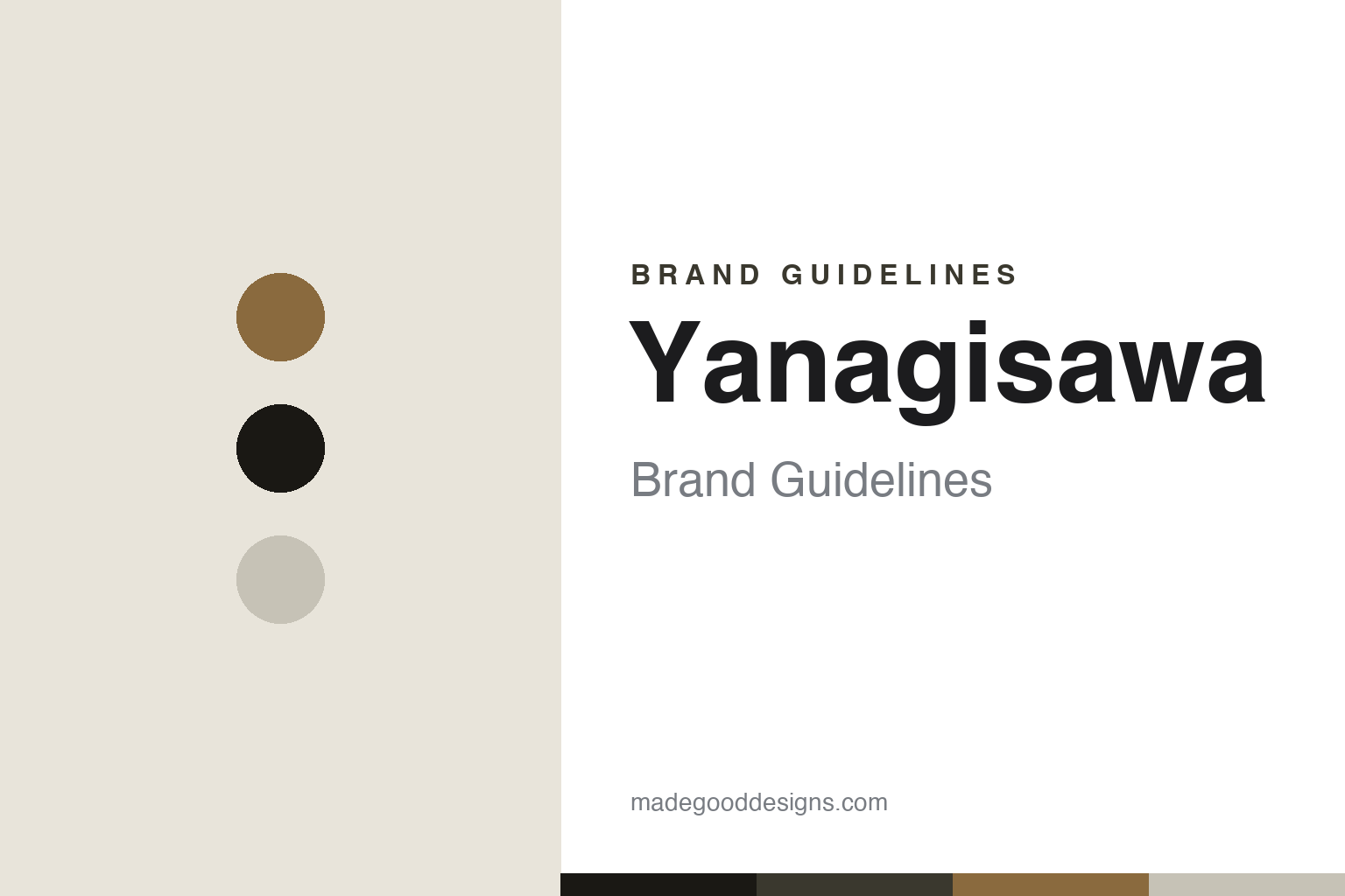
Yanagisawa Brand Guidelines
The saxophone specialist — one instrument, done completely, from a Tokyo family house.
Aa
Two constants: a bronze-and-silver palette and a precise Japanese sans. Abstract homage — not the Yanagisawa wordmark or engraving.
The saxophone specialist
Yanagisawa makes one thing.
Yanagisawa is a lesson in specialization as a strategy. The company began in Tokyo in the 1890s (most often dated 1894 — we hedge it) as a woodwind repair workshop, founded by Tokutaro Yanagisawa (romanizations of the name vary) repairing imported instruments for military-band musicians, and grew into a factory often described as the first to build woodwinds on Japanese soil. Its first saxophone came in 1951, a prototype by the founder’s son Takanobu — so the arc is genuinely “repair first, then saxophones.”
The defining fact is focus. Yanagisawa makes saxophones almost exclusively — no flutes, no clarinets, no brass, none of the sprawling catalogues of the generalist giants. It’s a small, family-owned, boutique maker (led by later generations of the Yanagisawa family) that is routinely ranked among the very top professional saxophone makers, alongside Selmer Paris and Yamaha. Its flagship is the WO series (rolled out from 2014) — professional sopranos, altos, tenors and baritones — and it’s known for offering different body materials that change the tone: brass, phosphor bronze (from 1992), silver-plate and solid silver (its first solid-silver saxophone came in 1972), plus the full range from sopranino to baritone and both straight and curved sopranos.
Yanagisawa is independent, family-owned, and made in Japan — a sharp contrast to the conglomerates of the brass world. (One accurate irony worth noting: in the US market, Yanagisawa saxophones have been distributed by Conn-Selmer — the independent boutique maker reaching players through the very kind of conglomerate it contrasts with.) (No official brand hex or typeface is published.)
Colour
Yanagisawa lives in a bronze-and-silver palette. Click a swatch to copy the hex.
Yanagisawa’s identity is precise, Japanese and understated — warm bronze, sumi-ink black and cool silver, the tones of a bronze-bodied saxophone finished with quiet exactness. The palette reads as craft and restraint: the colours of a specialist’s horn, muted and refined, from a house that makes one instrument superbly. It’s a precise, boutique world that signals engineering, focus and understated quality. It’s a bronze-and-silver palette that signals Japanese precision, craft and the specialist saxophone. The honest caveat: Yanagisawa publishes no official brand hex, so the bronze, sumi and silver here are an original, unofficial interpretation of its instruments, not first-party values.
The lesson is a muted metal palette signals precision and restraint. Yanagisawa’s understated world reads as exacting and focused. For designers, it’s a reminder that quiet, refined material tones — bronze, ink, silver — can express precision better than anything loud. The takeaways: use muted metals for understated quality; let restraint signal focus; and treat specific hexes as unofficial when there’s no published spec.
Typography
The wordmark is a precise Japanese sans — clean and exacting.
Yanagisawa’s identity carries a precise, restrained, Japanese spirit — a “Yanagisawa” wordmark whose clean letterforms read as exacting and understated. A precise Japanese sans captures the mood: it’s clear and refined, matching a specialist that makes one instrument to an exacting standard. Set against a bronze-and-silver palette, the clean sans feels precise and quiet — exactly the sax-only, WO-series personality Yanagisawa carries. It’s exact and understated rather than ornate or loud, mirroring a horn finished with quiet care. (Yanagisawa’s real wordmark and engraving are trademarks we describe but don’t reproduce.) Because the exact marks aren’t ours to use, the honest description is “a precise Japanese sans spirit,” not the Yanagisawa logo. The type behaves like the brand: precise, restrained and Japanese.
Aa
A precise Japanese sans spirit — clean and exacting. (Specimen set in Zen Kaku Gothic New, a clean Japanese-designed sans; NOT the Yanagisawa logo, which is a trademark.)
Specialization as the difference
Yanagisawa went deep, not wide.
Yanagisawa is a lesson in winning by specializing. Where the giants make everything — trumpets, flutes, clarinets, whole catalogues — Yanagisawa makes saxophones, and only saxophones, and by pouring a century of focus into that one instrument it earned a place beside Selmer Paris and Yamaha at the very top. Specialization is what lets it obsess over the details that generalists can’t: multiple body materials tuned for tone, straight and curved sopranos, the full family from sopranino to baritone, all finished with a specialist’s precision. Depth becomes the brand’s signature and its moat — you go to Yanagisawa precisely because saxophones are all it thinks about. The lesson is that in a world of generalists, choosing to go deep rather than wide — mastering one thing completely — can build a reputation and a defensibility that breadth never could. Anyone can make many instruments; Yanagisawa made one, superbly. Specialize completely, and the focus becomes the brand.
For designers and brand-builders, Yanagisawa offers a clear takeaway: depth can beat breadth. The lessons: master one thing completely (saxophones only); let that focus fund real innovation (multi-material bodies); and keep the facts precise — Yanagisawa began as a Tokyo repair shop in the 1890s, made its first saxophone in 1951, and ranks among the top pro sax makers. It’s also a reminder to keep it honest: the founding date is hedged (1890s), the founder’s name romanization varies, its heritage is broadly woodwind though today it’s effectively sax-only, and Conn-Selmer has distributed it in the US; and no official brand hex or typeface is published, so the palette and type here are an interpretation. Yanagisawa went deep, not wide — proof that specialization can be the difference.
Explore & save
Keep Yanagisawa’s identity on hand — save it to a board in the Made Good inspiration library.
Yanagisawa identity set
Pin the bronze-and-silver palette and the Japanese-sans spirit to your own board.


