Zara Brand Guidelines
A logo ‘kerned into oblivion’ — the most divisive serif in fashion, and the fast-fashion empire behind it.
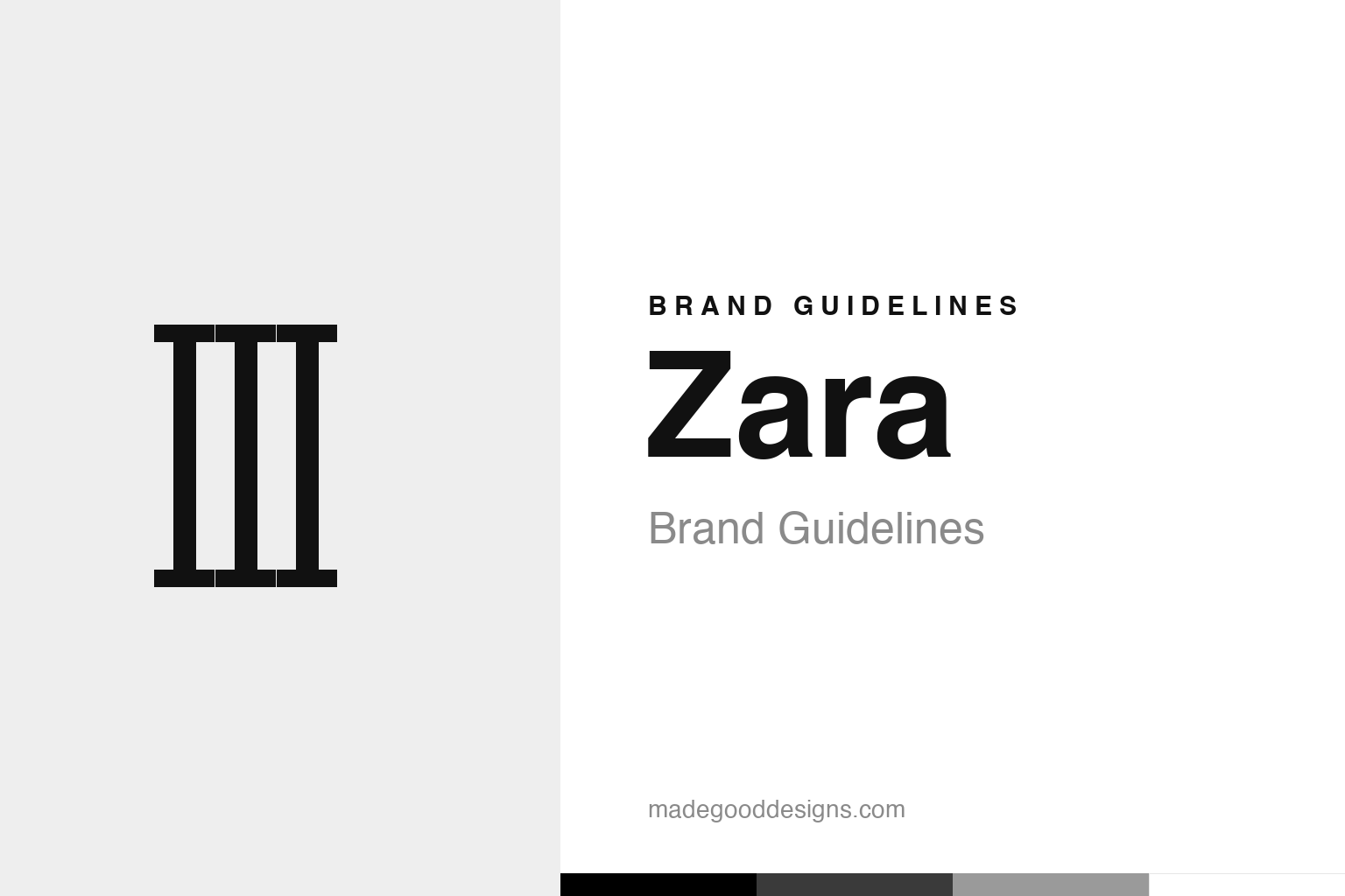
Abstract crowded serif strokes — the tight-kerning idea, not the letters. Deliberately not the Zara wordmark.
The logo that divided the internet
Zara’s 2019 rebrand was pure controversy.
In 2019, Zara unveiled a new logo that became one of the most divisive pieces of type in recent memory. Designed by the acclaimed Fabien Baron (of Baron & Baron, also Zara’s artistic director), it took the previous, more elegant and spaced serif wordmark and squeezed the letters tightly together, so they overlap and crowd into one another, with new curves on the Z and R. Reactions were fierce: fans called it bold, editorial and high-fashion; critics were savage — the legendary type designer Erik Spiekermann reportedly called it “the worst piece of type I’ve seen in years,” and others said it looked “kerned into oblivion.” Love it or hate it, it got everyone talking — which, for a fashion brand, is rarely a bad thing. Our homage nods to that crowded-serif idea without the letters.
High-fashion looks, fast-fashion prices
Zara’s identity mimics luxury deliberately.
The controversial logo makes sense once you understand Zara’s core strategy: it sells high-fashion aesthetics at accessible prices. Everything about the brand’s identity — the elegant (now tightly editorial) serif wordmark, the stark black-and-white palette, the minimal, gallery-like stores, the fashion-magazine styling — is designed to feel upscale, sophisticated and luxurious, deliberately echoing the visual language of premium designer houses. That’s the whole point: Zara wants to look like a luxury brand while being affordable and fast. A high-fashion, editorial serif logo (crowded and confident, like a couture house’s) reinforces that aspirational positioning. The divisive tight-kerned mark isn’t a mistake — it’s a deliberate signal that Zara plays in the same visual register as the luxury brands it takes cues from.
The Inditex machine
Behind the minimal logo is a fast-fashion revolution.
Zara was founded in 1975 in A Coruña, Spain, by Amancio Ortega (with then-wife Rosalía Mera), and is the flagship of the giant Inditex group. Its real revolution wasn’t a logo but a business model: pioneering fast fashion — an astonishingly quick design-to-store cycle that could take a trend from the runway to the shop floor in weeks, with constant small-batch drops that keep stores feeling fresh and create urgency to buy now. That model made Ortega one of the world’s richest people and reshaped the entire apparel industry. Zara’s minimal, premium-feeling branding is the deliberate face of that machine: understated, chic and aspirational on the outside, backed by a ruthlessly efficient, trend-chasing supply chain underneath. The look sells the clothes; the model delivers them at speed.
When controversy is the strategy
Zara shows a bold identity can be its own marketing.
Zara’s story offers two intertwined lessons. First, the power of aspirational branding: by adopting the visual language of luxury — elegant serif type, monochrome minimalism, editorial store design — a fast-fashion retailer can punch far above its price point, making affordable clothes feel desirable and upscale. The identity does real strategic work, positioning Zara as chic rather than cheap.
Second, the value of a bold, distinctive (even polarising) design choice. The 2019 logo was genuinely controversial, but it was also unmistakably confident and got the entire design and fashion world talking — free attention, and a clear signal that Zara takes its visual identity as seriously as any couture house. A brand secure in its position can afford to make a divisive statement; the discussion itself becomes marketing. Not every brand should court controversy, but Zara shows that a bold, high-fashion identity — even one critics hate — can reinforce exactly the aspirational, of-the-moment image a fashion brand wants. Underneath the minimal black-and-white surface and the kerned-together serifs sits one of the most efficient retail machines ever built — and the confident, luxury-mimicking design is precisely what makes that machine feel like fashion rather than mere shopping.
Ultimately, Zara’s identity is a reminder that great branding is an exercise in clarity and restraint. Decide the one idea that matters, find the simplest form that expresses it, strip away everything that doesn’t, and then resist the urge to keep fiddling. The discipline to leave a good mark alone — refining rather than replacing, evolving rather than abandoning — is rarer and more valuable than the ability to design something new. That is how a symbol earns a permanent place in people’s memory, and how a brand turns recognition into lasting trust.
Type & the wordmark
An editorial, high-fashion serif.
Zara’s wordmark is an editorial serif — in 2019 kerned tightly so the letters overlap. The specimen below stands in with a high-contrast serif.
Editorial
Elegant, high-contrast, crowded — type that mimics couture. (Specimen set in Playfair Display, a neutral high-fashion stand-in.)
Monochrome
Stark black and white. Click a swatch to copy the hex.
Zara’s palette is pure black #000000 (~PMS Black 6 C) on white — minimal, editorial, luxury-adjacent. Lead with black below.
Explore & save
Keep the crowded-serif idea on hand — save the homage and the monochrome palette to a board.
Zara identity set
Pin the crowded-serif homage, the monochrome palette and the aspirational-branding lesson to your own board.


