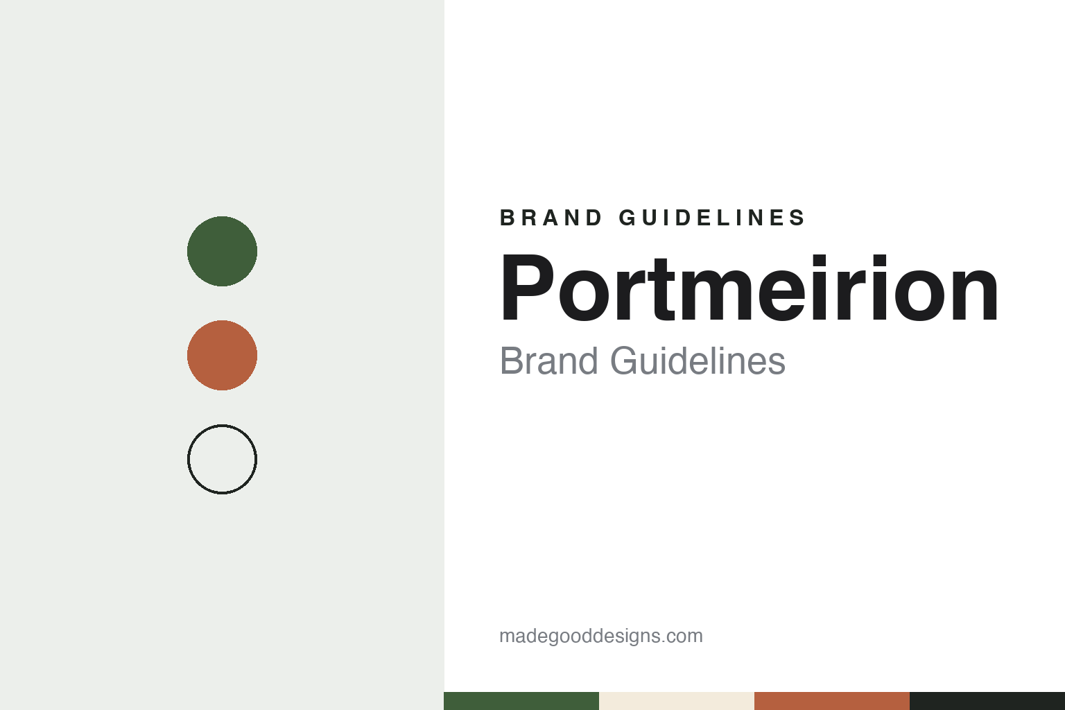
Portmeirion Brand Guidelines
A Welsh village name, a Stoke pottery and a 1972 botanical pattern.
Aa
Two constants: a botanic green, cream and terracotta palette and a botanical serif register. Abstract homage — not a Portmeirion product or mark; no pattern, backstamp or logo is reproduced.
A village shop and a Stoke works
A designer, her husband and two small potteries.
Portmeirion the pottery took its name from a place. In the 1950s the designer and illustrator Susan Williams-Ellis and her husband Euan Cooper-Willis sold pottery in the gift shop at Portmeirion, the Italian-style tourist village in North Wales created by her father, Sir Clough Williams-Ellis, the group’s history page says. Some of those pieces were designed by Susan for the shop and were made and decorated by A. E. Gray & Company, a small business in Stoke-on-Trent; English Wikipedia says they carried the backstamp “Gray’s Pottery Portmeirionware.”
In 1960 the couple bought A. E. Gray, and in 1961 they bought Kirkhams Limited, a pottery that could make wares as well as decorate them. The two businesses were combined at the Kirkhams premises, which the company says it still occupies, and the design and making of pottery under the Portmeirion name began. English Wikipedia calls the combined company Portmeirion Potteries Ltd and says it specialises in earthenware tableware.
Susan Williams-Ellis designed the early patterns herself. English Wikipedia lists Malachite in 1960, Moss Agate in 1961 and Talisman in 1962, then Totem in 1963, an abstract pattern based on primitive forms on a cylindrical shape, followed by Magic City in 1966 and Magic Garden in 1970. The company listed on the London Stock Exchange in 1988 and moved to the Alternative Investment Market in 2004, its history page says.
Colour
Botanic Garden, Totem and named patterns.
The pattern that came to define the company arrived in 1972. Botanic Garden, which the group says was created and shaped by Susan Williams-Ellis, is decorated with plant illustrations adapted, English Wikipedia says, from Thomas Green’s botanical dictionary of 1817, and looks back to the botanical designs of the Chelsea porcelain factory in the 1750s. The group calls it its highest-selling pattern, says new motifs and shapes have been added over the years, and marked its 50th anniversary in 2022.
Later collections have come from other designers. English Wikipedia names Sophie Conran’s Crazy Daisy and Dawn Chorus, and the company says a new Sophie Conran for Portmeirion collection launched in 2021 with two new shapes, Arbor and Floret. In 2019, the year the group also launched the Botanic Garden Harmony and Atrium ranges, according to its timeline, the Victoria and Albert Museum mounted an exhibition of Portmeirion pottery, English Wikipedia says.
The public identity of the brand rests on those named patterns, each dated and credited to a designer on the company’s own pages, and on the place name borrowed from the Welsh village. Totem’s abstract forms and Botanic Garden’s illustrated plants look very different, yet both are presented as Portmeirion designs by the same founder.
The pottery’s early backstamp shows how the name began: as a shop label applied by another maker. Within two years the couple owned both the decorating business and the factory, and the name moved from the shop to the works.
Typography
How tableware makers present themselves.
Tableware and glassware makers mostly present themselves through the table rather than the logo. Their catalogues and websites lean on collection photography: a single glass against a plain ground, a stack of plates, or a full place setting with cutlery, napkins and food. The setting does much of the work, signalling whether a range is meant for a family kitchen, a formal dinner or a busy restaurant, and the same pieces are often shown in more than one of those roles.
Names carry a large share of the identity. Ceramic makers mark the underside of a plate with a backstamp that gives the maker’s name, often with a pattern name and a place, and collectors and buyers use that mark to identify a piece. Patterns and shapes are usually given their own names, so that a single company may sell dozens of named ranges, each with its own photography and description, while the company name stays small.
Many makers also split their identity between home and trade. Arc, for example, keeps separate brand names for consumer tableware and for bars, hotels and restaurants, according to French Wikipedia. Hospitality catalogues tend to be practical documents, organised by shape, capacity and use, with product codes and packing details, while the consumer side is closer to a lifestyle magazine. Some makers add their own shops: Paşabahçe, the Turkish glassware brand, runs a chain of stores under its own name.
Behind the products sits a corporate layer. Company pages describe factories, founding dates and owners, and in this sector those stories often involve old works, family control, takeovers and court-supervised restructurings, as the profiles in this guide show. For a designer, the useful lesson is how these makers keep a recognisable voice across a long range of named collections, a trade catalogue and a corporate history at once.
Aa
A botanical serif for a pattern-led pottery. (Specimen set in Cormorant Garamond, a serif STAND-IN; NOT the Portmeirion logo.)
Portmeirion Group
Spode, Royal Worcester and a new name.
The company grew by buying brands. It acquired Pimpernel, a placemat and coaster brand, in 2006, the group says. On 23 April 2009, English Wikipedia says, it bought the Spode and Royal Worcester brands, which had been placed into administration the previous November; the purchase covered the intellectual property and trade names but not the factories, and the company changed its name to Portmeirion Group. Spode, founded by Josiah Spode in 1770, is known for its Blue Italian pattern, launched in 1816; English Wikipedia says much of its ware, including Blue Italian and Woodland, is now made at the group’s Stoke-on-Trent factory, while Royal Worcester’s production in Worcester has ended. The group has kept the older brands’ anniversaries in view: it marked 200 years of Blue Italian in 2016 and 250 years of Spode in 2020, launched a Spode Kingsley range made in the UK in 2019, and added newer collections such as Royal Worcester Wrendale Designs, according to its history page.
Further purchases followed: Wax Lyrical, a home fragrance maker, in 2016, and Nambé, a homewares business based in the United States, in 2019, the group says. In 2016 it also received the Queen’s Award for Enterprise in the International Trade category. Today the group, headquartered in Stoke-on-Trent and listed on AIM, describes itself as owning six brands, from Spode and Royal Worcester to Pimpernel and Wax Lyrical. In June 2026 it raised new equity through a placing and a retail offer, with a general meeting held on 23 June, according to its investor pages.
A change of name is in progress. In September 2026 the group confirmed it would proceed with renaming itself Spode Group PLC, with the market code changing to SPDE, TheBusinessDesk reported on 23 September 2026. On 2 November its chairman described the rename as coming shortly, Housewares reported. The rename had been announced but not completed at the time of writing, and Portmeirion remains one of the six brands listed on the group’s website.
For a design guide, Portmeirion shows how a place name and a run of named, dated patterns can carry a pottery brand through changes in the group above it. Compare Wedgwood, another Staffordshire pottery name, and Royal Doulton. For this guide we use a botanic green, a cream and a terracotta with a serif, an unofficial interpretation; no product or logo is reproduced.
Explore & save
Keep Portmeirion’s identity on hand — save it to a board in the Made Good inspiration library.
Portmeirion identity set
Pin the Portmeirion botanic green, cream & terracotta palette and the botanical serif register to your own board.