Cisco Brand Guidelines
A logo that is a bridge and a signal at once — and a company named after the city it looked out on.
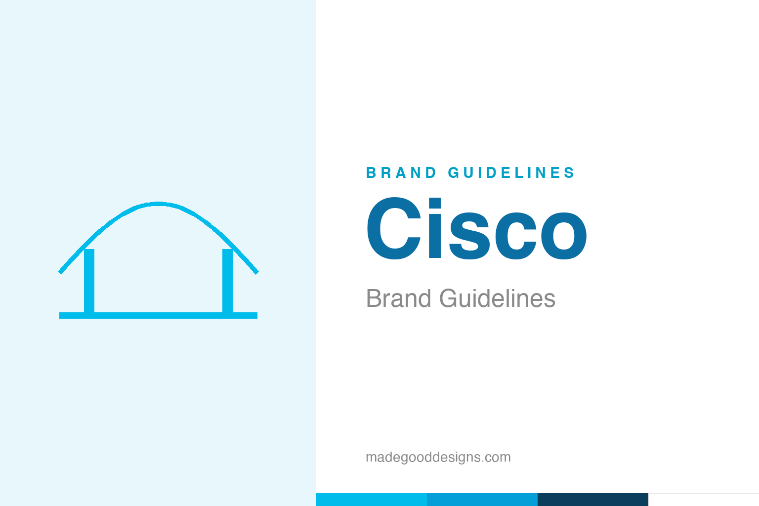
An abstract suspension bridge — the Golden Gate idea, not the bars. Deliberately not the Cisco mark.
A bridge you can also hear
Cisco’s bars are two things at once, and both are true.
Cisco’s logo — a set of vertical bars of varying height — is a clever visual double-meaning. Read one way, the bars are the two towers and suspension lines of the Golden Gate Bridge, San Francisco’s landmark. Read another, they’re a digital signal or waveform — the pulse of data moving across a network. Both readings are intentional, and both are perfect for a company that builds the plumbing of the internet: Cisco literally connects things, so a bridge that doubles as a signal is an ideal emblem. It’s the kind of economical idea great logos are made of — one simple shape carrying two meanings that reinforce each other. Our homage leans into the bridge reading with an abstract span, rather than reproducing the bars.
The city in the name
‘Cisco’ isn’t an acronym — it’s the back half of a city.
The name puzzles people until they see it: Cisco is simply the tail end of San Francisco. The founders were Stanford computer scientists building networking gear in the Bay Area, and they named the company after the city on their doorstep — which is also why the Golden Gate Bridge ended up in the logo. (The often-told tale of the founders driving toward the city and seeing the bridge lit by the sun is a nice origin anecdote, best treated as story rather than verified history.) In the early days the company even styled itself lower-case “cisco.” The through-line is charming: a global technology giant whose name and symbol are both quiet love letters to San Francisco.
Two Stanford scientists, 1984
Cisco began as a way to make two computers talk.
Cisco was founded in 1984 by Leonard Bosack and Sandy Lerner, a married couple who worked at Stanford University. The origin story is the stuff of Silicon Valley legend: they helped pioneer the multi-protocol router, the device that lets different computer networks communicate, and turned it into a company that would become synonymous with the infrastructure of the internet itself. That heritage shapes the brand’s whole posture — Cisco is an enterprise company, more comfortable in server rooms than on billboards, and its identity reflects that: technical, dependable, understated. The bridge-and-signal logo suits a business whose entire product is connection, quietly holding the network up the way a bridge holds up a road.
Refining the signal
Cisco has modernised its mark without ever abandoning the bars.
Over the years Cisco has tidied its identity — simplifying the bars, adjusting their number and weight, and shifting its blue toward a brighter, more digital cyan — but it has never walked away from the core bridge-and-signal motif. That consistency is smart for an infrastructure brand, where trust is the whole product: customers building their networks on Cisco gear want a company that reads as stable and permanent, not one that reinvents itself every few years.
The colour tells the same story of careful evolution. Cisco’s earlier era leaned on a deeper web blue (around #049FD9); the current identity uses a brighter Cisco Blue nearer #00BCEB, tuned for vivid screens. The shape stays; the hue freshens. It’s a textbook example of how a technology brand keeps up with the times — refine the surface, protect the symbol — so that forty years on, the mark still says exactly what it said in 1984: we connect things, reliably.
The closing thought is simple, and it is the one Cisco keeps proving: build on something real. An identity anchored in genuine substance — authentic heritage, a true point of view, a product worth believing in — will always outlast one built on styling alone. The symbol is the visible part, but its power comes from what stands behind it. Choose an idea with real substance, give it a distinctive and honest form, and commit to it fully, and you create a mark that means something — and, year after year, keeps meaning it.
Type & the wordmark
Clean, corporate, engineered for the enterprise.
Cisco pairs the bridge mark with a clean, modern sans wordmark — straightforward and legible, the typographic equivalent of reliable hardware. The brand uses clear humanist sans faces across its communications. The specimen below stands in with a neutral sans.
The bridge to possible
Even, modern, dependable — type built for spec sheets and keynotes alike. (Specimen set in Archivo, a neutral stand-in.)
Cisco blue
A bright, digital cyan-blue. Click a swatch to copy the hex.
Cisco’s current identity centres on a bright Cisco Blue #00BCEB (Pantone 2995 C), with the earlier logo era using a deeper #049FD9 (Pantone 299 C). Lead with #00BCEB for current branding and note #049FD9 as the legacy value. Copy the working values below.
Explore & save
Keep the bridge idea on hand — save the span homage and Cisco blue to a board.
Cisco identity set
Pin the suspension-bridge homage, Cisco blue and the modern wordmark to your own board.