Oura Brand Guidelines
A smart ring from Finland — Nordic minimalism, a daily Readiness Score and a rare published palette.
Aa
Two constants: a Nordic palette (official) and a clean sans. Abstract homage — not the ŌURA wordmark.
A smart ring from Finland
Oura pioneered the smart-ring category.
Oura is a lesson in owning a whole new product category. Ōura Health was founded in 2013 in Oulu, Finland — a city with deep tech pedigree (Nokia, Polar) — by Petteri Lahtela, Kari Kivelä and Markku Koskela. The Oura Ring launched via a Kickstarter in August 2015, hitting its $100K goal in about 15 hours and raising roughly $650,000. (A nice verified detail: the company was originally named Jouzen — from the Finnish for “swan” — before becoming Oura, a name traced to the city of Oulu, not to “aura,” which is unofficial wordplay.) (Honest caveat: unusually, Oura does publish an official palette, cited below; the wordmark typeface is undocumented.)
The product defined a category: the Oura Ring is a smart ring worn on the finger that tracks sleep, heart rate, HRV, body temperature, activity and readiness — best known for detailed sleep tracking and a daily Readiness Score. Full app insights sit behind a subscription membership. By putting serious sensors into an elegant piece of jewellery rather than a wrist gadget, Oura created the smart-ring space and remains its defining name.
Oura rose to prominence during COVID-19: the NBA bought thousands of rings for its 2020 Orlando “bubble” to flag early fever/illness, and Oura partnered on illness-detection research. It grew into a multibillion-dollar company (a roughly $5.2B valuation in late 2024, and a reported ~$11B round in 2025). The identity is premium and minimalist — a sleek metal ring in multiple finishes, and a wordmark stylised ŌURA with a macron over the O (Oura gives no official reason for the macron). A calm, Nordic, wellness-first brand.
Colour
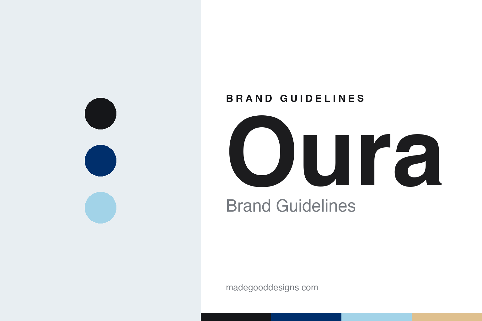
Oura lives in a published Nordic palette. Click a swatch to copy the hex.
Unusually for the brands in this series, Oura publishes an official palette rooted in “Nordic heritage.” The primary colours are Oura Black #151619 and white, with a deep navy Helsinki Blue (Pantone 294) and a warm-beige Skin Tone (Pantone 467); secondary accents include the pale Enso Blue #A2D3E8 and a Living Coral (Pantone 172). The palette reads as calm, premium and wellness-oriented — muted, natural and Scandinavian — matching a health brand you wear to sleep. It’s restrained and sophisticated, avoiding the loud neon of much fitness tech. (Caveat: a few of the Pantone-referenced tones are best treated as approximate hexes; the core Oura Black and Enso Blue are exact.)
The lesson is a calm, natural palette signals premium wellness. Oura’s muted Nordic colours feel sophisticated and restful, apt for a device about recovery and sleep. For designers, it’s a reminder that a wellness brand can win with quiet, natural tones instead of neon. The takeaways: match the palette to the product’s emotional job (calm colours for sleep/recovery); publish a clear palette so the brand stays consistent (as Oura does); and anchor it with a distinctive named colour (Oura Black, Enso Blue).
Typography
The wordmark is a clean sans — premium and minimal.
Oura’s clean sans wordmark — stylised ŌURA with a macron over the O — is premium and minimal. The even, modern letterforms read as calm, sophisticated and trustworthy, matching a wellness brand you wear every day, and the macron gives it a small, distinctive, ownable twist (Oura publishes no official reason for it, so a pronunciation cue is only speculation). The type feels quiet and confident rather than showy, exactly right for a health device about rest and recovery. It sits comfortably with the muted Nordic palette. (Because Oura’s guidelines specify wordmark construction but don’t name the typeface, the honest description is “a clean sans,” not a named font.) The type behaves like the brand: premium, minimal and calm.
Aa
A clean sans — premium and minimal. (Specimen set in Outfit, a geometric sans in the spirit of the Oura wordmark; the real face is undocumented, and the ŌURA macron is a custom detail.)
Designing calm
Oura made health tech feel restful.
Oura is a lesson in matching design to a product’s emotional purpose. Most fitness tech shouts — neon colours, loud screens, aggressive “crush your goals” energy. Oura does the opposite: a discreet ring you barely notice, a calm Nordic palette, quiet minimal type, and a gentle daily Readiness Score that’s about recovery, not just pushing harder. That restful, premium restraint is a deliberate design choice, and it’s exactly why Oura resonates with people who want wellness and better sleep rather than a workout drill sergeant. The whole identity is engineered to feel calm — proof that design should serve how a product is meant to make you feel.
For designers and brand-builders, Oura offers a clear takeaway: align the entire design system with the emotional job the product does. The lessons: pick colours, type and form to match the feeling (calm, restful, premium for sleep/recovery); own a new category by making the product elegant, not just capable (a ring, not a gadget); and keep a distinctive, consistent identity (the published Nordic palette, the ŌURA macron). It’s also a reminder to keep the facts precise — Oura was founded in 2013 in Oulu, Finland (originally Jouzen), launched via Kickstarter in 2015, pioneered the smart ring with its Readiness Score and subscription, rose to prominence in the 2020 NBA bubble, and publishes an official Nordic palette anchored by Oura Black and Enso Blue. Oura designed calm — proof that design should serve how a product is meant to feel.
Explore & save
Keep Oura’s identity on hand — save it to a board in the Made Good inspiration library.
Oura identity set
Pin the Nordic palette and the clean-sans spirit to your own board.