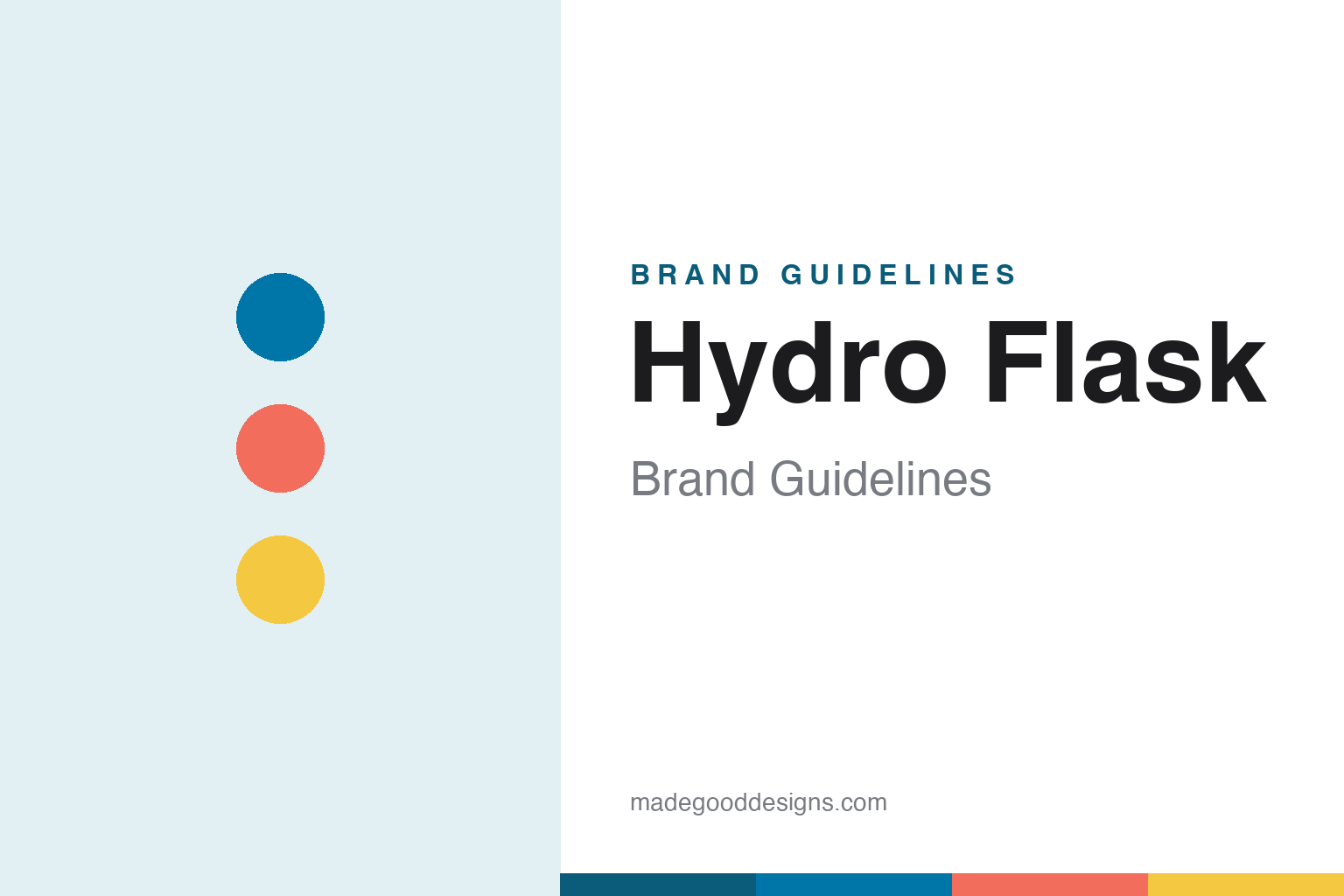
Hydro Flask Brand Guidelines
Colour as the product — the grippy powder-coat that turned a steel bottle into a Gen-Z accessory.
Aa
Two constants: a bright, powder-coat palette and a friendly, rounded sans. Abstract homage — not the Hydro Flask wordmark.
The colour revolution
Hydro Flask made colour the product.
Hydro Flask is a lesson in colour becoming the product. It was founded in 2009 in Bend, Oregon (co-founded by Travis Rosbach and Cindy Weber), making double-wall vacuum-insulated stainless-steel bottles. Vacuum bottles weren’t new — but Hydro Flask’s breakthrough was the finish: a durable, grippy matte powder-coat applied in a wide range of bright colours. That single move turned a utilitarian steel bottle into a fashion and lifestyle accessory. (Two honest notes: Hydro Flask didn’t invent the vacuum bottle — it popularised the colourful powder-coated version; and it publishes no single official brand hex, because the identity is deliberately multi-colour.)
The product system reinforced the appeal: a wide-mouth opening (easy to fill, add ice and clean) and interchangeable caps — the Flex Cap, the Straw Lid, the Flip Lid — that let people customise the bottle to their use and their look. Around 2016–2019 the brand exploded in popularity, and in ~2019 it became a defining object of the “VSCO girl” aesthetic: a Gen-Z status symbol on TikTok and Instagram, paired with scrunchies, Birkenstocks, metal straws and “save the turtles.” A steel water bottle had become a cultural signifier.
Behind the scenes, Hydro Flask was independent from 2009 until March 2016, when it was acquired by Helen of Troy (the consumer-products company behind brands like OXO) for roughly $210M. The identity is bright and friendly — a clean sans-serif Hydro Flask wordmark with a water-drop motif, and above all a bold, ever-rotating spectrum of powder-coat colour. (Note: Hydro Flask’s ~2019 VSCO moment is distinct from Stanley’s later Quencher craze of 2023–2024 — two different brands, two different viral waves.) Colour, made the point.
Colour
Hydro Flask lives in bright, rotating colour. Click a swatch to copy the hex.
Hydro Flask’s identity is colour. Rather than one signature hue, the brand is built on a broad, ever-rotating spectrum of bright, saturated powder-coat colours — teals, corals, sunflower yellows, pastels and more — that make each bottle a personal, expressive object. The colour is the product’s whole point: it’s what turned a plain steel bottle into a fashion accessory and a Gen-Z status symbol. The palette reads as fun, youthful, optimistic and Instagram-ready, and it’s deliberately flexible so the brand can chase seasons and trends. The honest caveat: because the identity is intentionally multi-colour, Hydro Flask publishes no single official brand hex — the teal, coral and yellow here are observed approximations, not first-party values.
The lesson is colour itself can be the differentiator. In a category of near-identical steel bottles, Hydro Flask competed on the grippy powder-coat and its rainbow of colourways — and won a cultural moment. For designers, it’s a reminder that surface, finish and colour can matter as much as function. The takeaways: differentiate on finish and colour when function is commoditised; keep the palette broad and rotating for expression and trend-chasing; and treat specific hexes as approximate when the identity is deliberately multi-colour.
Typography
The wordmark is a clean, friendly sans — bright and approachable.
Hydro Flask’s identity carries a clean, friendly, rounded spirit — an approachable sans-serif wordmark (with a water-drop motif) that reads as fun, youthful and optimistic. The soft, contemporary letterforms match a brand built on bright colour and everyday self-expression, and the friendliness invites personalisation. Set against a spectrum of powder-coat colour, the type feels playful and inviting — exactly the youthful, lifestyle personality Hydro Flask cultivates. It’s approachable and warm rather than rugged or austere, mirroring the colourful bottles. Because the exact wordmark face isn’t publicly documented, the honest description is “a clean, friendly rounded sans spirit,” not a named font. The type behaves like the brand: bright, friendly and expressive.
Aa
A clean, friendly rounded sans spirit — bright and approachable. (Specimen set in Rowdies, a friendly rounded display sans in the spirit of the Hydro Flask identity; the real face is undocumented.)
Winning on finish
Hydro Flask competed on colour.
Hydro Flask is a lesson in differentiating on finish in a commodity category. Double-wall vacuum stainless bottles are functionally similar across dozens of brands — so Hydro Flask competed not on the physics but on the surface: a durable, grippy matte powder-coat in a huge range of bright colours. That reframed the bottle from a utilitarian object into a personal, expressive accessory, and set up the cultural moment (~2019’s VSCO-girl trend) that made it a Gen-Z status symbol. The lesson is that when the core function is commoditised, the differentiator can move to design, finish and colour — the parts customers actually see, touch and identify with. Hydro Flask also shows the double edge of riding a trend: cultural moments fade, so the durable brand is the one that keeps evolving its colour and product system rather than relying on a single meme. Win on the surface people see.
For designers and brand-builders, Hydro Flask offers a clear takeaway: when function is commoditised, differentiate on finish, colour and self-expression. The lessons: compete on the visible surface (the grippy powder-coat, the colour range); build a flexible system that invites personalisation (interchangeable caps, rotating colours); and treat a viral cultural moment as a boost, not a foundation. It’s also a reminder to keep the facts precise — Hydro Flask was founded in 2009 in Bend, Oregon, popularised (not invented) the colourful powder-coated vacuum bottle, had its VSCO moment around 2019, and has been owned by Helen of Troy since March 2016. Hydro Flask competed on colour — proof that finish can be the differentiator.
Explore & save
Keep Hydro Flask’s identity on hand — save it to a board in the Made Good inspiration library.
Hydro Flask identity set
Pin the bright powder-coat palette and the friendly-sans spirit to your own board.