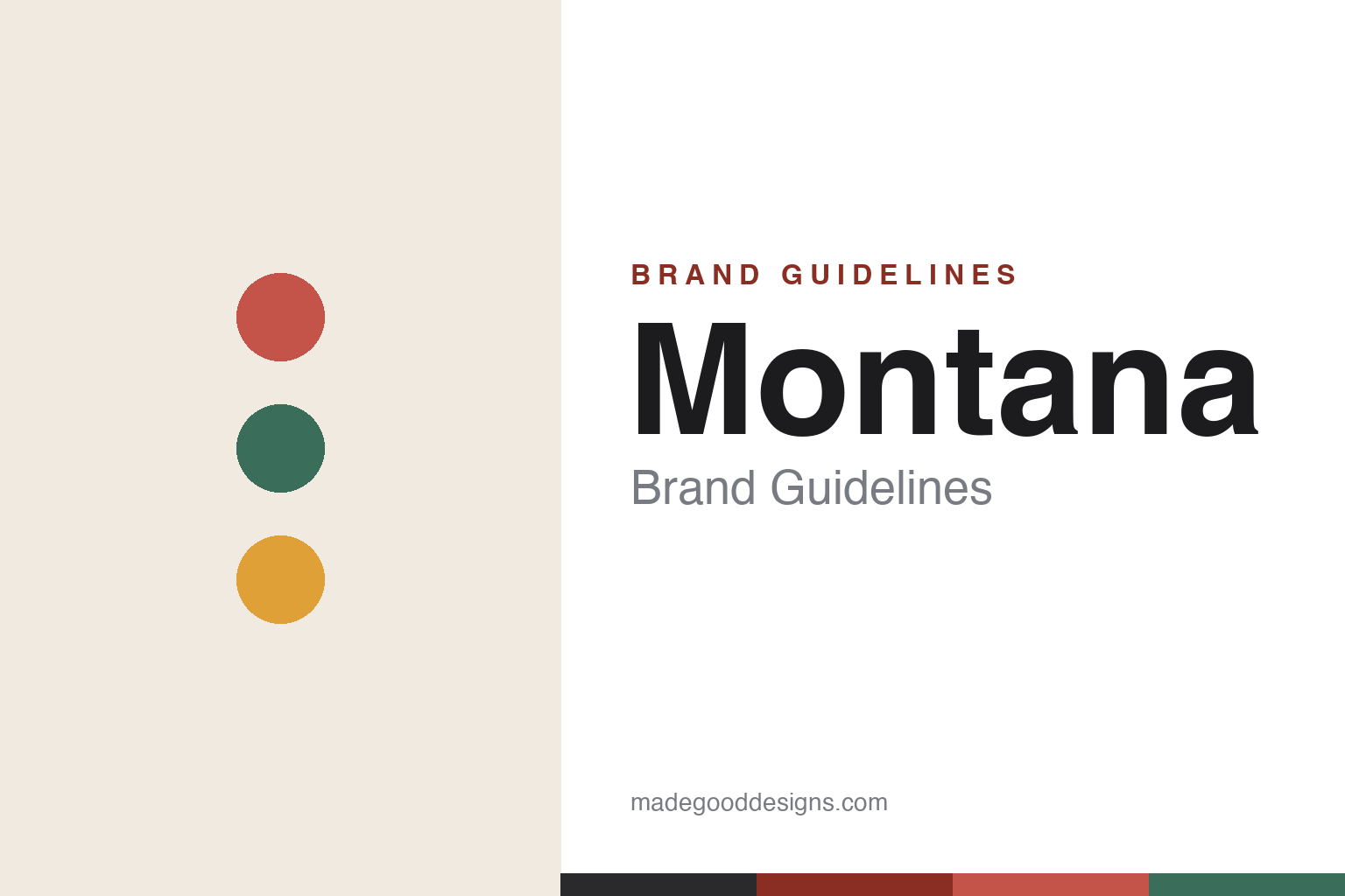
Montana Brand Guidelines
Making room for personality — a modular Danish storage system in more than forty colours, built to order.
Aa
Two constants: a bold, named-colour palette and a clean, geometric sans. Abstract homage — not the Montana wordmark.
Making room for personality
Montana modularised the shelf.
Montana is a lesson in modularity and colour as personalisation. It was founded in 1982 by Peter J. Lassen (1930–2019) in Denmark, and he also designed the modular Montana System that launched it. (Two honest notes: no official brand hex is published, and the wordmark typeface is undocumented.)
The Montana System is a modular, made-to-order shelving and storage system — a grid of boxes (currently around 36 modules in four depths) that can be endlessly combined, wall-mounted or freestanding, into almost any configuration. Lassen described its origin sculpturally: “As a sculptor starts with an abstract stone, I started with an abstract square box” — with rounded edges, missing corners and retracted fronts as its design DNA. It’s a genuinely adaptable system that grows and changes with a home.
Montana’s signature, though, is colour. The system comes in a defined palette of more than 40 colours (currently 43), with evocative names — Rosehip, Camomile, Fjord, Juniper, Masala, Oyster — that let customers personalise a piece to their taste. (An honest note: the modern colour palette was developed with the Danish colour expert Margrethe Odgaard and relaunched in 2019.) The ethos is right there in the tagline: “Making room for personality.” Montana remains family-owned, run by Peter’s son Joakim Lassen — the fifth generation of his family in furniture, and (a lovely detail) the great-grandson of the manufacturer Fritz Hansen. It’s made in Denmark. Making room for personality.
Colour
Montana lives in a bold, named-colour palette. Click a swatch to copy the hex.
Montana’s identity is its defined, named-colour palette — more than forty considered hues, from deep Rosehip reds and Juniper greens to warm Masala, soft Oyster and cool Fjord blues. The colour is the whole point: where much storage furniture is neutral, Montana turns colour into personalisation, letting each piece express its owner. The palette is broad but curated (developed with a colour expert), so it reads as sophisticated and playful rather than garish. The honest caveat: Montana publishes colour names, not official hex values (it sells physical colour samples), so the Rosehip, Juniper and amber here are an original, unofficial interpretation, not first-party values.
The lesson is a defined, named-colour palette can be a brand’s whole signature. Montana’s named colours turn storage into personal expression. For designers, it’s a reminder that a broad-but-curated colour system (with evocative names) can be a powerful, ownable brand asset. The takeaways: make a defined, named colour palette central to the brand; use it for personalisation; and treat specific hexes as unofficial when the brand markets by name and swatch.
Typography
The wordmark is a clean geometric sans — modular and systematic.
Montana’s identity carries a clean, systematic, modular spirit — the all-caps “MONTANA” wordmark whose even, geometric letterforms read as modern, precise and grid-like. A clean geometric sans captures the mood: it feels like a modular system — ordered, adaptable, built from clear units — matching a brand built on a grid of boxes and a defined colour palette. Set against a bold, named-colour palette, the type feels systematic and modern — exactly the modular, “make room for personality” personality Montana cultivates. It’s clean and geometric rather than decorative, mirroring the ordered, colourful system. Because the exact wordmark face isn’t publicly documented, the honest description is “a clean geometric sans spirit,” not a named font. The type behaves like the brand: clean, systematic and modular.
Aa
A clean geometric sans spirit — modular and systematic. (Specimen set in Sarala, a clean geometric sans in the spirit of the Montana identity; the real face is undocumented.)
Colour and modularity as the difference
Montana personalised storage.
Montana is a lesson in personalisation through modularity and colour. Storage is one of the most utilitarian, easily-ignored furniture categories; Montana transformed it into a canvas for self-expression by combining two ideas — a genuinely modular, made-to-order system (any configuration you want) and an extensive, curated palette of named colours (any look you want). Together, they turn buying a shelf into designing something personal: your configuration, in your colour. That personalisation is the whole differentiator — “making room for personality” isn’t a slogan bolted on, it’s the product’s core logic — and it’s durable, because a modular system grows and reconfigures with the owner for decades. Backed by real Danish craft, family stewardship and a serious colour philosophy (developed with a colour expert), the system reads as considered, not gimmicky. The lesson is that giving customers genuine, well-designed choice — modularity plus a curated colour system — can differentiate even the most utilitarian category by making the product personal. Let people make it theirs, and the product means more. Personal by design.
For designers and brand-builders, Montana offers a clear takeaway: modularity plus a curated colour system can personalise even a utilitarian category. The lessons: build a genuinely modular, made-to-order system (any configuration); offer a broad-but-curated palette (named colours); and make personalisation the core promise (“making room for personality”). It’s also a reminder to keep the facts precise — Montana was founded in 1982 by Peter J. Lassen, who designed the modular system, comes in more than forty colours, and is family-owned by his son Joakim Lassen. Montana personalised storage — proof that colour and modularity can be the difference.
Explore & save
Keep Montana’s identity on hand — save it to a board in the Made Good inspiration library.
Montana identity set
Pin the named-colour palette and the geometric-sans spirit to your own board.


