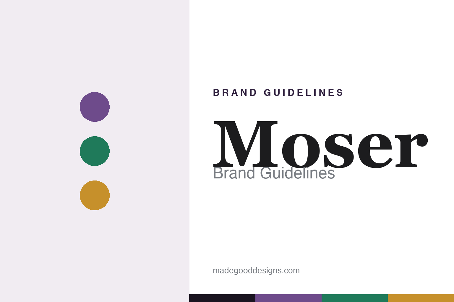
Moser Brand Guidelines
Lead-free Bohemian crystal — the “Glass of Kings.”
Aa
Two constants: a jewel-tone palette and a classic serif. Abstract homage — not the Moser wordmark or logo.
The Glass of Kings
Moser is Bohemia’s luxury crystal house.
Moser is a lesson in craft made regal. It was founded in 1857 by Ludwig Moser in Karlovy Vary (Karlsbad), Bohemia — today the Czech Republic — as an engraving and decorating workshop, only building its own glassworks in 1892. Its reputation, “the Glass of Kings and King among Glass,” was earned through documented royal clients: Emperor Franz Joseph I (a 1904 court warrant), the Persian Shah (1901), King Edward VII (1908), the Ottoman Sultan Abdul Hamid II, and a papal commission; Queen Elizabeth II received a Moser set as a 1947 wedding gift.
Its defining signature is that Moser crystal is lead-free — a hard, brilliant potassium/sodium formula used since 1893, which sets it apart from French lead crystal. Its other signature is colour: rare-earth jewel tones including Alexandrite (a neodymium crystal that shifts between violet and blue with the light), Beryl green, Eldor topaz-gold, Rosalin pink and smoky Aquamarine — the colour-shifting glasses debuting at the 1929 Leipzig fair — finished with hand cutting, engraving and 24-carat gold gilding.
After nationalisation in 1948 and privatisation in 1991, Moser operates today as the Czech company Moser a.s. (Honest notes: Moser is lead-free — its brilliance comes from a hard potassium/sodium glass, not lead oxide, unlike Baccarat or Saint-Louis; Bohemian crystal is a different tradition from French lead crystal; Alexandrite is a rare-earth optical colour change, not a dye; and no official brand hex is published.)
Colour
Moser lives in a jewel-tone palette. Click a swatch to copy the hex.
Moser’s identity is coloured, brilliant and gilded — an Alexandrite violet, a beryl green, a topaz gold, a smoky aquamarine, and a soft rosalin pink. The palette reads exactly like its signature coloured crystal: rare-earth jewel tones warmed by 24-carat gold. It signals colour mastery and regal craft rather than clear-crystal restraint. The honest caveat: with no published brand hex, these tones are an original, unofficial interpretation, not first-party values.
The lesson is a jewel-tone palette signals coloured Bohemian crystal. Moser’s world reads as rich and luminous. For designers, it is a reminder that neodymium violet, beryl green and topaz gold convey colour-work and heritage luxury, matching a house famous for lead-free coloured crystal. The takeaways: build from rare, saturated jewel tones with a gold accent; let colour and light lead; and treat any single hex as unofficial — using a dark ground for small text so the loud tones stay in the palette.
Typography
The wordmark spirit is a classic serif — regal and crafted.
Moser’s identity carries a regal, crafted, old-world spirit — a “MOSER” wordmark whose refined forms match a house of royal crystal. A classic serif captures the mood: it is graceful and stately, the register of imperial courts and hand engraving rather than modern industry. Set against a jewel-tone palette, the classic serif feels regal and rich — exactly the coloured-crystal, Glass-of-Kings personality Moser carries. It is refined rather than plain, mirroring hand-cut coloured crystal and gold. (Moser’s real wordmark — and the historic “M” maker’s mark — are trademarks we describe but do not reproduce, and the exact typeface is not something we assert.) Because the specific mark is not ours to use, the honest description is “a classic serif spirit,” not the Moser logo. The type behaves like the brand: regal, crafted and old-world.
Aa
A classic serif spirit — regal and crafted. (Specimen set in EB Garamond, a classic serif; NOT the Moser logo, which is a trademark.)
Lead-free colour as the difference
Moser stands for coloured Bohemian crystal.
Moser is a lesson in owning a different tradition. While the great French houses built their name on lead crystal, Moser made brilliance without lead — a hard potassium/sodium glass — and combined it with rare-earth colour most rivals never mastered, like the neodymium Alexandrite that changes hue with the light. Tie that to a genuine history of royal and diplomatic commissions, and Moser had an identity no lead-crystal house could copy. The differentiator is a distinct material and colour signature — Bohemian, lead-free, coloured — not an imitation of France.
For designers and brand-builders, Moser offers a clear takeaway: a different technical tradition can be the whole identity. The lessons: lean into what makes you materially distinct (lead-free crystal, rare-earth colour); back it with real heritage (royal and state commissions); and let a regal, crafted identity carry it. It is also a reminder to keep the facts honest: Moser was founded in 1857, its crystal is lead-free from 1893, Alexandrite is an optical colour change, and it operates today as the Czech Moser a.s. — with the palette here an unofficial interpretation. Moser made lead-free colour its own — proof that a distinct tradition can be the difference.
Explore & save
Keep Moser’s identity on hand — save it to a board in the Made Good inspiration library.
Moser identity set
Pin the jewel-tone palette and the classic-serif spirit to your own board.